• Membership
  • Newsletter
  • Projects
  • Learning
  • About
  • Member Login
  • Estimating the condition of the economy

    September 14, 2022

    Topic

    Statistical Visualization  /  economy, New York Times

    Measuring the condition of the economy is tricky, because there are many parts to the economy. You can’t just say it’s good or bad. So Ben Casselman and Lauren Leatherby, for The New York Times, broke it down with a series of charts to view from different angles.

  • Animated charts to show sports results

    September 13, 2022

    Topic

    Infographics  /  animation, Krisztina Szűcs, sports

    Krisztina Szűcs likes to make animated charts to show sports results, from fencing, handball, soccer, to hockey. She cataloged all of her sports charts in one place. I’m partial to the triangle timelines, which play well to sports with back and forth scores.

  • Open cameras and AI to locate Instagram photos

    September 12, 2022

    Topic

    Data Sharing  /  AI, Dries Depoorter, Instagram, privacy, surveillance

    Dries Depoorter recorded video from open cameras for a week and scraped Instagram photos. Then he used AI to identify the people in the photos and their locations. Depoorter calls it The Follower.

  • Emissions from fires in the Arctic

    September 9, 2022

    Topic

    Maps  /  Arctic, carbon, Reuters, wildfire

    Reuters reported on the fires in the Arctic and the relatively high levels of carbon emissions they release in the atmosphere. The map above shows carbon emissions from wildfire in 2021, and the chart on the right shows totals by latitude, which emphasizes the geography in the north.

    The illustrations, which I appreciate and have become more of a norm in Reuters pieces, round out the maps and charts with more context:

  • Members Only

    Unrestricted Visualization

    September 8, 2022

    Topic

    The Process  /  learning, rules

    It’s nice that visualization has developed over the years to the point that there are dedicated classes for it, but I also like learning informally.

  • Images behind the generated images from Stable Diffusion

    September 8, 2022

    Topic

    Data Sharing  /  AI, Andy Baio, Simon Willison, Stable Diffusion

    People have been having fun with the text-to-image generators lately. Enter a description, and the AI churns out believable and sometimes detailed images that match the input. The reason these systems work is because the models were trained on a lot of data, in the form of images. Andy Baio and Simon Willison made a tool to browse a subset of this data behind the recently released Stable Diffusion.

  • Color palette generator

    September 7, 2022

    Topic

    Apps  /  color, generator

    In the never-ending quest to find the perfect color scheme for any given situation at any given moment, Coolors is another set of tools to find the right shades for your application. The twist is that there’s a generator that shows you schemes based on inputs, such as a certain hue or a photograph. There is also a list of trending palettes.

  • Science of the tennis toss

    September 6, 2022

    Topic

    Infographics  /  New York Times, tennis, toss

    To serve the ball in tennis, a player first tosses the ball in the air. The New York Times explained the details behind the simple action, from mechanics, positioning, to point of contact. They got fancy with it.

  • Gerrymandering detection with simulations

    September 6, 2022

    Topic

    Infographics  /  gerrymandering, simulation, Washington Post

    Harry Stevens, for The Washington Post, how simulations can be used to detect severely gerrymandered congressional districts. In the interactive, you play the role of concerned citizen with the task of proposing a map that more closely resembles the political leanings of the state as a whole.

  • Where memes from the past decade came from

    September 2, 2022

    Topic

    Statistical Visualization  /  Know Your Meme, meme

    Know Your Meme analyzed a decade of meme data to see where the memes have come from, breaking it down by year. It’s all Twitter and TikTok these days, but it used to be YouTube and 4chan.

  • Members Only

    Play With Your Data

    September 1, 2022

    Topic

    The Process  /  fun, play

    Time for less work and more play.

  • Data Underload  /  meaning, time use, well-being

    Where We Find Meaning in the Everyday

    The American Time Use Survey asks people to log their activities for a day, and in the most recent release, people also rated the meaningfulness of the activities. Here’s how activity categories rated, sorted by most meaningful to least meaningful.

    Read More
  • Splitting the US population evenly, with arbitrary shapes

    August 31, 2022

    Topic

    Maps  /  Engaging Data, population

    By Engaging Data, this interactive map shows various splits of the United States with the condition that each division has the same population:

    This visualization lets you divide the US into 1,2,3,4,5,8 and 10 different segments with equal population and across different dimensions. The divisions are made using counties as the building blocks (of which there are 3143 in the US). There are numerous different ways to make the divisions. This lets you make the divisions by different types of geographic directions and divisions by population density.

  • China’s possible blockade around Taiwan

    August 30, 2022

    Topic

    Maps  /  blockade, China, New York Times, Taiwan

    It appears China wants to impose a blockade around Taiwan with ships, submarines, and airplanes. The New York Times mapped the possibility and how it could disrupt life in and around the island.

  • Losses and comebacks of Serena Williams

    August 29, 2022

    Topic

    Infographics  /  Serena Williams, tennis, Washington Post

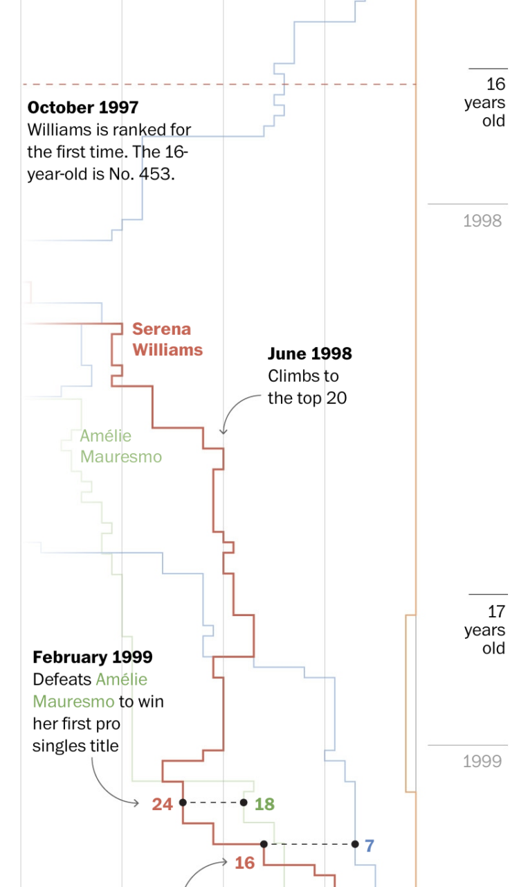
    We tend to celebrate the wins in sports and often forget about or don’t see the climb that athletes take to get to the top. Artur Galocha and Adrian Blanco, for The Washington Post, look back at Serena Williams’ winning career, focusing on who or what she had to compete against from age 15 to 40.

    They start with a wideout view that shows Williams’ full career. Then they zoom in to notable career milestones where past competitors fade in and out of the picture. Years and age run along the same axis, and annotation points to key wins.

    The timeline view is simple and static, but it is well-made.

  • Big diagram of metabolic pathways

    August 29, 2022

    Topic

    Network Visualization  /  biochemistry, metabolism

    The contents of this diagram is not in my scope, but it is a very big, detailed diagram of metabolic pathways. Many steps, many arrows.

  • Where restaurant chains dominate

    August 26, 2022

    Topic

    Maps  /  chains, Clio Andris, restaurant, Xioafan Liang

    Researchers Xiaofan Liang and Clio Andris estimated the percentage of restaurants that are chains and independent to identify “McCities”:

    These high chainness McCities are prevalent in the Midwestern and the Southeastern United States. Independent restaurants were associated with dense pedestrian-friendly environments, highly educated populations, wealthy populations, racially diverse neighborhoods, and tourist areas. Low chainness was also associated with East and West Coast cities.

    Check out the interactive map here.

    My only criticism is that they used a rainbow color scale instead of using a single hue or a diverging color scale that breaks at half.

  • Introduction to Probability for Data Science, a free book

    August 26, 2022

    Topic

    Statistics  /  book, probability, Stanley Chan

    Introduction to Probability for Data Science is a free-to-download book by Purdue statistics professor Stanley H. Chan:

    We need a book that balances the theory and practice. We need a book that provides insights and not just theorems and proofs. We need a book that motivates the students, telling them why probability is so essential to their work. We need a book that highlights the impacts of the subject. From over than half a decade of teaching the course, I have distilled what I believe to be the core of probabilistic methods. I put the book in the context of data science, to emphasize the inseparability between data (computing) and probability (theory) in our time.

    Download a free PDF copy or buy a physical copy.

  • Members Only

    Visualization Tools and Learning Resources, August 2022 Roundup

    August 25, 2022

    Topic

    The Process  /  roundup

    Here’s the good stuff for August.

  • Meteorologist delighted by surprise map interaction

    August 25, 2022

    Topic

    Maps  /  interaction, weather

    Meteorologist Greg Dutra was delivering the daily weather news for ABC Chicago and accidentally discovered that his map was interactive when he touched the screen:

    This wasn’t in the training manual! @TBrownABC7 @valwarnertv and I go OFF THE RAILS when I discovered the TV is a touch screen while on-air on @ABC7Chicago 😂 pic.twitter.com/almrdxqz3d

    — Greg Dutra (@DutraWeather) August 4, 2022

    It’s good, wholesome joy from a data display, in case you forgot what that looks like.

  • Page 55 of 392
  • <
  • 1
  • ...
  • 52
  • 53
  • 54
  • 55
  • 56
  • 57
  • ...
  • 392
  • >

Analyze, visualize, and communicate data usefully, beyond the defaults.

Become a member →

Recently for Members

May 15, 2025
Step Chart, Enhanced

May 8, 2025
When the data is not what it seems

May 1, 2025
Finding the Right Charts

April 24, 2025
Visualization Tools, Datasets, and Resources – April 2025 Roundup

April 17, 2025
Breaking Out of Chart Software Defaults

Browse by Chart Type See All →

Table Connected Scatter Plot Treemap Line Chart Heatmap Bump Chart Mosaic Plot Box Plot Spiral Chart Unit Chart

Browse By Topic

  • Visualization

    Seeing data

  • Maps

    Seeing geographic data

  • Infographics

    Explaining data

  • Networks

    Connecting data

  • Statistics

    Analyzing data

  • Software

    Working with data

  • Sources

    Getting data

  • Design

    Making data readable

Get the Book

Visualize This: The FlowingData Guide to Design, Visualization, and Statistics

Available now.

Order: Amazon / Bookshop

Made by FlowingData

  • The Process

  • Data Underload

  • Chart Everything

  • Guides

  • Books

  • Shop

  • About
  • Contact
  • Newsletter
  • LinkedIn
  • Instagram
  • Bluesky
  • RSS
Copyright © 2007-Present FlowingData. All rights reserved.