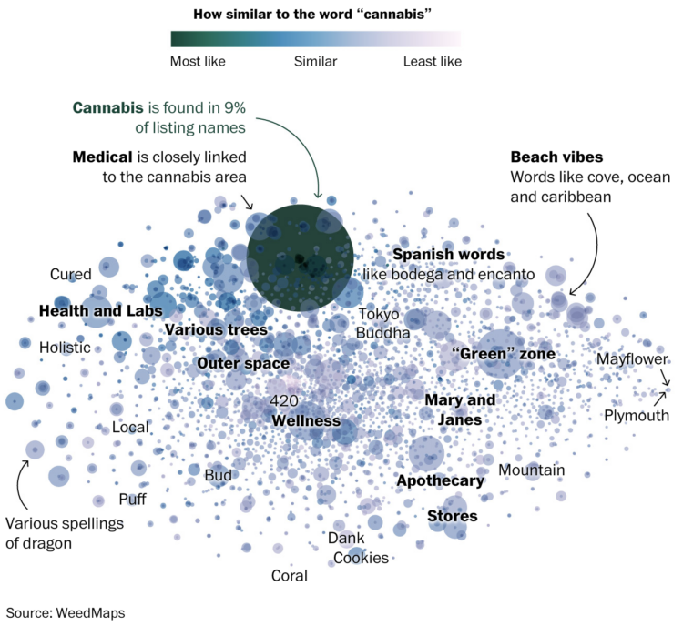
Given our love for making our opinions heard for products on the internets, Earth Reviews from Neal Agarwal extends the possibilities. Review acne, frogs, snow, gum, doors, and many other important things that require important reviews. Make your voice heard.
-
Zack Capozzi, for USA Lacrosse Magazine, explains how he calculates win probabilities pre-game and during games. On interpretation, which could easily apply to other sports and all forecasts:
But interpretation here matters quite a bit. And this is frustrating for some people, but that 61 percent should be interpreted as: “if these teams played 100 times, we would expect Marquette to win 61 of those games.” It definitely does not mean that the model is 61 percent confident that Marquette will win.
This is a bit odd, but this also means that if the Win Probability model gives Team A a 90% chance to beat Team B, there is nothing wrong with the model if Team B ends up winning the game. The issue would arise if, out of 100 90-percent win probability games, the favorite wasn’t winning around 90 of those games. When the model says 90 percent, you want it to mean 90 percent.
I wonder how many people incorrectly interpret the probability as “61 percent confident”. I bet a lot.
I do know that ever since the Golden State Warriors lost to the Cleveland Cavaliers in the 2016 NBA Finals — while holding a 90-something percent win projection by FiveThirtyEight — I stopped paying attention to win probability. But learning more about the calculation made it more interesting.
-
Atomic Agents is a JavaScript library by Graham McNeill that can help simulate the interactions between people, places, and things in a two-dimensional space. Saving for later. Looks fun.
-
In 2021, a large portion of North America was stuck in a heat dome with record temperatures and wildfires. Gordon Logie for Sparkgeo mapped the before-and-after of major wildfires during the year in British Columbia, with a combination of satellite imagery, photos, and scrolling. Logie then shows major floods, which are not necessarily caused by the fires, but are highly correlated.
The transitions for the before-and-after show the wildfire damage clearly. Instead of using the slider format, which kind of uncovers an after image, you can see the already boundaried regions change right away.
-
For TechCrunch, Zack Whittaker reporting:
In its second ruling on Monday, the Ninth Circuit reaffirmed its original decision and found that scraping data that is publicly accessible on the internet is not a violation of the Computer Fraud and Abuse Act, or CFAA, which governs what constitutes computer hacking under U.S. law.
The Ninth Circuit’s decision is a major win for archivists, academics, researchers and journalists who use tools to mass collect, or scrape, information that is publicly accessible on the internet. Without a ruling in place, long-running projects to archive websites no longer online and using publicly accessible data for academic and research studies have been left in legal limbo.
-
With the NBA playoffs underway, it can be fun to watch the best players and wonder what it’d be like if they were drafted earlier by a different team. For The Pudding, Russell Goldenberg did this for every player and team since the 1989 draft. Goldenberg made a similar thing five years ago, but this time there’s a team component.
Another five years from now, in Redraft 3.0, I fully expect “better” picks to also consider the team makeup at the time of drafting. For example, check if it makes sense to draft another power forward when you already have a star power forward and need a shooting guard.
-
Taxes are due today in the U.S. (yay). Geoffrey A. Fowler for The Washington Post on the part when tax services like TurboTax and H&R Block ask for your data:
What he discovered is a little-discussed evolution of the tax-prep software industry from mere processors of returns to profiteers of personal data. It’s the Facebook-ization of personal finance.
America’s most-popular online tax-prep service, Intuit’s TurboTax, also asks you to grant it additional access to the data in your return to “enrich your financial profile, communicate with you about Intuit’s services, and provide insights to you and others.”
[…]
The good news is because of Internal Revenue Service rules, this is one data request you can actually say “no” to while continuing to do your taxes online. And if you already clicked “agree” and now have changed your mind, there are some steps you can take, too.
-
NZ Herald talked to Ross Ihaka, one of the creators of R:
Today, R is depended upon around the world by analysts, data scientists and big-name companies like Facebook, Google, Amazon and the New York Times, and it’s garnered Ihaka something of a rockstar status in the field of data science and statistics.
He’s received numerous accolades over the years recognising his work, such as the Royal Society of New Zealand’s prestigious Pickering Medal, and the Statistical Computing and Graphics Award from the American Statistical Association.
Asked how many people use R on a daily basis, Ihaka’s guess is in the millions but he’s not quite sure how many million.
One of the reasons R is called R is because Ihaka and co-creator Robert Gentleman both had first names that started with the letter.
-
Earlier this year, an underwater volcano erupted in the island nation of Tonga. For The New York Times, Aatish Bhatia and Henry Fountain describe the effects of the eruption, which lasted for days and rippled around the world. The introductory animated globe shows the pressure wave and gives a good sense of the eruption’s massive scale.
-
Members Only
-
Based on leaked IRS data for the 400 wealthiest Americans, ProPublica provides a comparison of their incomes and the lower taxes they paid between 2013 and 2018. This might be best piece so far from ProPublica’s IRS series in terms of understanding the big picture from their dataset. Also, that “smaller than a pixel” note for the average American is doing some heavy lifting.
-
Social media apps are on a lot of phones these days, but some tend towards a younger audience and others an older. Some are common across the population. Here’s the breakdown by age for American adults in 2021, based on data from the Pew Research Center.
-
This map by @loverofgeography shows the usual dinner times for countries in Europe. There’s no source listed, so I’m not sure if this is based on actual data or just anecdotal, but I think the latter. From my meager experience, this seems right? I might have to check out European time use data.
-
Jeff Bezos’ wealth is difficult to understand conceptually, because the scale is just so much more than what any of us are used to. So for NYT Magazine, Mona Chalabi took a more abstract approach, focusing less on monetary values and more on how many multiples more Bezos has compared to the median household.
See also The Washington Post’s comparison from a couple of years ago, scaling things down to spending equivalencies. I think Chalabi’s comparison works better. It’s abstract compared with abstract.
-
Georgios Karamanis plotted the ratio of girls-to-boys over time for all the names in the Social Security Administration dataset. You can see the more gender-specific names at the edges and more gender-neutral names clustering in the middle.
Those dips in 1989 and 2004 are curious. Otherwise, the increase in gender-neutral names seems to match up with my analysis from a while back.
-
Microsoft researchers analyzed keystrokes by time of day, for a sample of Microsoft employees during this past summer. You can see the typical peaks during work hours with a dip for lunch. But among 30% of workers in the sample, there was a third peak starting around 9 o’clock in the evening.
That third peak felt too close to home for me.
-
The 2022 Oscars came and went, and it was like all anyone could talk about was how outfits paired with public health charts. William Lopez has the collection.
-
For Nature, Lynne Peeples spoke to the people behind many of the popular covid dashboards and the lessons learned:
Among the shared themes for the dashboards were simplicity and clarity. Whether you are producing visuals and analytical tools for policymakers or for the public, Blauer says, the same rules of thumb apply. “Don’t overcomplicate your visualization, make the conclusions as clear as possible, and speak in the most basic of plain-language terms,” she says.
Yet, as other data scientists point out, presenting data simply might not be enough to ensure viewers get the message. For one thing, attention to detail matters. Ritchie recalls how she and her team spent hours focused on the titles and subtitles of charts, “because that is ultimately what most people will look at”. And in those titles and subtitles, the analysts made sure to specify ‘confirmed’ deaths or ‘confirmed’ cases. “An emphasis on ‘confirmed’ is really important because we know that it’s an underestimate of the total,” says Ritchie. “It might seem very basic, but it’s really crucial to how you understand the data and the scale of the pandemic.”
-
The New York Times shows how Russia has tried to take over and how Ukraine continues to stop the offensives. The mixed media piece pulls you in to how different strategies have worked and have not, at least the best you can through a screen.