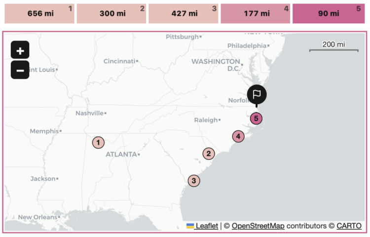
China’s fish supply is running low along its own coast, so they’ve shifted their fishing activities globally. The New York Times visualized the shift with animated maps.
-
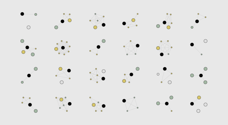
Say you want to identify clusters in a scatterplot of points. K-Means is commonly used method that might get you there. Yi Zhe Ang explains how the method works with a visual and interactive essay.
-
Anahad O’Connor, Aaron Steckelberg and Garland Potts, for The Washington Post, made charts that compare the benefits of coffee and tea. But let’s be honest here. All we really want to see in a battle between coffee and tea is an anthropomorphic bean and leaf wrestle.
-
The Olli library aims to make it easier for developers to improve the accessibility of existing charts:
Olli is an open-source library for converting data visualizations into accessible text structures for screen reader users. Starting with an existing visualization specification created with a supported toolkit, Olli produces a keyboard-navigable tree view with descriptions at varying levels of detail. Users can explore these structures both to get an initial overview, and to dive into the data in more detail.
-
Simon Willison asked a straightforward question about the tools people use:
If someone gives you a CSV file with 100,000 rows in it, what tools do you use to start exploring and understanding that data?
Then he expanded the question asking what people use for files with 1 million rows, 10 million rows, and 1 billion rows.
Browse the thousands of replies, and you quickly see that (1) there are many options to explore a dataset and (2) many people feel that what they’re using is the best option. There’s click-and-play programs, web-based products, programming languages, and command-line options. Some use a combination of whatever works for them at a given time for a certain dataset.
This is why when people ask me what the “best” tool is, I usually have to follow up with what they know already and what they want to do with the tool. It’s also why best-of lists for data exploration are usually not worth your time, unless you account for the assumptions about usage.
-
It seems a lot of data scientists have either left or were laid off from their jobs during the past few months. Jacqueline Nolis and Emily Robinson, data scientists who hosted a podcast and wrote a book on building a career in the field, happened to be in the lot. So naturally, they brought back the podcast for a bonus episode on their experiences with sudden unemployment and the job search.
I’ve never had a “real” job (as some tend to tell me), so workplace experiences are always interesting to me, like peering into an aquarium. The layoff process seems not fun.
-
Kelton Sears used a vertical scroll upwards to think about trees and time.
-
Bringing in data from various federal agencies:
Climate Mapping for Resilience and Adaptation (CMRA) integrates information from across the federal government to help people consider their local exposure to climate-related hazards. People working in community organizations or for local, Tribal, state, or Federal governments can use the site to help them develop equitable climate resilience plans to protect people, property, and infrastructure.
-
Members Only
-
You know those signs in workplaces that keep track of days since injury? Making use of NASA APIs, Neal Agarwal used that concept to keep track of natural disasters. As of this writing, it’s been 9,691,764 since the last Apocalyptic Volcanic Eruption (VEI 8). Pretty good.
-
How to Draw and Use Polygons in R
R provides functions for basic shapes, but you can also draw your own for maximum fun.
-
NOAA provides a map of potential flooding due to Hurricane Ian headed towards Florida. Red indicates greater than 9 feet of flooding above ground.
-
When someone fires a gun into the air, the bullet travels thousands of feet in elevation. Gravity pulls the bullet back down, and it accelerates fast enough to penetrate a human skull by the time it reaches ground-level. Acceleration and trajectory vary by type of gun and the shot angle. 1Point21 Interactive shows the variation and dangers with a visual explainer.
-
To teach, learn, and measure the process of analysis more concretely, Lucy D’Agostino McGowan, Roger D. Peng, and Stephanie C. Hicks explain their work in the Journal of Computational and Graphical Statistics:
The design principles for data analysis are qualities or characteristics that are relevant to the analysis and can be observed or measured. Driven by statistical thinking and design thinking, a data analyst can use these principles to guide the choice of which data analytic elements to use, such as code, code comments, data visualization, non-data visualization, narrative text, summary statistics, tables, and statistical models or computational algorithms (Breiman 2001), to build a data analysis. Briefly, the elements of an analysis are the individual basic components of the analysis that, when assembled together by the analyst, make up the entire analysis.
-
Randall Munroe provides another fine observation through xkcd.
I often wonder what our data and charts will look like a century or two from now. Will the conventions and aesthetics look silly and amateur or classic and vintage? Will what seems like a lot of detailed data now seem spotty and useless, or will we look back in disbelief that companies were allowed to track our activities? Will AI have taken over human cognition and make these questions obsolete, because we’re in a suspended dream state, our bodies used as energy to power super computers, unsure of what is real and what is simulated? Important questions.
-
Wildfire obviously damages the areas it comes in direct contact with, but wildfire smoke can stretch much farther. Based on research by Childs et al., Mira Rojanasakul, for The New York Times, shows how pollution from smoke spread between 2006 and 2020.
My kids’ rooms still have air filters from a few years ago, when a fire many miles away made the sky orange and our indoor environment smokey.
-
I heard you like spiral charts when the data is seasonal. I think that’s what Kevin Schaul and Hamza Shaban, for The Washington Post, had in mind when they charted housing demand through the lens of percentage of houses sold within two weeks.
-
Rafael Moral sang a very nerdy data analyst song, to the tune of “One Week” by Barenaked Ladies:
The “Data Horror Stories Song”, inspired by a tweet by @rogierK and commissioned by @LisaDeBruine
Any of these ever happened to you?#rstats #Statistics #DataScience pic.twitter.com/7A8PYGbolq
— Rafael Moral (@rafamoral) September 18, 2022
-
Members Only