-
Members Only
-
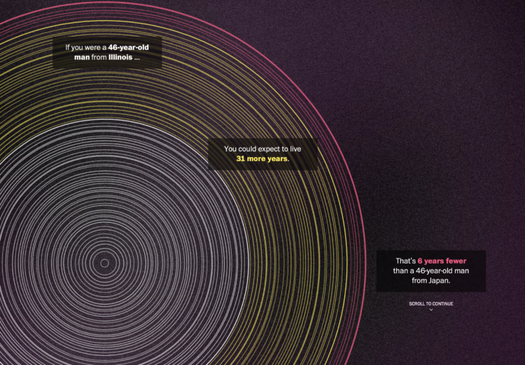
The Washington Post goes with a tree ring metaphor to compare life expectancy in your state. Enter your sex, age, and state. The inner white circles represent how old you are, the middle yellow circles represent how many expected years you have left, and the outer red circles represent the expected years of those with the same age and sex but in Japan.
The rings are a lead-in graphic to more statistical charts. I kind of wish they went all in with the rings, but that’d probably be limiting in the points they could get across.
-
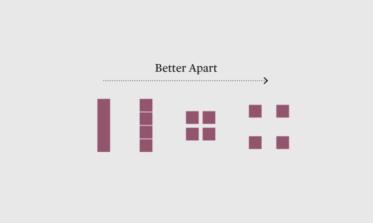
When we watch sports on television, the scale of many sports don’t seem that different, because the camera zooms in on players and everything is within the frame of our screens. So here are the major sports drawn at the same scale to help appreciate the size differences.
-
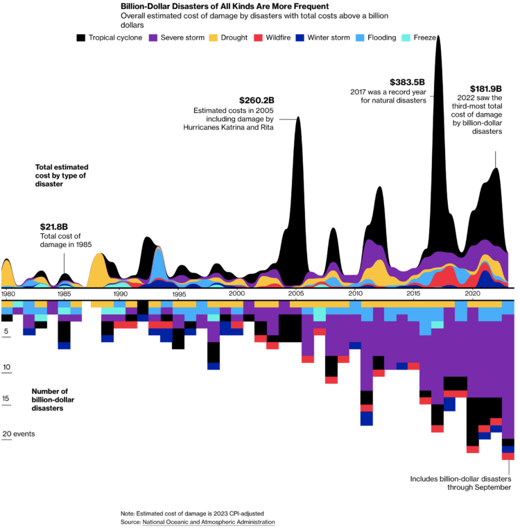
For Bloomberg, Rachael Dottle and Leslie Kaufman go with the combo stacked area chart and stacked bar chart on the top and bottom to show increased cost of billion dollar disasters and the counts over time. It looks like the sporadic tropical cyclones are causing the most damage.
-
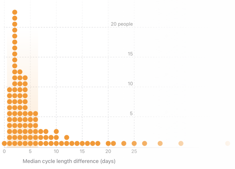
For the Apple Women’s Health Study, which uses cycle tracking data from iPhones and Apple Watches, the Harvard T.H. Chan School of Public Health provides a visual explanation of how menstrual cycles vary. With some tweaks, it could also stand in as an explainer for distributions and averages.
-
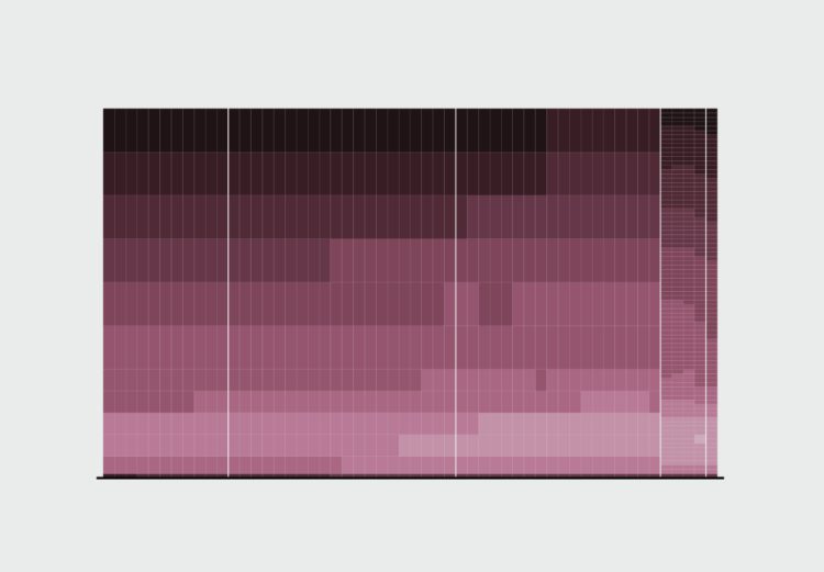
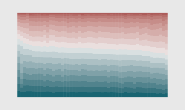
As we get older, our life expectancy declines. But when and how quickly the decline happens and how it happens has changed over the years.
-
Members Only
-
The David Rumsey Map Collection has been home to tens of thousands of historical maps, and now you can search the collection by the text in the maps instead of just through metadata:
About 57,000 of the georeferenced maps from the collection have been processed with a machine learning tool called mapKurator to collect all the text on maps, i.e. every piece of text (printed or handwritten) that appears on a map, including place names, but also information like a map’s title or its scale, or the names of the people involved in producing the map. Through this process of automatic annotation, this approach turns the text on maps into structured data (text on maps data): the enormous amount of data that has been collected from these maps is now searchable.
-
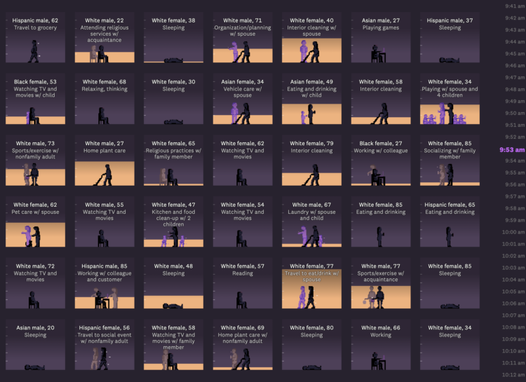
For The Pudding, Alvin Chang examines loneliness through the lens of individual responses from the American Time Use Survey:
In this story, we’ll go through 24 hours of a typical weekend day in 2021. We know what people did – and who they did it with – because, since 2003, the American Time Use Survey has asked people to track how they use their time.
By the end of the day, we’ll learn that Martin’s isolation isn’t unique. In fact, loneliness has become a far more common experience in the last few decades – and it was supercharged by the pandemic.
The heart of the piece is in the anti-aggregate view of individuals through 24 hours. See each person’s schedule, who they spend time with, and how that changes through the day. Sorting draws patterns. The scrolly clock on the right ticks. And it works on mobile. Chang makes the data immediately relatable.
-
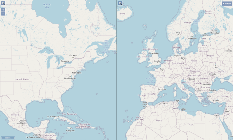
When you compare two areas on a single map, it can be a challenge to compare the actual size of them because of the trade-offs with projecting a three-dimensional space onto a two-dimensional space. Josh Horowitz made a thing that automatically rescales side-by-side maps as you pan and zoom, so that you get a more accurate comparison.
-
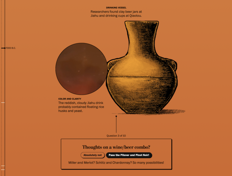
Beer dates back thousands of centuries, but it was not the beer we know today. It might have been more… chewy? More like gruel? Sounds amazing. With a fun illustrated piece, The Washington Post describes the evolution of beer, from the chunky fermented grain stuff to the clear carbonated beverage in cans.
-
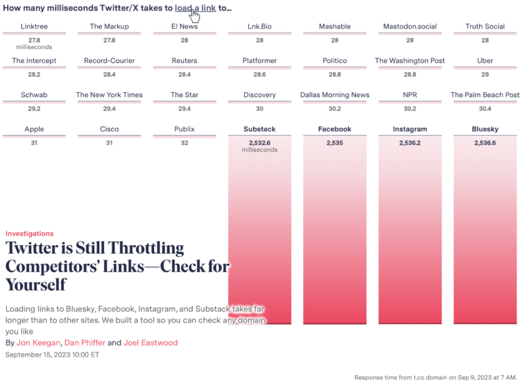
When you click a link on Twitter, you go through a Twitter shortlink first and then to the place you want to go. When you click on a link that points to one of Twitter’s competitors, by complete coincidence I am sure, there’s a delay. For The Markup, Jon Keegan, Dan Phiffer and Joel Eastwood ran the tests. You can also try it with your own URLs.
I’m into the animated opening graphic.
-
Members Only
-
Researchers at the University of Tübingen are studying crows’ abilities to understand statistical inference. For Ars Technica, Kenna Hughes-Castleberry reports:
To do this, Johnston and her team began by training two crows to peck at various images on touchscreens to earn food treats. From this simple routine of peck-then-treat, the researchers significantly raised the stakes. “We introduce the concept of probabilities, such as that not every peck to an image will result in a reward,” Johnston elaborated. “This is where the crows learn the unique pairings between the image on the screen and the likelihood of obtaining a reward.” The crows quickly learned to associate each of the images with a different reward probability.
In the experiment, the two crows had to choose between two of these images, each corresponding to a different reward probability. “Crows were tasked with learning rather abstract quantities (i.e., not whole numbers), associating them with abstract symbols, and then applying that combination of information in a reward maximizing way,” Johnston said. Over 10 days of training and 5,000 trials, the researchers found that the two crows continued to pick the higher probability of reward, showing their ability to use statistical inference.
-
Tall buildings in dense cities can trap heat and restrict air flow, which can make living in an area really hot. It’s worse when the environment as a whole is also warming. So Singapore is spending a lot to cool down their cities. For The New York Times, Pablo Robles, Josh Holder, and Jeremy White illustrate the measures Singapore has put in place.
I always appreciate the scrolly transitions from real life imagery with photos or video to the more abstract illustrations. It’s a good mechanism to keep concepts rooted in reality.
-
When looking into getting a pet, it’s important to consider life expectancy. You probably don’t want to accidentally sign up for a twenty-year commitment with an impulse adoption at the pet store. That’s a bad deal for you and the animal.
-
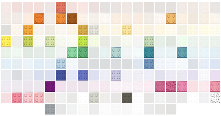
Lego started with five brick colors: red, yellow, blue, white, and clear. The selection peaked in 2004 but then surprisingly decreased to cut costs. For The Washington Post, Kati Perry shows the evolution.
-
In some states there are more kids, such as Utah, which has the youngest median age at 31 years and 4 months. In others states there are more older adults, such as Maine, which has the oldest median age at 44 and 8 months. This is based on the 2021 American Community Survey.
Of course, we can see the age breakdowns in greater detail. States aren’t uniformly young and old.
-
Members Only
-
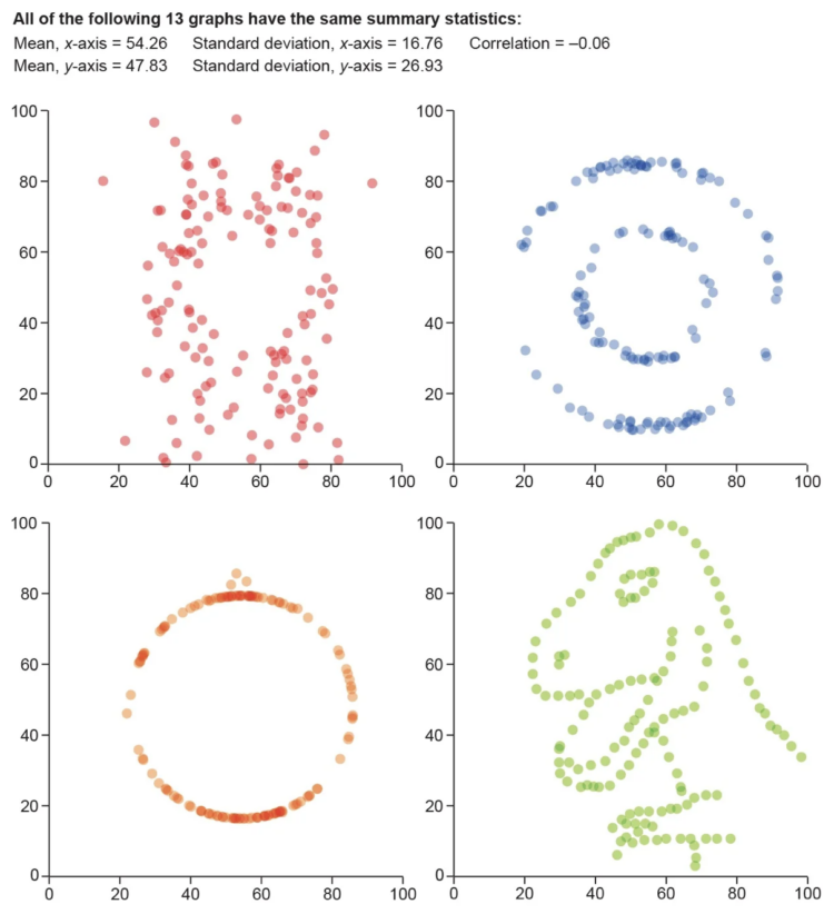
For Scientific American, Jack Murtagh describes the importance of visualization in understanding the roughness of data:
One maxim that should be etched into the walls of all scientific institutions is to visualize your data. Statistics specializes in applying objective quantitative measures to understand data, but there is no substitute for actually graphing it out and getting a look at its shape and structure with one’s own eyeballs. In 1973 statistician Francis Anscombe feared that others in his field were losing sight of the value of visualization. “Few of us escape being indoctrinated” with the notion that “numerical calculations are exact, but graphs are rough,” he wrote. To quash this myth, Anscombe devised an ingenious demonstration known as Anscombe’s quartet. Together with its wacky successor, the datasaurus dozen, nothing more dramatically communicates the primacy of visualization in data analysis.





 Visualize This: The FlowingData Guide to Design, Visualization, and Statistics (2nd Edition)


