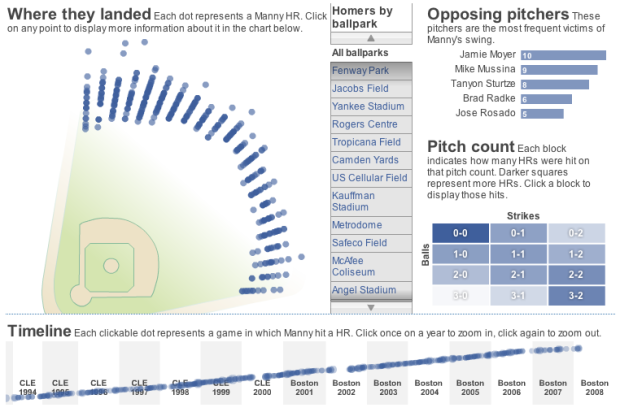
In elementary school through high school, I always used Microsoft Excel for my charts and graphs (and use it to clean data every now and then). In undergrad, I learned all of my programming in C++ and Java and did a little bit of engineering stuff in MATLAB. When statistics rolled along, I always analyzed data using R.
Then I got into data visualization, and for a while it was all about Processing. When I interned for The New York Times, I used a lot of Adobe Illustrator (and still really enjoy playing with it). Lately, I’ve been immersed in Actionscript.
So what do you use to make sense of data?
If your weapon of choice isn’t listed, I’d be interested to know what your “other” tool is in the comments, because, well, there’s always more fun stuff to learn.
{democracy:3}


 The more people who flock a story, the higher up the flock list the story goes. In the sidebar of each story is an interactive graphic that shows readers flocking around the news and stories getting highlighted. The larger the bubble, the more people who have flocked it; story bubbles light up orange when someone flocks it. The site isn’t showing any larger sizes, but a full screen version could be fun. Maybe a screensaver.


 Visualize This: The FlowingData Guide to Design, Visualization, and Statistics (2nd Edition)


