Peter Atwood used NASA data to depict the wildfires in Canada this year. The realistic rendering of the fires as burning embers and smoke activity is something.
-
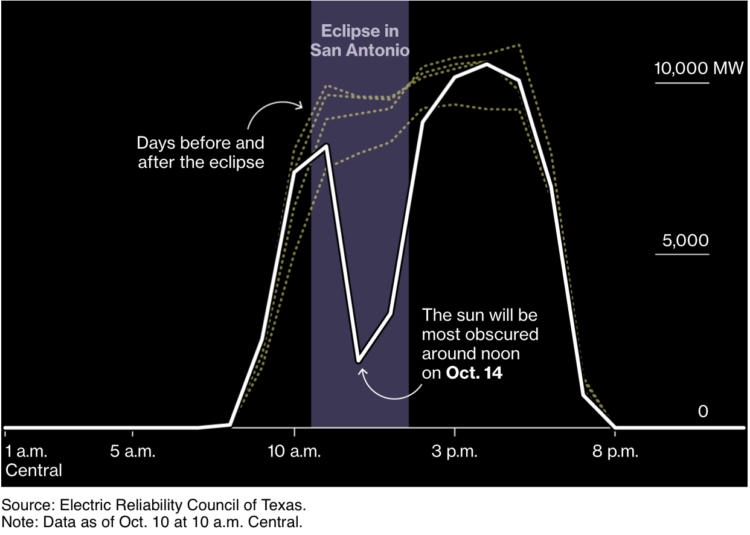
Solar power is clean and all, but what happens when the sun is blocked by the moon and there’s suddenly no sunlight for a fixed period of time? For Bloomberg, Naureen Malik, with graphics by Denise Lu, describes the preparations that power companies will take during this weekend’s solar eclipse.
-
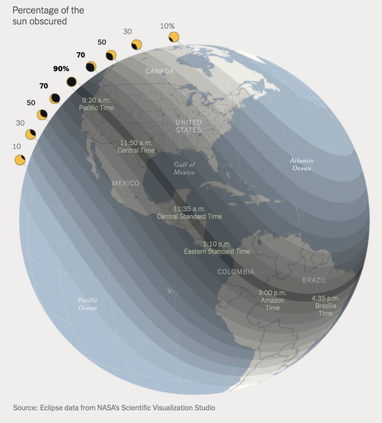
The moon is going to get in the way of the sun this Saturday. For The New York Times, Jonathan Corum has the map of when and how much sun coverage we’ll see in the western hemisphere.
-
Members Only
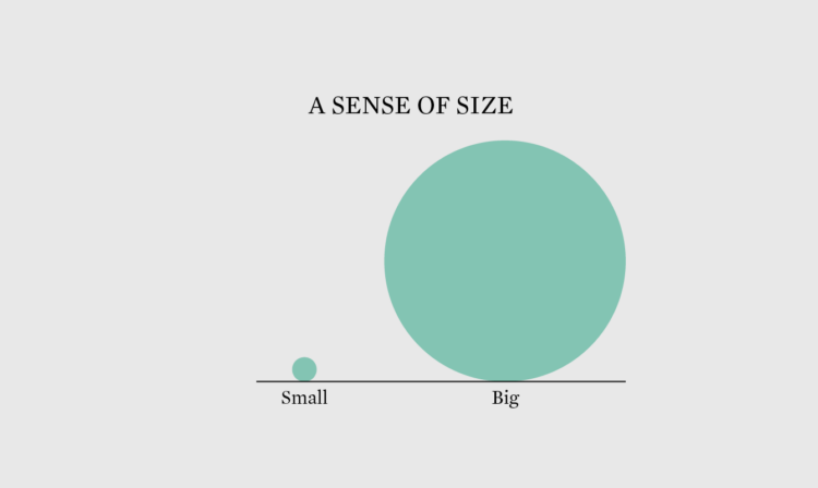
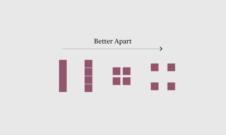
Whether a difference seems big or small, important or not, depends on the scale you choose.
-
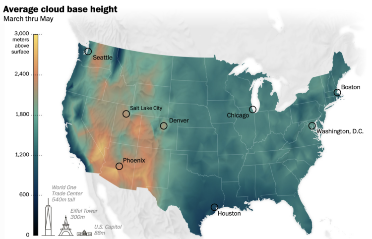
Cloud formation depends on temperature and moisture levels, so in places of high humidity like the East Coast and Pacific Northwest, the clouds form lower. In dryer places like the southwestern United States, the clouds don’t form until higher up. For The Washington Post, Kasha Patel and Dylan Moriarty have the maps that show the contrast over the seasons.
-
How to Make a Heatmap with Irregular Bins in R
There are existing functions and packages to make heatmaps in R, but when the data is irregular, it’s worth going custom.
-
Star Trek and related might be fictional, but they usually reference real stars, planets, and galaxies. Overview Effect mapped, charted, and spreadsheeted the possible real-life locations in space of the fictional places.
-
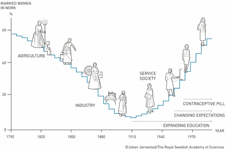
Claudia Goldin, an economist at Harvard, has won the Nobel Prize in Economics. A big part of her studies are rooted in the collection and analysis of centuries-old data:
Women are vastly underrepresented in the global labour market and, when they work, they earn less than men. Claudia Goldin has trawled the archives and collected over 200 years of data from the US, allowing her to demonstrate how and why gender differences in earnings and employment rates have changed over time.
Goldin showed that female participation in the labour market did not have an upward trend over this entire period, but instead forms a U-shaped curve. The participation of married women decreased with the transition from an agrarian to an industrial society in the early nineteenth century, but then started to increase with the growth of the service sector in the early twentieth century. Goldin explained this pattern as the result of structural change and evolving social norms regarding women’s responsibilities for home and family.
Amazing.
The illustrations by Johan Jarnestad that accompany the announcement are also really useful.
-
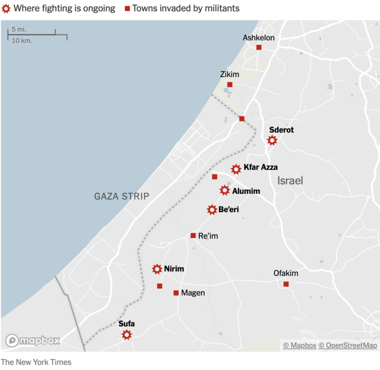
The New York Times is mapping rocket strikes, attacks, and ongoing conflict in the region.
-
Ben Welsh has a running list of the news organizations blocking OpenAI crawlers:
In total, 532 of 1,147 news publishers surveyed by the homepages.news archive have instructed OpenAI, Google AI or the non-profit Common Crawl to stop scanning their sites, which amounts to 46.4% of the sample.
The three organizations systematically crawl web sites to gather the information that fuels generative chatbots like OpenAI’s ChatGPT and Google’s Bard. Publishers can request that their content be excluded by opting out via the robots.txt convention.
On the web, it used to be that you would write or make something and there would be a link to the thing. Other websites could link to the thing, and people would go to the place with the thing. With this recent AI wave, a lot of the thing ends up elsewhere and no one sees the original place.
Fun times ahead.
-
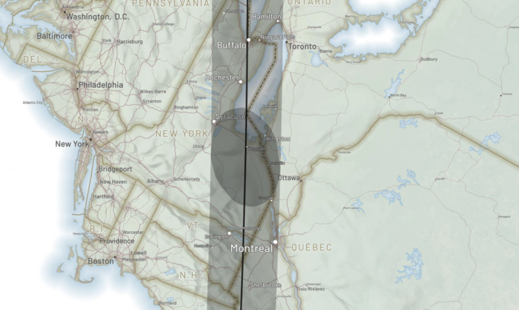
There is going to be a solar eclipse on April 8, 2024. The moon will only partially block out the sun in most areas (if at all), but for a select few in the right path, it’ll go all dark for a few minutes. Andy Woodruff mapped the path of full eclipse-ness.
-
Members Only
Look at individual data points separately and get more out of the small pictures.
-
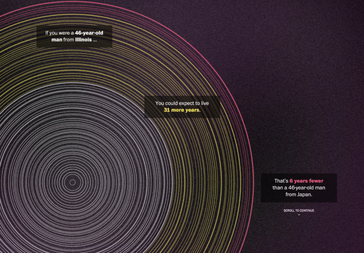
The Washington Post goes with a tree ring metaphor to compare life expectancy in your state. Enter your sex, age, and state. The inner white circles represent how old you are, the middle yellow circles represent how many expected years you have left, and the outer red circles represent the expected years of those with the same age and sex but in Japan.
The rings are a lead-in graphic to more statistical charts. I kind of wish they went all in with the rings, but that’d probably be limiting in the points they could get across.
-

When we watch sports on television, the scale of many sports don’t seem that different, because the camera zooms in on players and everything is within the frame of our screens. So here are the major sports drawn at the same scale to help appreciate the size differences.
-
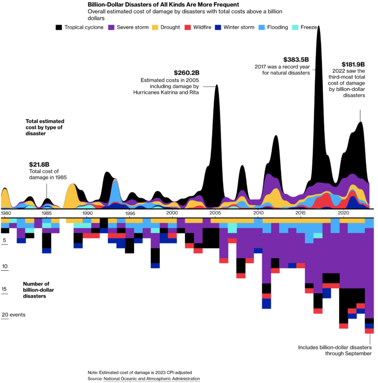
For Bloomberg, Rachael Dottle and Leslie Kaufman go with the combo stacked area chart and stacked bar chart on the top and bottom to show increased cost of billion dollar disasters and the counts over time. It looks like the sporadic tropical cyclones are causing the most damage.
-
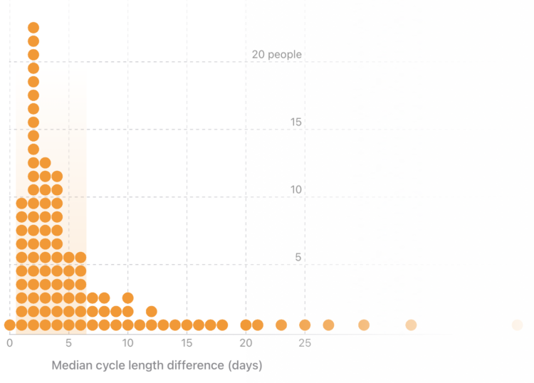
For the Apple Women’s Health Study, which uses cycle tracking data from iPhones and Apple Watches, the Harvard T.H. Chan School of Public Health provides a visual explanation of how menstrual cycles vary. With some tweaks, it could also stand in as an explainer for distributions and averages.
-
As we get older, our life expectancy declines. But when and how quickly the decline happens and how it happens has changed over the years.
-
Members Only

Every month I collect tools and resources to help you make better charts. Here’s the good stuff for September.
-
The David Rumsey Map Collection has been home to tens of thousands of historical maps, and now you can search the collection by the text in the maps instead of just through metadata:
About 57,000 of the georeferenced maps from the collection have been processed with a machine learning tool called mapKurator to collect all the text on maps, i.e. every piece of text (printed or handwritten) that appears on a map, including place names, but also information like a map’s title or its scale, or the names of the people involved in producing the map. Through this process of automatic annotation, this approach turns the text on maps into structured data (text on maps data): the enormous amount of data that has been collected from these maps is now searchable.
-
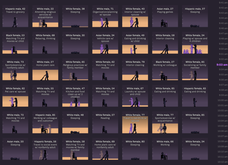
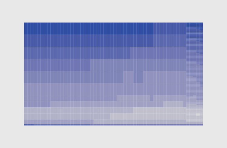
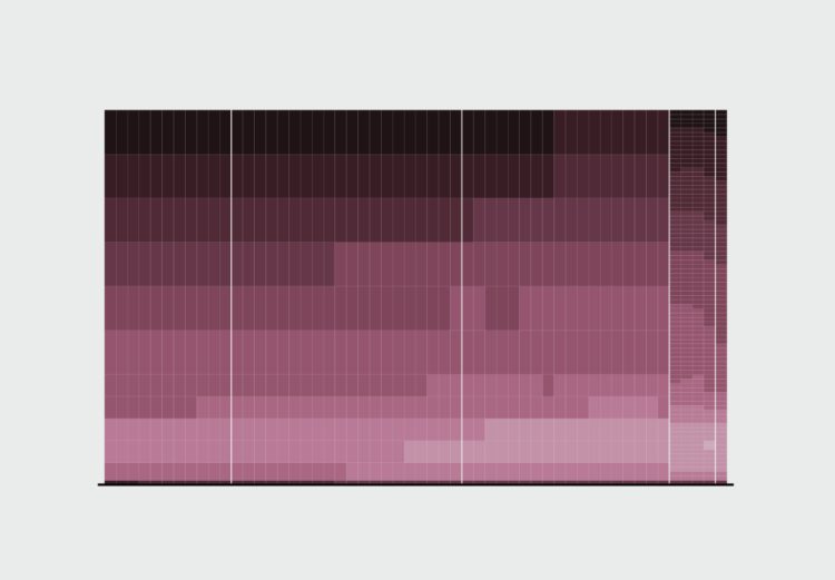
For The Pudding, Alvin Chang examines loneliness through the lens of individual responses from the American Time Use Survey:
In this story, we’ll go through 24 hours of a typical weekend day in 2021. We know what people did – and who they did it with – because, since 2003, the American Time Use Survey has asked people to track how they use their time.
By the end of the day, we’ll learn that Martin’s isolation isn’t unique. In fact, loneliness has become a far more common experience in the last few decades – and it was supercharged by the pandemic.
The heart of the piece is in the anti-aggregate view of individuals through 24 hours. See each person’s schedule, who they spend time with, and how that changes through the day. Sorting draws patterns. The scrolly clock on the right ticks. And it works on mobile. Chang makes the data immediately relatable.
Recently for Members
Second Edition
 Visualize This: The FlowingData Guide to Design, Visualization, and Statistics (2nd Edition)
 Visualize This: The FlowingData Guide to Design, Visualization, and Statistics (2nd Edition)
New tools, refined process.
Browse by Chart Type See All →


