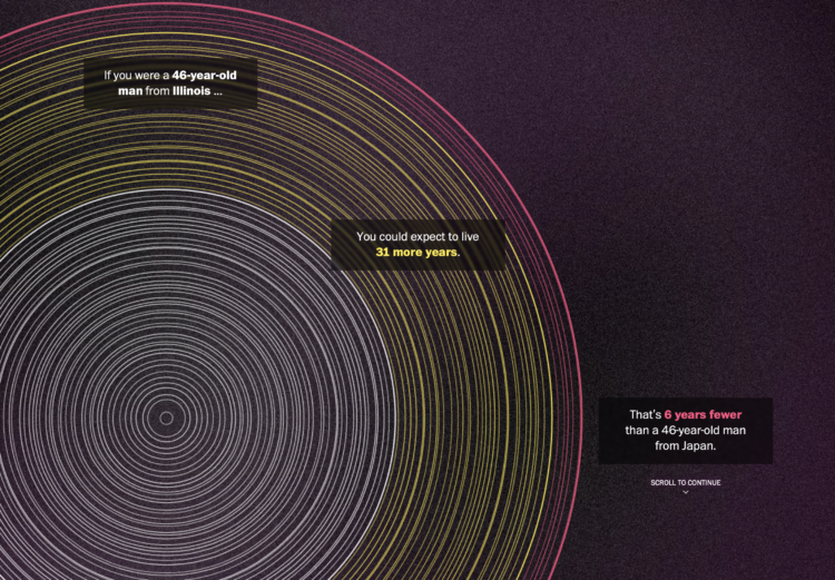
The Washington Post goes with a tree ring metaphor to compare life expectancy in your state. Enter your sex, age, and state. The inner white circles represent how old you are, the middle yellow circles represent how many expected years you have left, and the outer red circles represent the expected years of those with the same age and sex but in Japan.
The rings are a lead-in graphic to more statistical charts. I kind of wish they went all in with the rings, but that’d probably be limiting in the points they could get across.


 Visualize This: The FlowingData Guide to Design, Visualization, and Statistics (2nd Edition)