What if you could see all the individual bits of information scattered across the Web in one view and then interact with it in a meaningful way? This is what Microsoft Live Labs’ new Pivot experiment tries to do.
Pivot makes it easier to interact with massive amounts of data in ways that are powerful, informative, and fun. We tried to step back and design an interaction model that accommodates the complexity and scale of information rather than the traditional structure of the Web.
The goal is to let users make connections between pages, data points, photos, etc that go beyond links, with what the developers call collections. The below video is a demonstration and explanation:
Pivot’s ability to display lots of thumbnails and then reorganize and zoom in on them is the tool’s foundation. The transition between each view involves a flutter of thumbnails, which sort of provides a link between data arrangements. The browsing behavior looks a lot like that of Photosynth, a Live Labs project that lets you browse giant bundles of photos.
Jeffrey Heer et. al. wrote a paper on these transitions a while back. I can’t really say whether it works or not. I suspect it’s more about a fun factor once you get into higher volumes of data than it is about making connections. That’s not to say it’s not important, of course. After all, most of the Web is about entertainment in some form or another.
All in all, it’s an interesting concept, and it will be fun to see where the Live Labs team takes the project.
Pivot is currently by invitation only, but I have a handful of invites (10 to be exact) for you guys. Download Pivot from here, and then use this activation code: 3C5D 19BD B7DA 3186. Come back here and let us know what you think in the comments.
[Thanks, Jeff]
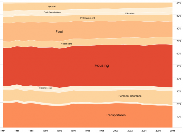
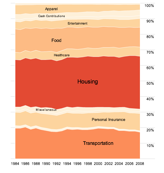

 Visualize This: The FlowingData Guide to Design, Visualization, and Statistics (2nd Edition)


