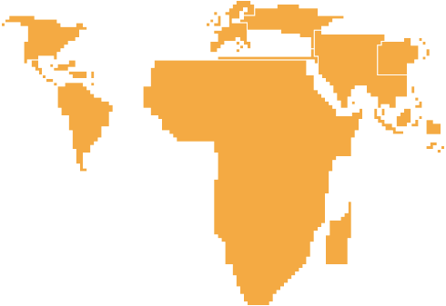
It was World AIDS Day last week and UNAIDS published the latest estimates on the number of people around the world who are living with HIV. Xaquin G.V. provides four cartograms (i.e. value-aread maps) to show the numbers. In the final result (above) each square represents 10,000 people with HIV, and regions are color-coded by percentage of people with the virus.
There shouldn’t be any surprises, really. Africa is in bad shape (although a lot of progress has been made in recent years); North America, Asia, and Europe are below the average average; and the rest are at the world average.
Here are the other cartograms that led to the final. Same data, but different types. There are apparently names for each type.
The Dorling cartogram…

The Demers cartogram…

The rectangular cartogram…

It’s always fun to see the process of making a graphic. People always think that’s just plug in data and go, but it’s more than that – for the customized good stuff at least.
Find the full versions here.

 Visualize This: The FlowingData Guide to Design, Visualization, and Statistics (2nd Edition)

I used Google Earth to map UNAIDS HIV prevalence rates. You can read more about the Google Earth content layere here on my website: http://www.merkador.com/?q=node/19
Alternatively, you can see it directly in Google Earth: http://www.merkador.com/kmz/aidsrates.kmz
Pingback: Geographic breakdown of AIDS by XaquÃn. via FlowingData — Some Random Dude
Pingback: A world map of AIDS : Contrarian