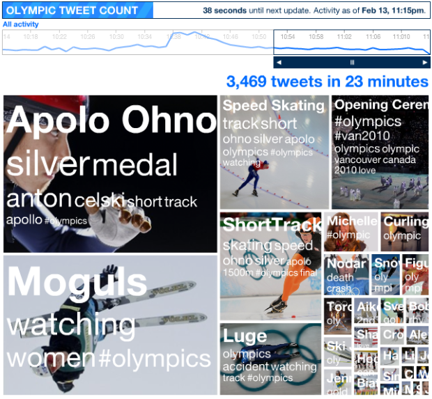
The Olympics are in full swing, so of course Twitter is abuzz with every big event. Want to keep track of the trends in real-time? Watch the Olympic pulse, by Stamen Design, on the NBC site.
Read More
The Olympics are in full swing, so of course Twitter is abuzz with every big event. Want to keep track of the trends in real-time? Watch the Olympic pulse, by Stamen Design, on the NBC site.
Read More

Tales around the Web for everyone’s favorite holiday.
Obligatory Valentine’s Day map – Aww, how sweet. Indiemapper sends its love in what else, map form, and even accompanied by the proper equations.
Science Valentine – Stick man of xkcd writes a valentine with just the data. This is what happens when you only let your brain lead. As they say, lead with your heart… and you won’t end up a boring sack of facts who no one likes. [thanks, all]
Love on the (Facebook) wall – It’s the greatest love story of all time. Woman gets divorced. Old friend comments on her wall. Comment turns to chat, chat turns to text, and text turns to phone call. Man proposes to woman via comic.
RIT student Nikki Graziano photographs math functions in the real world. Some are a stretch but others are dead on.
Read More
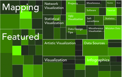
If your data is a hierarchy, a treemap is a good way to show all the values at once and keep the structure in the visual. This is a quick way to make a treemap in R.

The online dating world can be a confusing place. How do you interact with others? Who should contact? What should you say about yourself? There are a lot of decisions to make, but it all starts with your profile picture when it comes to grabbing the attention of potential dates. Online dating site, OkCupid, analyzed over 7,000 profile pictures, debunking four myths:
Some of the results are pretty surprising. For example, men’s photos were most effective when they weren’t looking at the camera and not smiling:

It was the opposite for women. A flirty face or smiling while looking at the camera showed most effective:

Catch the full analysis here.
[Thanks, Tom]
Anatoly Zenkov provides this nifty tool (Mac and PC) to track your mouse pointer. Really simple. Just start it, let it run, minimize the window, and carry on as usual. In the end, you get this image that looks something like a Pollock. Circles show areas where the pointer didn’t move while the tracks show movement.
Read More
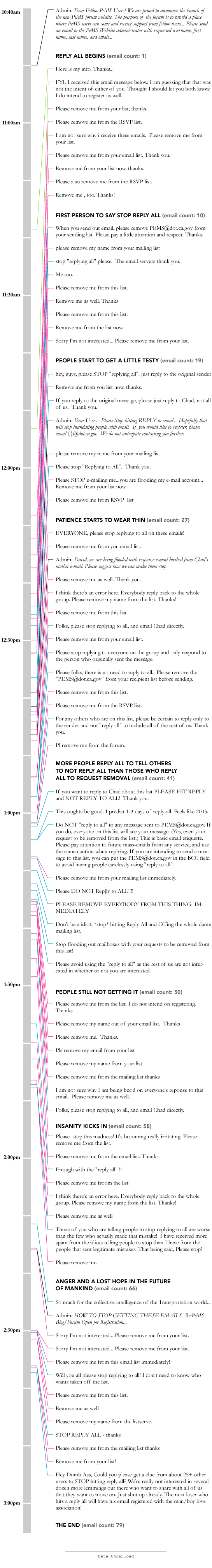
A few months back, the Caltrans Performance Measurement System (PeMS) opened up a…

Here are some links and stuff to chew on as you wait for the Super Bowl, in between the beer, pizza, and wings.
Pink Floyd Timeline, 1960-2000 – A highly stylized timeline of music from Pink Floyd over the years.
The making of the NYT’s Netflix graphic – The interactive showing the geography of Netlfix rentals was a big hit around the Web. Detailed, engaging, interesting, and a great ad for Netflix.
An Interview With Nicholas Felton, Creator of the Feltron Annual Report – It manages to make a bigger splash every month. Felton gets into some of the details of compiling the report [thanks, Mike].
Multiplayer Basketball – Nothing to do with data or visualization. Just pure, simple multiplayer fun [via Waxy].

If you’re an undergraduate with an interest in data and statistics, you should definitely consider applying to this one-week summer program: Explorations in Statistics Research. It’s in Boulder, Colorado and your travel expenses, along with room and board, will be covered.
The seven day workshop is designed so that students get a sense of how statisticians approach large, complex problems. Several different topics will be presented over the course of the week.
You’ll also get hands-on experience with computing and visualization tools. Basically, you’re going to have fun with data when you’re there.
And since three of the four organizers are either past or current advisers of mine, I can tell you first-hand that you’re going to learn some cool stuff during the workshop.
Get your application in now. The deadline is March 3.
In case the in-flight pamphlet isn’t enough for you, everything on this Kulula airplane is labeled for your convenience.
Read More
Back in May last year, the US government launched Data.gov as a statement of transparency, and the Internet rejoiced. After the launch, excitement kind of fizzled with the actual Data.gov site, but big cities like San Francisco, New York, and Toronto got in on the open data party.
Then just a couple of weeks ago, Data.gov.uk launched, which brought me back to the US counterpart. How do the two compare? Here’s my take. Read More

Just a quick update for those who ordered the World Progress Report. It’s been with the printer this past week, and I expect to have the prints physically in my hands tomorrow. I’ll start mailing them out as soon as I get them. Thanks for your patience.
By the way, together we raised around $2k for Haiti earthquake relief. Way to go, FD readers.
Update (2/5/10) – First batch of prints went out today.
Update (2/12/10) – Second batch went out today. Last batch, mostly international orders, go out next.
Update (2/18/10) – Last batch of reports went out today.
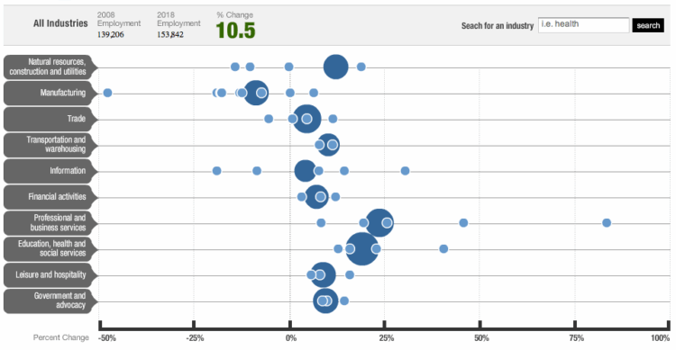
NPR shows projected employment changes from 2008 to 2018. Large circles represent major employment sectors and are sized by current employment numbers. Smaller circles are areas in the respective category.
Maybe my eyes are playing tricks on me, but the sizes of the large sectors look funky. For example, is the bubble for Education, health, and social services really ten times the size of the bubble for Information? I don’t think so (and it should be).
It’d probably aslo be worth distinguishing between negative and positive growth. You know something simple like making the 0% line solid or color-coding the declining sectors.
What do you think?
[via The Big Picture | Thanks, Barry]
Are you using the most efficient typing technique or are your fingers jumping all over the keyboard? If it’s the latter, I implore you – there is a better way. Your arms don’t have to be tired after typing for ten minutes, and you just might finish that novel before the end of the decade. See these finger movement diagrams form Weather Sealed if you don’t believe me.
Read More
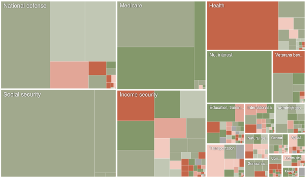
President Obama announced his 2011 budget proposal. How does it compare to last year’s budget? Shan Carter and Amanda Cox of The New York Times compare the two plans. Red indicates a decrease in the percentage of the budget dedicated to the respective area, and green is for growth. Zoom in for a better view of the smaller areas.
Read More
I started the FlowingData Flickr group a little while ago, but didn’t come back to it until now. Here are just a few of the graphics you all have added. Click on the images below for the full-size versions.
Read More
Designers Matt Robinson and Tom Wrigglesworth looked at ink usage of some commonly-used typefaces, by hand-drawing them with ballpoint pens.
Read More
I’m sure a lot of you love The Beatles. I’m not a huge fan myself, but for those who are, you will love these graphics from designer Michael Deal.
The graphic up top shows the level of collaboration between group members. The level of shared authorship was a lot higher early on and then pretty much died off before the breakup.
Read More
 Visualize This: The FlowingData Guide to Design, Visualization, and Statistics (2nd Edition)
New tools, refined process.


