
The Economist discusses the return of big government and includes this graph showing total government spending as a percentage of Gross Domestic Product. We see a dip in 2000 and a big jump this past year.
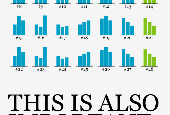
The trouble is that the country labels are cluttered. If you read them left to right, you get mixed up initially. Keep your eyes left and move top to bottom, and you might be okay.
The Challenge
Can you think of a way to make this graph easier to read? Is there a better way to represent the time series?
One catch: you have to work within the size limitation of 290 pixels wide and 300 pixels tall. It’s an easy fix with unlimited space. But what can you do when space is scarce? Leave your thoughts in the comments below.
P.S. I was looking for the data this graph uses but got tired of using the OECD stat browser, so we’ll just have to use our imagination for this one.
[Thanks, Justin]
Update: Here’s GDP (sans spending) by country from 1995 to 2008 if anyone would like to take a wack [thanks, Kim].


 Visualize This: The FlowingData Guide to Design, Visualization, and Statistics (2nd Edition)


