In this graphic, we take a look at some data on how long you’re expected to live.
Live in Hawaii and you just might live a little longer.
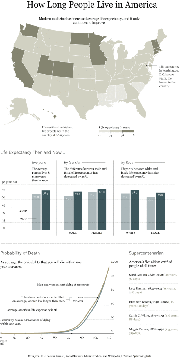
Hawaii has an average life expectancy at birth of 80.0 years. It’s 72.0 years in Washington, D.C., the lowest life expectancy in the country.
 Visualize This: The FlowingData Guide to Design, Visualization, and Statistics (2nd Edition)
I think it would be interesting to see life expectancy broken down by some measure of poverty.
Or weight.
nice chart,
what I find scary when playing with mortality data is that you realize that the odds of dying at your age are no longer negligible. For a French man of my age chances of dying every day are 1/280,000.
that’s 50 times more likely than winning the lottery…
the odds go under 1 per million at 16, 1/100,000 at 46, and 1/10,000 at age 76.
I have a blog post that shows age at death by county. I wondered why people die earlier in the South. I suspect it is because more people smoke cigarettes.
Smoking does appear more prevalent in the south.. There are also of course positive correlations between poverty, weight, & the lack of health insurance and early death (looping bck to earlier posts). I will see if I can come up with some data on these things (and geographical data) and if I can I will send it to Nathan.
PS Nice work on the education posters, Nathan !
Pingback: General Anaesthetic Taking the edge off.
hi we recently created a map in “Current World Life Expectancy” http://chartsbin.com/view/o9f . We did find out average lifespan around the world is around double what it was 200 years ago. Currently Macau, Andorra, Japan, Singapore, San Marino, Hong Kong, Australia, Canada are having more than 80 years.
We did find out some reason that developed countries spending more money on health and also these people having more health awareness.
Do you think modest annual increments in life expectancy will lead to immortality?
Pingback: Infographic on Life Expectancy in America | VizWorld.com
Pingback: Life expectancy across the US | HAWK by John Keane
I recall hearing that, after removing deaths of children under 1yr old, there have been negligible gains in life expectancy over the last hundred years. Anyone have a source that can confirm/disprove that?
These tables disprove that. Over the past century, overall life expectancy increased by 25 years, while the life expectancy of a 10-year-old has increased by about 15 years.
Thanks John S. I had been looking for that kind of data for some time. It appears that in 1850, white 60 yr old males would live an average of 16 more years. In 2004, white 60 yr old males would live an average of 21 more years. In +/- 150 years, we’ve extended the life expectancy of the average newborn from 38 to 75. And for those that are 60 years old now, they can expect to live an addtl 5 yrs than they would have if they were living back in 1850.
Pingback: How Long People Live in America « clubantietam.com
Couple of comments on the graphics.
1. Why not use a continuous color scale, rather than bucketed, for the map? Or at least more buckets? I think the current map suppresses a lot of interesting data and creates spurious large distinctions between some states.
2. The “probability of death” graph is interesting, but I’d like to see a version that brought out the detail in the under 75 part of the x-axis. Maybe a log or log odds sort of thing…
Pingback: How long do we live in America? « HyperCurio.us (beta)
haha white and black only?
that’s the only data made available
Pingback: Don’t Trust Science?
For the record, your sub-heading about “modern medicine” is not relevant to what you show in the charts.
And as someone who has studied this data, the least I will say is that “modern medicine” plays a fairly small role in mortality changes. A whole host of things, which people debate about, correlate with mortality changes; like public health, education, income, environment, stress, “lifestyle” and the many interactions of all those play a role. There have been a few “modern medicine” examples that have extended life but on this aggregated scale the other things have a much bigger impact.
Pingback: Understanding Gender Differences in Life Expectancy » Sociological Images