your.flowingdata got a couple of cool updates recently. One is based on your interactions with others on Twitter and the other helps you find relationships in your actions.
Twitter Mentionmap
The first is the Twitter Mentionmap created by Daniel McLaren. It’s a network visualization (above) that lets you explore how you (or other Twitter users) interact with others.
It’s not focused on the data that many of you are used to seeing on YFD, but it’s always been my plan to bring in other data sources. So when I saw Daniel post the original Mentionmap, I jumped at the chance to get a version for YFD. It seemed like a good first step to branching out. Get it? Network, branching out. Oh nevermind.
By the way, Daniel used his constellation framework to build this. It’s called asterisq. It’s worth a look if you’re looking to visualize network data. Daniel can also help you with customization and design.
Correlating Actions

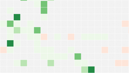
Finally, some actual statistics starts to enter the picture. Using cross-correlation, this visualization shows you how your actions are correlated. Remember, correlation doesn’t mean causation, but it can hint where to look in your data. Correlation also becomes more meaningful as you enter more data, so keep that in mind as you use YFD.
What do you think?
You can find the correlation viz along with the Twitter Mentionmap in the exploration section of YFD. Check ’em out now and let me know what you think in the comments below. This is a thesis-related project I’ve been working on for some time now, and every little bit of feedback helps a lot.
Update: New version of YFD iPhone app
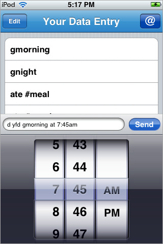
I just realized that the iPhone app for YFD [iTunes link], by Jose Castillo, also got an update. It’s now easier to timestamp your data:

Give it a try. Tell us what you think.

 Visualize This: The FlowingData Guide to Design, Visualization, and Statistics (2nd Edition)
