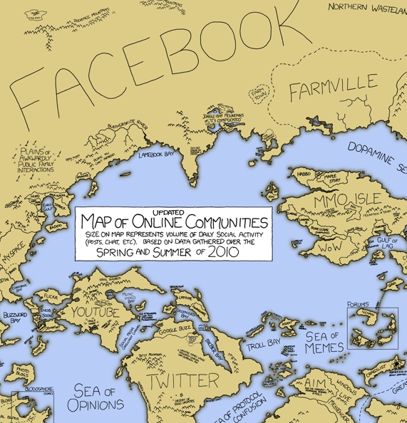
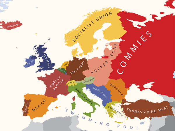
I don’t dream in numbers, but if I did, I’m pretty sure it’d look a lot like this. In Nature by Numbers, a short movie by Cristobal Vila, inspired by, well, numbers and nature, Vila animates the natural existence of Fibonacci sequences, the golden ratio, and Delaunay triangulation. Watch it. Even if you don’t know what those three things are, the video will rock your socks off.
Read More
-
-
Nutrition facts labels are uniform across products, but let’s imagine for a second that you could do whatever you want, just as long they showed certain bits of information. FFunction takes a stab at redesigning the standard milk carton under this premise. No cows, no fields of green, and no dairies. Just nutritional facts and full transparency on what’s going into your body.
This wouldn’t work with a mass market, but hey, they’ve got my purchase. After all, data does a body good.
[Thanks, Audree]
-
There’s been a lot of hullabaloo about Facebook’s newly installed privacy policies. It started out very closed, to just university students, and has expanded its reach, especially over the past year, to the more public Web. Matt McKeon, of the Visual Communication Lab, explores Facebook’s privacy policies, from 2005 to present.
Rings represent the audience, starting with you in the middle all the way out to the entire Internet. Slices represent bits and interactions you have on Facebook. Click on the image to see how the policies changed over the years for each bit.
Finally, you can also download the code (in the implementation section), which was written in Processing.js. I think I’m noticing a trend. Check it out here.
[via Ben Fry]
-
Lee Byron open-sourced his streamgraph code in Processing about a month ago. Jason Sundram has taken that and ported it to JavaScript, using Processing.js.
The algorithms are the same as that in the original, but of course the natural benefit is that people don’t need Java to run it their browsers. Jason has also added a few features including dynamic sizing, more straightforward settings, and some interaction with zoom and hover control. Really nice work.
Grab the code, plus examples on GitHub.
[Thanks, Jason]
-
Yeah, it’s Friday. [Married to the Sea | via @levib]
-
For those following the status of the oil spill, the New York Times provides a map tracking the spread. Press play to get the day-by-day. The oil is currently spreading to the west of the Mississippi delta, getting dangerously close to the oyster beds (in red).
Read More -
Big information graphics have been around for a long time. They’ve come in…
-
As always, it was an interesting month for FlowingData. Thanks again, everyone for showing your support through retweets, likes, and stumbles.
In case you missed them or are new to FD, here are the top posts from the last month, based on a combination of views and comments. The Walmart map came back to life recently with new data and a feature on CNNMoney.
- Watching the growth of Walmart – now with 100% more Sam’s Club
- Data Underload #18 – Sleep Schedule
- Explorations of real-world traffic
- Air traffic rebooted in northern Europe
- Trustworthiness of beards
- Data Underload #17: Famous Movie Quotes, p. 2
- A flowchart to decide what typeface to use
- 100 Pixar characters drawn to scale
- Data Underload #19: First Date vs. Reality TV First Date
- Streamgraph code is available and open source
From the Forums
There’s some good stuff in the forums too.
- Example of bad Illustrations – Sometimes graphics make things more confusing.
- Multi-series scatter plots – Looking for a way to make these.
- Creating visualizations – What tools should you use?
- Data Scientists and Engineers for Online Game Data Startup – Looking for a job?
Have a question or something cool to share? Post it in the forums.
-
There are a lot of job opportunities out there for visualization people. This is one of the more awesome ones:
We are looking for a PhD-level researcher who is excited by data, visualization, and communication. A job candidate should have a history of designing and building innovative visualizations. An emphasis on large-scale user participation (e.g. collaboration, crowdsourcing, social communication) and on evaluation of hypotheses about user behavior is a plus. A successful candidate will have published in one or more areas of information visualization, computer-supported cooperative work, and human-computer interaction.
No more Martin and Fernanda, but still good I am sure.
[via @infosthetics]
-
Along the same lines of Dolores Labs’ color experiment, Randall Munroe of xkcd reveals the results of his color survey. He took a slightly different approach though. Here are some of the basic findings:
If you ask people to name colors long enough, they go totally crazy.
“Puke” and “vomit” are totally real colors.
Colorblind people are more likely than non-colorblind people to type “fuck this” (or some variant) and quit in frustration.
Indigo was totally just added to the rainbow so it would have 7 colors and make that “ROY G. BIV” acronym work, just like you always suspected. It should really be ROY GBP, with maybe a C or T thrown in there between G and B depending on how the spectrum was converted to RGB.
A couple dozen people embedded SQL ‘drop table’ statements in the color names. Nice try, kids.
Nobody can spell “fuchsia”.
-
SolarBeat is an audiolization by Whitevinyl that makes music with the planets. Each planet is assigned a note. As the planets orbit, a note is played each time a year passes on that planet. Result: the planets make sweet, sweet music together.
[via Information is Beautiful | Thanks, John]
-
Gary Wolf, of Wired and The Quantified Self, describes personal data collection and analysis in NYT magazine. Collect data about yourself, and you just might learn something.
Humans make errors. We make errors of fact and errors of judgment. We have blind spots in our field of vision and gaps in our stream of attention. Sometimes we can’t even answer the simplest questions. Where was I last week at this time? How long have I had this pain in my knee? How much money do I typically spend in a day? These weaknesses put us at a disadvantage. We make decisions with partial information. We are forced to steer by guesswork. We go with our gut.
That is, some of us do. Others use data.
It all sounds great at first. But the story ends, as these types of stories almost always do, with a guy in a Google shirt walking around with one too many gadgets:
Bo Adler, a young computer scientist at Fujitsu Laboratories of America, is one of the most committed self-trackers I’ve ever met: during his most active phase he wore a blood-pressure cuff, pulse oximeter and accelerometer all day long, along with a computer on a harness to collect the data. Adler has sleep apnea, and he is trying to figure it out. When he became too self-conscious going to the gym in his gear, he wore a Google T-shirt to throw people off. Maybe he was a freak, but at least people could mistake him for a millionaire freak.
We data folk stick to our guns though:
“My girlfriend thinks I’m the weird person when I wear all these devices,” Bo Adler says. “She sees me as an oddity, but I say no, soon everybody is going to be doing this, and you won’t even notice.”
So proud. You tell ’em, Bo Adler. You tell ’em.
-
Just a quick note. Sunlight Labs’ Design for America contest is coming up soon on May 15. There’s $40k in prize money up for grabs, so get your entries in soon. All forms of media are accepted – including sculptures.
Read More -
On June 25, 2007 I published the first FlowingData post. Today, here is…
-
Death and Taxes: 2011 poster – Jess’ annual look at government spending has hit the shelves. Use the code ‘flowingdata’ at checkout for buy one, get one free.
2 Girls, 1 Cup reactions analysis – Paul Shen tracks the sound and movement of people’s reaction to the horrible video. The collage at the end is the best part. [via]
Fernanda Viégas is an influential woman – As if you needed another reason to contract Flowing Media for your visualization needs. [via]
China’s investments in foreign companies – An animated map of investments from 2005 to 2009. Kind of rough around the edges, but Interesting.
-
Stupid Fight compares fans on Twitter using “stupid indicators” like “OMG” and number of exclamation points. Congratulations, @flowingdata fans. You are smarter than @justinbieber fans. However, I regret to inform you that you are in the yellow. OMG.
[via Waxy]
-
Some colors represent different things in different parts of the world, while others are universal. For example, in movies, villains are almost always portrayed in black and passion is going to bring out the red. But what about death? American culture usually calls for black. Hindu calls for white. David McCandless and Always With Honor explore these differences.
[Thanks, @augustjoki]
-
In much of the same spirit of the recent Cartographies of Time, the BBC is running a series on The Beauty of Maps. They’ve got two branches. The first is historical, which is an exploration of some of the world’s oldest existing maps. As a complement, the second is a study of digital worlds, or maps of virtual spaces.
Read More -
Because you can never get enough Twitter visualizations, Jason Stirman takes a look at the tweets among Twitter’s first 140 employees. It’s called 140 Characters [pdf]. Ha. Get it?
Much like Chris Harrison’s Bible viz, 140 Characters represents connections, or in this case mutual follows, with arcs. Employees are sorted by account creation date, and larger arcs represent an older employee linked with a newer one. The bar graph shows the number of tweets, relative to everyone else. For example, the engineers @al3x and @evan are quite active, along with newer employee @tiger. Good stuff.
140 Characters is meant only as something pretty to look at, but to take a step in the more analytical direction, I’d try sizing the bars by relative number of mentions between the employees. For one, you’d see who’s most “popular” and second, you might start to see the conversations within the group. I’d expect @ev and @biz to have a lot of @mentions, especially during presentations. Placing employees by creation time, instead of just order, could be interesting too.
[Thanks, @MacDivaONA]
-
Here we have a case of worthwhile data and an interesting story about obesity trends. People are getting heavier younger. The graph was made to show this; however, it’s hard to understand and kind of makes things more confusing. Can you redesign the above, using the same data, to tell the story more clearly?
The Data
This is what we know about the data. It comes from a study that took place between 1971 and 2006. We have obesity rates, separated by when study participants were born. So for example, in the above graph, the orange line shows the obesity trend for people who were born between 1956 and 1965. When that group was in between 30 and 39 years old, about 27% of them were obese.
It’s a little confusing at first, but let it simmer for a little. It’s actually not too bad.
The Question
Okay, now the question: are people getting fatter faster? The original graph suggests that yes, people are, but the story isn’t as clear as it could be. Plus, it took 19 powerpoint slides to tell it. Your job is to put it all in one graphic. Are you up for it? I think so. Leave your suggestions and links to remakes in the comments below.
One more time – here’s the data [csv], and you can find more info about the study here.
[via FD forums]