• Membership
  • Newsletter
  • Projects
  • Learning
  • About
  • Member Login
  • Maui fires timeline, a visual reconstruction of the events

    November 6, 2023

    Topic

    Maps  /  Lahaina, New York Times, wildfire

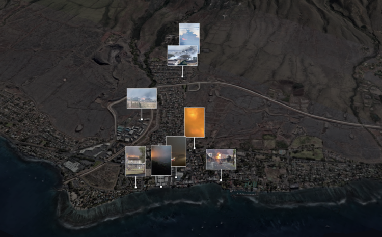
    Using a combination of weather reports, videos, and 911 calls, The New York Times uses mixed media to show the events leading up to the wildfire in Lahaina, Maui.

    Firefighters had rescued dozens of people from the seawall by 2 a.m. The fire continued spreading into the next morning. To the north, more residents, unsure of the risk to them, were roused from their homes when flames suddenly reached their streets. The fire also spread to the town’s southern edge, where the police worked to evacuate residents.

    The inferno ultimately consumed thousands of buildings, stretching across more than three miles of Lahaina’s waterfront.

  • Demonstration of bias in AI-generated images

    November 3, 2023

    Topic

    Infographics  /  AI, bias, Washington Post

    For The Washington Post, Nitasha Tiku, Kevin Schaul and Szu Yu Chen demonstrate how AI generators lead to biased images. The systems use data slurped up from the internet to guess what pixels to show based on the text (i.e. a prompt) that you provide. So the images are often the result of calculations that look for the most common pixels in the source data rather than a real-world representation.

    To most people, the bias probably seems harmless with an assumption that the systems will improve. And that might be the case. But just you wait until an AI chart generator, based on the inputs of visualization critiques scraped from the internets, only produces bar charts with obscene amounts of white space no matter what you try. Then you’ll be sorry you didn’t care sooner.

  • Members Only

    Chart Options When You Need to Fill Space

    November 2, 2023

    Topic

    The Process  /  options, space

    Maybe you’ve run into the rare situation/blessing of too much space, and you’re not sure how to fill it. There are options.

  • Data-based journal of Pavement tour songs

    November 2, 2023

    Topic

    Infographics  /  Denise Lu, music, Pavement

    Denise Lu, a superfan of Pavement, an indie rock band, examined the set lists from years past. I didn’t know anything about the band going in but came out with an appreciation of their art and some curiosity.

    Mostly, I enjoy these pieces where someone loves something and takes you down the data rabbit hole with them.

  • Disney’s innovations in animation

    November 1, 2023

    Topic

    Infographics  /  animation, Disney, Reuters

    As Disney and its stock price struggles with streaming, Reuters looks at how Disney overcame previous challenges in its 100-year history. One of the first challenges was making animation that was believable:

    He obsessed over quality and poured money into producing cartoons that would resonate with his audience. He wrote that observing the real world was key and animation must have, “a foundation of fact, in order that it may more richly possess sincerity.”

    The studio formalized 12 principles of animation which transformed static sketches into lively characters on a screen. Veteran animators taught the principles to each of the new artists who joined the studio to ensure consistency.

  • Getting a reservation at a busy restaurant, gamified

    October 31, 2023

    Topic

    Infographics  /  game, New York Times, reservation, seating

    When you score a reservation at a busy restaurant, it can feel like you just won a modest lottery. However, getting a reservation is not just randomness. You’re up against others vying for the same seats, and you have to work within the seating arrangements of the restaurant. You need a strategy.

    For The New York Times, Priya Krishna, Umi Syam and Aliza Aufrichtig frame strategies in the context of getting a reservation at Semma, a restaurant in New York City. They documented their reservation quest through the service Resy.

    I enjoyed the pixel view and game metaphor. All it needed was some 8-bit music.

  • Taylor Swift earnings visualized with bracelet beads

    October 30, 2023

    Topic

    Infographics  /  beads, billionaires, Bloomberg, Taylor Swift

    Bloomberg estimates that Taylor Swift reached billionaire status with her recent touring and music releases. Swift achieved the milestone mostly with music. Bloomberg provides the visual splits with bracelet beads.

  • Falling insect species

    October 27, 2023

    Topic

    Statistical Visualization  /  extinction, insects, Reuters

    Insects are dying at a high rate every year, but it is difficult to estimate an accurate number, because it is a challenge to gather data for millions of species around the world. In a new-to-me series, Reuters broke it down:

    The world has lost 5% to 10% of all insect species in the last 150 years — or between 250,000 and 500,000 species, according to a February 2020 study in the journal Biological Conservation. Those losses are continuing, though estimates vary due to patchy data as well as uncertainty over how many insects exist.

  • Members Only

    Visualization Tools and Resources, October 2023 Roundup

    October 26, 2023

    Topic

    The Process  /  roundup

    Here is the good stuff for October 2023.

  • Data Underload  /  income

    Rising to Top Net Worth, by Age

    The Survey of Consumer Finances from the Federal Reserve asks people about their assets and debt, which are used to estimate net worth. With the most recent release for 2022 (the survey runs every three years), see how your household’s net worth compares against others’.

    Read More
  • Food shortage in a height chart

    October 25, 2023

    Topic

    Infographics  /  food shortage, height, Reuters

    There are food shortages in Guatemala. For Reuters, Cassandra Garrison, Clare Trainor and Sarah Slobin used a height chart to show stunted growth as an indicator.

    A few tortillas and a half bowl of reheated beans were all Maria Concepcion Rodriguez had to feed her six children in the isolated village of El Aguacate, one day in August.

    Only her three-month-old breastfed baby had height commensurate with her age. The others were stunted by undernourishment. They looked too young for their years.

  • Data on net worth, income, and savings

    October 24, 2023

    Topic

    Data Sources  /  Federal Reserve, income

    Data for the 2022 Survey of Consumer Finances, from the Federal Reserve Board, was made available recently. It comes out every three years, so you can see how income and savings have changed over time, broken down by demographics.

    For example, the above shows that net worth increased, across age groups, since the last release in 2019. The chart is from the SCF’s “chartbook,” which isn’t the most elegant thing in the world, but it works.

  • When Mike Breen announces “Bang!”

    October 24, 2023

    Topic

    Data Sources  /  bang, basketball, Mike Breen

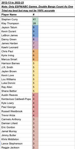
    Mike Breen is a well-known NBA basketball announcer. When a player hits a big three-pointer, Breen often uses his catchphrase, “Bang!” Someone counted all the times he yelled the phrase for each player, because sure why not. Stephen Curry and Klay Thompson are a cut above the rest.

  • Analysis of romance novel covers

    October 23, 2023

    Topic

    Infographics  /  Alice Liang, book covers, Pudding, romance

    When I was a kid, I remember uncomfortably walking past the book section at a grocery store where I would see a bunch of books with a muscular man, probably Fabio, clutching to a woman as he looked deeply into her eyes. Times have changed. For The Pudding, Alice Liang analyzed the shifting style of the romance novel cover.

  • Google Maps and 3D experiments

    October 20, 2023

    Topic

    Maps  /  3D, Google Maps, Houdini, Robert Hodgin

    The Google Maps API lets you access high-resolution 3D map tiles now. Robert Hodgin has been experimenting with the new data source using Houdini, which is 3D graphics software that might as well be black magic.

  • Evolution of race categories in U.S. Census forms

    October 20, 2023

    Topic

    Infographics  /  census, New York Times, race

    For The New York Times, K.K. Rebecca Lai and Jennifer Medina show the changing checkboxes over the past couple centuries:

    Over the centuries, the census has evolved from one that specified broad categories — primarily “free white” people and “slaves” — to one that attempts to encapsulate the country’s increasingly complex demographics. The latest adaptation proposed by the Biden administration in January seeks to allow even more race and ethnicity options for people to describe themselves than the 2020 census did.

    What we measure and how we measure is a reflection of what we’ve cared about.

  • Members Only

    Making Dents

    October 19, 2023

    Topic

    The Process  /  purpose

    Every now and then, the work can feel like too much, but that usually means I’ve lost sight of the point.

  • Gaza Strip size compared to U.S. cities

    October 19, 2023

    Topic

    Maps  /  Gaza, scale, Washington Post

    One of the most straightforward ways to help others better understand the scale of an unfamiliar place is to compare it to familiar places. For The Washington Post, Dylan Moriarty and Bonnie Berkowitz show Gaza next to a handful of major U.S. cities.

  • More pets than children in Taiwan

    October 18, 2023

    Topic

    Infographics  /  age, population, Taiwan Data Stories

    Julia Janicki, Daisy Chung, and Joyce Chou explore Taiwan’s aging population, where in 2021, pets outnumbered children. I like the experimental views in this piece. More of this please.

  • Data Underload  /  mortality

    Most Common Causes of Death, by Age

    This is how the most common causes have changed over time for people aged 0 to 85.

    Read More
  • Page 34 of 391
  • <
  • 1
  • ...
  • 31
  • 32
  • 33
  • 34
  • 35
  • 36
  • ...
  • 391
  • >

Analyze, visualize, and communicate data usefully, beyond the defaults.

Become a member →

Recently for Members

May 8, 2025
When the data is not what it seems

May 1, 2025
Finding the Right Charts

April 24, 2025
Visualization Tools, Datasets, and Resources – April 2025 Roundup

April 17, 2025
Breaking Out of Chart Software Defaults

April 15, 2025
Line Chart with Decorative Neon Accents

Browse by Chart Type See All →

Density Plot Small Multiples Bar Chart Gantt Chart Unit Chart Connected Scatter Plot Grid Map Streamgraph Moving Bubbles Glyph Chart

Browse By Topic

  • Visualization

    Seeing data

  • Maps

    Seeing geographic data

  • Infographics

    Explaining data

  • Networks

    Connecting data

  • Statistics

    Analyzing data

  • Software

    Working with data

  • Sources

    Getting data

  • Design

    Making data readable

Get the Book

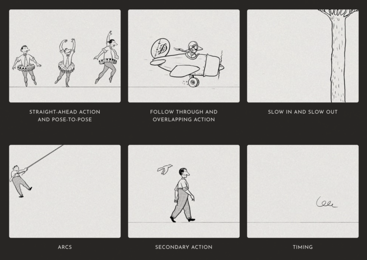
Visualize This: The FlowingData Guide to Design, Visualization, and Statistics

Available now.

Order: Amazon / Bookshop

Made by FlowingData

  • The Process

  • Data Underload

  • Chart Everything

  • Guides

  • Books

  • Shop

  • About
  • Contact
  • Newsletter
  • LinkedIn
  • Instagram
  • Bluesky
  • RSS
Copyright © 2007-Present FlowingData. All rights reserved.