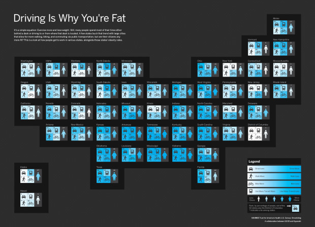
In a collaboration between GOOD and Hyperakt, they come out with a bold statement: driving is why you’re fat. They follow with a graphic that shows rankings by state for amount of driving, walking, biking, and use of mass transit.
Each state is represented by a four-square grid, colored so that lighter indicates more physical activity. Each grid is complemented with a fat/skinny icon, which represents rank for obesity.
I like how the grids are geographically-placed, but I’m not so sure about coloring by rank. Would it have been better to color by the actual metrics the ranks were based on? Does driving a lot really lead to obesity or do obese populations collectively prefer to drive more? Sound off with your constructive comments below.


 Martin Wattenberg, who with his associate Fernanda Viégas, was just


 Visualize This: The FlowingData Guide to Design, Visualization, and Statistics (2nd Edition)


