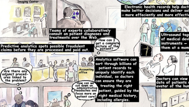
• My wife is an ER doc, so I hear about this sort of stuff all the time. Hospitals are going all-digital, and the exchange of data from doctor to doctor, from hospital to hospital, from patient to doctor, and doctor to patient is only going to get easier.

    This expedited exchange of information will bring advantages such as fewer prescription errors, easier hospital transfers, and through sensors and mobile devices, professional health practitioners will be able to provide better care to those with chronic health conditions. This illustration from Chris Luongo explains a bit more.

    Naturally, with all these benefits come plenty of challenges. Data privacy is huge here. Can you imagine if your medical charts ended up in some random hacker’s hands and then sold to the highest bidder? At least we might get more useful spam. I want big discounts on mis-spelled drugs that I actually need.

    Seriously though. Data is blowing up, and there’s going to be monster demand for data scientists in the next ten years. See that wagon? Better jump on it while there’s still room.

    [via Smarter Planet]

  • I should just automatically bring the OkTrends feed into FlowingData. In their never-ending quest to understand humankind, the group from online dating site OkCupid analyzes 11.4 million opinions on what makes a “great” photo – as in makes people want to date you. Some of the findings include: photos from Panasonic Micro 4/3s were best received, “photo attractiveness” decreased by age, and the Flash adds seven years.

    There’s one finding that’s got everyone buzzing though. iPhone users have more sexual partners. See the graph above and below for the numbers.
    Read More

  • Martin Wattenberg, who with his associate Fernanda Viégas, was just snatched up by Google, talks data and visualization in a lecture at MIT. For the most part, he focuses on past projects, which I am sure you’ve seen. However, even if you have seen all of Martin and Fernanda’s work, it’s still worth a watch as he highlights the interesting tidbits that each tool or piece can reveal. The rundown makes you appreciate the work that much more, in the same way you appreciate art when you know the story behind the picture.

    The great thing about Martin and Fernanda is that they’re able to switch back and forth between art and science, which in turn gains the respect of the academic visualization world and attention from the masses.

    Watch the full keynote below. It’s on the longish side, at about an hour, so you might want to bookmark it for later.
    Read More

  • I’m still not comfortable sharing my location with strangers, and my friends are all really low-tech, so FourSquare has never appealed to me. But if you are an avid FourSquare user, you’ll like this one. Geo startup, Movity, built Weeplaces over the weekend. It’s a simple idea to visualize your movements via FourSquare check-ins.
    Read More

  • There’s a lot of history behind the New York City subway map, but despite all the revisions, people (especially out-of-towners) still find it hard to navigate the underground. Designer Eddie Jabbour took his frustrations and put that energy towards a heavy redesign. After the MTA rejected it, he put it up in the Apple Store as KickMap, so that people could at least make use of his map on their iPhone. So far, a quarter of a million of people have downloaded it.
    Read More

  • Alex Rodriguez became only the seventh player in MLB history to hit 600 home runs, at a younger age than any of the previous six by far. Amanda Cox and Kevin Quealy of The New York Times visualize home run counts for Rodriguez and other big hitters. It’s similar to the graphic NYT designed when Barry Bonds passed Hank Aaron back in 2007, except with this new one, you can sort the home run lines by season or by age.
    Read More

  • A simple question from GOOD magazine: where did the money to rebuild Iraq go? In 2003, the Development Fund for Iraq (DFI) was established for the benefit of the country’s people. The Department of Defense (DoD) managed that money. According to a report [pdf] from the Special Inspector General for Iraq Reconstruction:

    Weaknesses in DoD’s financial and management controls left it unable to properly account for $8.7 billion of the $9.1 billion in DFI funds it received for reconstruction activities in Iraq. This situation occurred because most DoD organizations receiving DFI funds did not establish the required Department of the Treasury accounts and no DoD organization was designated as the executive agent for managing the use of DFI funds. The breakdown in controls left the funds vulnerable to inappropriate uses and undetected loss.

    That’s 96% of 9.1 billion dollars that we apparently have no clue about how it was spent. What?

    [Thanks, Elise]

  • Here’s another timeline of Inception from deviantArt user, dehas. This one has the kicks in it. Start on the bottom left, and follow the character lines counter-clockwise. Lines end as characters die off in each level.
    Read More

  • You know I can never resist a good Back to the Future reference. Also from graphic designer Sean Mort, the trilogy timelines are displayed in parallel. Important events from each year are marked, starting at the original flick up top and moving down to the lesser, but still great, Western finale.

  • This flowchart from Watermark Design helps you decide if you need a new logo. Oddly enough all paths lead to Watermark’s logo design services. That is unless you think designers have no concept of reality and scream when someone tells you art is important to business, and you happen to be an international spy. Hm, interesting. [via]

  • Online dating site OkCupid continues with amusing yet thorough analysis of their 1.51 million users. This time around, they cover the lies people tell:

    People do everything they can in their OkCupid profiles to make themselves seem awesome, and surely many of our users genuinely are. But it’s very hard for the casual browser to tell truth from fiction. With our behind-the-scenes perspective, we’re able to shed some light on some typical claims and the likely realities behind them.

    Among the findings:

    • People exaggerate their height by about two inches.
    • If someone says they make $100k per year, they probably mean $80k.
    • The more attractive a picture, the older it is.
    • Most self-identified bisexuals (80%) only like one gender.

    Buyer beware.

  • Leading up to their book, Turning Pages: Editorial Design for Print Media, publisher Gestalten has a chat with Steve Duenes and Archie Tse — of famed New York Times graphics department — about what goes on behind the scenes.
    Read More

  • When street view came out on all the the popular online map applications, we thought it was awesome. We were able to see photos of the actual buildings and people walking on the street. It’s especially handy when you’re looking for something in a brand new area. Street Slide from Microsoft Research is the next iteration of that.
    Read More

  • You knew this was coming. I’d call spoiler alert for those who haven’t seen Inception yet, but honestly, this flowchart from graphic designer Sean Mort will just confuse you anyways. If, however, you’ve been fortunate enough to see the mind roller coaster of a film already, Mort’s chart makes perfect sense and might clarify any confusion. Levels and dreamers are labeled accordingly. I think the line for Cobb to Limbo should start at Level 4 though.

    [via datavis]

    Update: Sean provides a revised version after seeing the movie for the third time.

  • Andrew Garcia Philips and Sarah Slobin (plus five data gatherers) of The Wall Street Journal report on the prevalence of trackers and cookies on the fifty most popular U.S. websites:

    Marketers are spying on Internet users — observing and remembering people’s clicks, and building and selling detailed dossiers of their activities and interests. The Wall Street Journal’s What They Know series documents the new, cutting-edge uses of this Internet-tracking technology. The Journal analyzed the tracking files installed on people’s computers by the 50 most popular U.S. websites, plus WSJ.com.

    Websites (top half) and tracking companies (bottom half) are placed in the circular network diagram. Roll over a website, and lines flare out to the tracking companies that collect data about you on that site. Similarly, roll over a tracking company to see what sites they sit on. Lines are color-coded to indicate first-party tracker files and third-party ones.
    Read More

  • Once every blue moon I like to freelance as a short break from school work, and a few months back I got an email from Mozilla that basically said, “Hey we’ve got a lot of data. Do you want to do something with it?” Luckily, the scheduling worked out, and this was the result.

    We have active daily users on the top, mirrored by daily downloads on the bottom. Notice the holiday dips and the spikes with each new release, with an overall trend of up? Geographically, the map shows an estimate of Firefox users, normalized by Internet users in any given country. The darker the region, the higher the usage. Finally, on the right, we have a rundown of personas and add-ons.

    In short: a lot of people around the world use Firefox.

    See the full version here.

    In case you’re wondering, all the charts were done in R. I made the map with indiemapper. After that, I brought all the bits into Adobe Illustrator, and tada, there it is: a nice, pretty data poster for the recently past Firefox Summit.

  • Jess Bachman and Barry Ritholtz take a look at the Glenn Beck/Goldline scheme in standard flowchart fashion. In a nutshell: Goldline sponsors the Glenn Beck radio show; Glenn Beck supports them and tells listeners and viewers to buy from them; and now Congress recently opened an investigation on Goldline (and other shady gold dealers). Something is amiss.

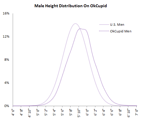
  • About a year after the launch of the Federal IT Dashboard, business intelligence consultancy Juice Analytics focuses on five areas — message, flow, charts, context, and design fundamentals — where the dashboard could use some improvement.

    The first tip on message:

    The information designer is responsible for presenting the data in a way that the message is delivered in a clear and understandable way. If the data is left to speak for itself, users can be left confused or frustrated. And in all likelihood they won’t to [sp] see the full value of the data. That’s particularly tough for this Federal IT Dashboard where a huge amount of effort has been put into gathering consistent data across agencies.

    Totally agree with this, but to avoid confusion, let’s clarify. You should always let the data speak for itself. It’s just that what the data says often seems like a foreign language to non-professionals. It’s up to you, the information designer, to translate. The better you can translate, the better the information designer you are.

    See the rest of the redesign on Juice Analytics (who is hiring, by the way).

  • Thanks again, everyone for sharing FlowingData. It was another good month, and it wouldn’t be the same without you. In case you missed them, here are the most popular posts from the past month, based on views, comments, and links.

    1. Flowchart to lifelong happiness
    2. History of The Beatles as told by their hair
    3. How to win Rock-paper-scissors every time
    4. Periodic table of swearing
    5. Path to happiness gets complicated and confusing
    6. Citizen’s guide to fancy pants coffee drinks
    7. Flowchart shows the startup business cycle
    8. 7 Basic Rules for Making Charts and Graphs
    9. Who participates online, by age
    10. How Britain has changed since 1997

    And remember – the FlowingData forums is still a great place to get your data questions answered, share tasty links, and post visualization job openings.

  • This graphic on Burning Man is totally lost on me, but maybe you guys will appreciate it more. I first heard about the event on Malcom in Middle several years ago and that’s about it. Well, that and my friend posted a picture on Facebook yesterday of him wearing fairy wings, which just confuses me more.

    I feel like I’m missing out on something though. I mean, who doesn’t want to see a giant, burning wood man on the beach?

    The designer Flint Hahn notes:

    The history of Burning Man has always been a complex entity that has survived, nay, mutated over the years. And because of this, it has grown rapidly since its humble beginnings of a simple gathering on a beach.

    The infographic poster shows only a small portion of what Burning Man is. By no means do mere numbers even begin to show a complete picture, as that is a history of stories, experiences, and individual tales.

    Ok then.

    [Thanks, Turtle & Jesse]