Using data from a recent Gallup report showing a correlation between wealth and faith, Charles M. Blow reports in graphic form. Each sphere, sized by population, represents a country. Spheres are colored by dominant religion in that country.
Read More
-
-
There are a bunch of college ratings out there to help students decide what college to apply to (and give something for alumni to gloat about). The tough part is that there doesn’t seem to be any agreement on what makes a good college. Alex Richards and Ron Coddington describe the discrepancies.
Read More -
I asked this same question a couple of years back. I wonder: has the software that people use for visualization and data graphics changed at all? Punch your answer in the poll below. If you select ‘other’ let us know your tool of choice in the comments.
P.S. I know many of you use a combination of these. Pick your favorite if that’s the case.
Read More -
Physicist Kristian Cvecek hangs out in the forest sometimes to take these beautiful pictures of firefly trails, using slow shutter speeds on his camera. Even better than the long exposure shot of a Roomba. [via]
-
If you’ve ever created an interactive graphic or anything else that requires that you feed in data, you will love this barebones data conversion tool by Shan Carter. Copy and paste data from Excel, which I feel like I’ve done a billion times, and then take your pick from Actionscript, JSON, XML, and Ruby. Simple, but a potential time saver. [via]
-
You can get pretty far with data graphics with just limited statistical knowledge, but if you want to take your skills, resume, and portfolio to the next level, you should learn standard data practices. Of all places, UK Parliament has some short and free guides to help you with basic statistical concepts. They provide 13 notes, each only two or three pages long that can help you with stuff like how to adjust for inflation, confidence intervals and statistical significance, or basic graph suggestions [pdf]. I like.
-
Flowchart Friday, anyone? This one describes the process to solve all of your problems. Unfortunately, sometimes in life, you just end up going around in circles. That’s what Maury Povich taught me.
[via]
-
A couple of months back, WNYC’s The Brian Lehrer Show asked listeners who have moved to or away from New York some questions. They asked current zipcode, previous zipcode, year of move, and some other questions. BLS then posted the data and let information and data folk have a go at it. Here are the results.
Read More -
I trust we’ve all seen the OldSpice YouTube campaign by now? This graphic from Know Your Meme categorizes videos by who they were directed to and how many views they received. For example, a video to Joe Blow would be in the low-profile category, while responses to Alyssa Milano go to the high-profile category.
Read More -
The tennis US Open is in full swing, and since you’re at work, you probably need a way to keep up with all of the matches. In a collaboration between the US Open and IBM, this real-time display shows you what’s going on during any given match.
Read More -
A big thank you to FlowingData sponsors for their support. They help me keep the lights on. Check ’em out. They help you understand your data.
Splunk – Leading software used to monitor, report and analyze live streaming IT data as well as terabytes of historical data – located on-premise or in the cloud. More than 1,850 organizations in 70 countries use Splunk to gain valuable insights from their IT data.
Tableau Software – Combines data exploration and visual analytics in an easy-to-use data analysis tool you can quickly master. It makes data analysis easy and fun. Customers are working 5 to 20 times faster using Tableau.
Want to sponsor FlowingData? Email me for details.
-
Last month we saw sorting algorithms visualized in rainbow technicolor. Now, by Rudy Andrut, here they are auralized.
This particular audibilization is just one of many ways to generate sound from running sorting algorithms. Here on every comparison of two numbers (elements) I play (mixing) sin waves with frequencies modulated by values of these numbers. There are quite a few parameters that may drastically change resulting sound – I just chose parameteres that imo felt best.
It sounds like someone is playing on old Atari game. Warning: may cause seizures. Watch it in action in the video below.
Read More -
It’s been a hectic month. With one month left until my thesis defense, there’s no letting up, and it’s time to turn on the after burners. It’s definitely been interesting though, culling everything I’ve learned these past five years.
As it turns out, writing for FlowingData is actually a nice break from thesis-writing every now and then, so I’ve managed to keep things up and running around here. Thanks to everyone who has sent suggestions. You’ve been a big help. And of course, thanks to all who continue to share FlowingData. Much appreciated.
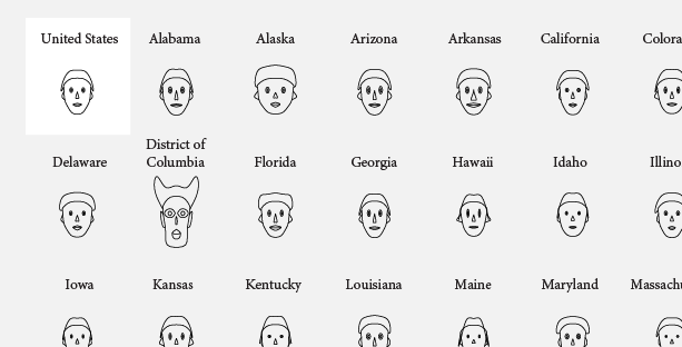
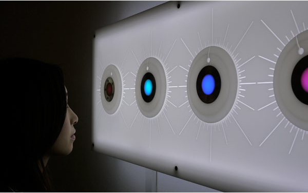
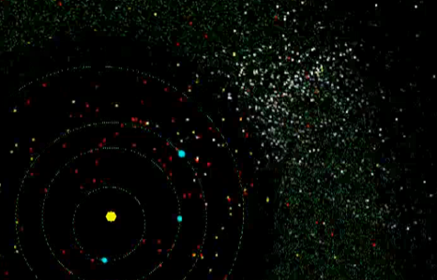
In case you missed them, or you’re new, here are the top posts from this past month.
Read More -
How to visualize data with cartoonish faces ala Chernoff
The goal of Chernoff faces is to show a bunch of variables at once via facial features like lips, eyes, and nose size. Most of the time there are better solutions, but the faces can be interesting to work with.
-
-
Connoisseur of scaled rounded rectangles, bubbles, and triangles, David McCandless of Information is Beautiful talks data visualization in recently posted TED talk (below). He explains how information design can help us get through information glut on the Web and how simple charts can show patterns that we never would have seen otherwise. He uses his own works and collaborations as evidence.
Read More -
This animation by Scott Manley of the Armagh Observatory shows a beautiful view of the past 30 years of asteroid discoveries, using data culled by Ted Bowell and company.
As time passes, asteroids are highlighted white and then colored by how closely they come to our inner solar system. Earth crossers are red, Earth approachers are yellow, and all others are colored green.
What you get is a view of the solar system’s planets and asteroids orbiting the sun and these beautiful sparkles in sky. As automated sky scanning systems come online in the 1990s, we see waves of discoveries. Then starting at the beginning of 2010, we see a discovery pattern as a result of the Wide-field Infrared Survey Explorer, which has been tasked with mapping all infrared light in the sky.
Watch the full video below.
Read More -
Do you know who owns the Arctic? As it turns out, it’s a pretty messy subject:
In August 2007 Russian scientists sent a submarine to the Arctic Ocean seabed at 90° North to gather data in support of Russia’s claim that the North Pole is part of the Russian continental shelf. The expedition provoked a hostile reaction from other Arctic littoral states and prompted media speculation that Russia’s action might trigger a “new Cold War” over the resources of the Arctic.
Luckily things are at least a little more in control now though. Well, sort of. Canada, Denmark and the US still need to define their continental shelf limits. Keep in mind that the shelf can be more than 200 nautical miles from these countries’ coastal baselines.
The International Boundaries Research Unit provides this map [pdf] of claimed boundaries and areas that will potentially be claimed in the future.
[via]
-
Nmap visualizes site popularity as scaled icons. Favicons, that is. They’re that little icon that shows in your address bar or when you bookmark a site in your browser. If you’re reading this on FlowingData, you should see a little red icon next to the URL. The larger the icon, the more popular the site is, based on Alexa traffic data. In whole, the image is a giant 37,440 by 37,440 pixels image. Google is 11,936 x 11,936 pixels. Facebook is 6,736 × 6,736 pixels. Yahoo is 6,544 × 6,544 pixels.
Read More -
This is part two in a seven-part series on basic rules for graph…