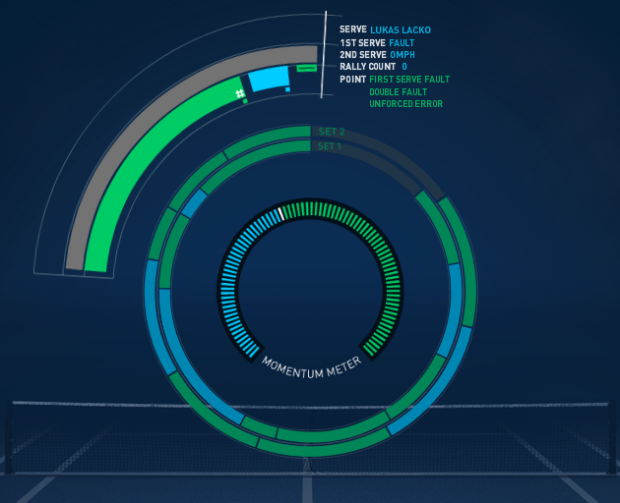
The tennis US Open is in full swing, and since you’re at work, you probably need a way to keep up with all of the matches. In a collaboration between the US Open and IBM, this real-time display shows you what’s going on during any given match.
New for the 2010 US Open, the USTA and IBM are introducing a “beta” release of US Open PointStream — a new way to enhance your US Open experience. PointStream visualizes match data and stats in real-time to give you insight into the way your favorite players are performing.
It’s sort of confusing at first, especially if you don’t know anything about tennis. There are just so many more encodings than you’re used to interpreting. That said, if you’re a tennis nut and have it running in the background, it’s easy to see how this could be useful as an ambient display, as opposed to an analysis tool.
Here are the main encodings. Each player has a color: green or blue. The inner ring is a calculated measure of who currently is at an advantage during the match. The outer ring shows progress of the current match. Bar height indicates serving speed and white lines indicate aces. Small squares on top of bars show winners. Finally, the rings in the middle show previous sets.
Still confused and have suggestions on how to improve it? Let them know. It’s still in beta, and they’re taking feedback. I was unsure what I was looking at at first, but it’s grown on me after staring at it for a little. What do you think? Thumbs up or thumbs down?
[Thanks, Jeff]
 Visualize This: The FlowingData Guide to Design, Visualization, and Statistics (2nd Edition)
Definetly thumbs up!
One thing that is missing is the parameter of time.
Maybe if the radius of each circle (set) was different according to the total time played. Or draw each set as an arc.(?)
Anyway great work.
I think time starts at the top and then moves clockwise for the middle circles. Then the outer circle goes the other way? Wait, that doesn’t seem right…
Pingback: Queekly Links - NEO Proyectamos ideas
In addition to being a data geek, I am apparently a certifiable Star Trek geek, because this immediately made me try to recall exactly where the graphic’s creators “stole” this concept from in the ST franchise. Fortunately, I am married to an even more dedicated geek, who found this image. http://movies.trekcore.com/gallery/albums/tvh/ch17/tvh1073.jpg There was a recurring design trend for circular displays with real time updates on the bridge back in the day.