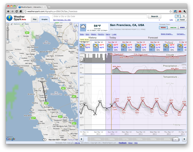
You know Matthew Ericson’s simple weather mashup? It shows only what you need to know for the day. WeatherSpark is the the opposite of that.
Read More
You know Matthew Ericson’s simple weather mashup? It shows only what you need to know for the day. WeatherSpark is the the opposite of that.
Read More
 The World’s Billionaires — Forbes publishes their annual list of the world’s richest people. Four of the top ten are from the US, but the richest man in the world is now Carols Slim Helu (and family) of Mexico.
What if I had bought Apple stock instead? — Apple stock is at about $350 per share right now. If you had invested in Apple instead of buying that Apple PowerBook G3 250 in 1997, you’d have stock valued at $330,563.
Interview with Jer Thorp — PopTech asks the New York Times data artist in residence some questions about his work and what’s in store for the future.
Q&A with me — Visualizing asked me a few questions, and then I answered them.

The New York Times maps the reach of the 8.9-magnitude earthquake in Japan. The page will probably be updated as they find out more.
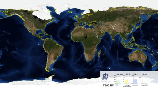
Adrian Meyer and Karl Rege of Zurich University of Applied Sciences visualize the melting poles, starting 21,000 years ago and advancing 1,000 years into the future.
End summer sea ice is shown. The yellow line shows the actual shoreline. The future projection is based on the assumption of complete cessation of carbon dioxide emissions in 2100 (IPCC A2). Because world population is rather uncertain we froze to its current value.
Check out the video below. Adding some speed could’ve made it more dramatic, but wow.
Read More
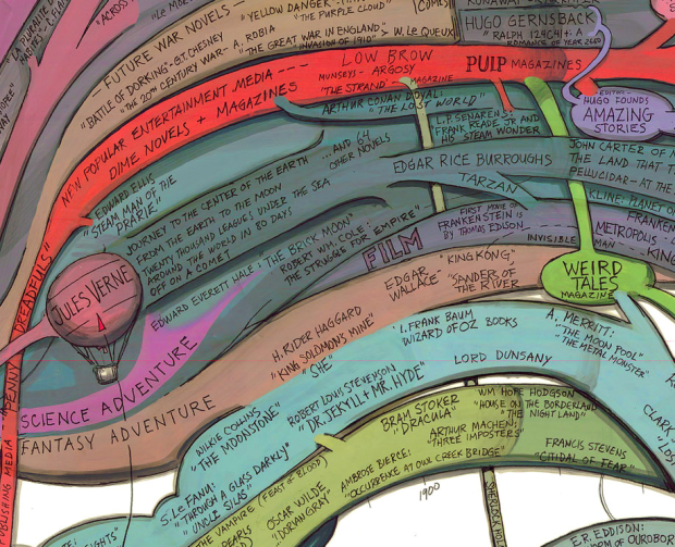
Artist Ward Shelley maps the history of science fiction in painstaking detail. See the way big version here. Accurate?
[Boing Boing via @brianboyer]
As we know, browsers keep getting better, and it grows easier every day to visualize data native in the browser, when you used to have to use Flash. In the early goings, the JavaScript visualization libraries felt clunky to their Flash counterparts, but the roles are changing. There’s Protovis, Polymaps, and Processing.js that help you make full use of modern browsers’ functionality.
Mike Bostock, who had a big hand in those first two, recently made Data-Driven Documents, or D3 for short, available to play with.
Read More
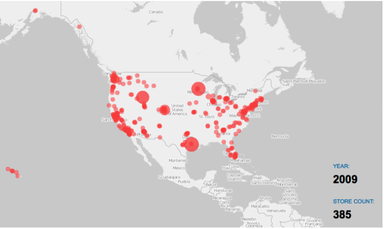
Costco is one of the best stores ever. It’s got everything you need in gigantic volumes and more, so you can imagine my delight when I stumbled on some store openings data I downloaded from Locations Complete a while back. Kind of the same feeling you get when you put on a jacket and find a twenty-dollar bill in the pocket.
I of course had to put the data into a growth map to watch how one of my favorite stores has grown since its first one a few decades ago. It’s not as wild as the Wal-Mart growth, which has thousands of locations, but it’s still fun to watch. Wal-Mart started in Arkansas and then spread outwards. In contrast, Costco, which has just over 400 locations (in the US), has focused on the coasts and has just started opening locations more inland.
Read More
 I finally got a chance to take a closer look at O’Reilly’s most recent edition to their “Beautiful” series, Beautiful Visualization: Looking at Data through the Eyes of Experts, and it’s a good one. In case you’re not familiar, each book in the series is a collection of essays from people who work in the field. Essays range in topic, but they usually focus on a single project and discuss the steps it took to make said project. To be clear, Beautiful Visualization isn’t a how-to book, although you can learn a lot from the writings.
Read More

Choice of color in a movie can say a lot about what’s going on in a scene. It sets the mood, changes the tone, indicates a change in point of view, so on and so forth, which is why moviebarcode is so fun to click through. The concept is simple. Take every frame in a movie and compress it into a sliver, and put them next to each other. Voilá. Movie barcode.
Read More
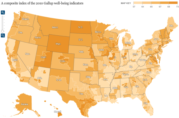
Analyzing Facebook and Twitter updates to gauge happiness is all the rage these days, but Gallup has been doing it old school for the past three years. Every day, Gallup has called 1,000 randomly selected American adults and asked them a series of questions about their well-being such as, “Did you experience feelings of happiness during a lot of the day yesterday?” and “Do you smoke?”
Matthew Bloch and Bill Marsh for the New York Times mapped the responses for the past calendar year. Use the browser to quickly compare well-being in your area and across the country.
Read More
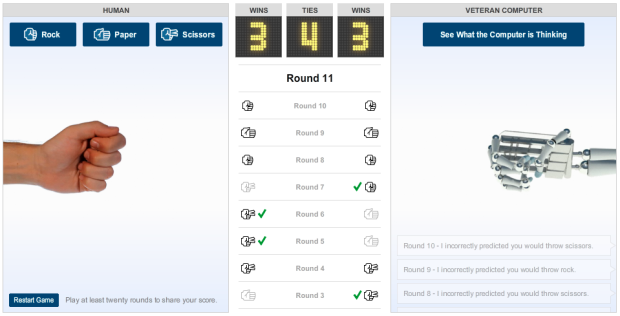
We learned the strategy to win Rock-Paper-Scissors every time, but does it really work? For the New York Times, Gabriel Dance and Tom Jackson give you your chance:
Computers mimic human reasoning by building on simple rules and statistical averages. Test your strategy against the computer in this rock-paper-scissors game illustrating basic artificial intelligence. Choose from two different modes: novice, where the computer learns to play from scratch, and veteran, where the computer pits over 200,000 rounds of previous experience against you.
Be sure to play at least five rounds, and then click on the button to see what the computer is thinking. In veteran mode, the computer searches its database for sequences that match your last five moves and its last five moves and then tries to predict what you’ll throw next.
Are you good enough to beat the basic artificial intelligence?
February was a good month. We continue to inch closer towards the 50k-subscriber mark, and traffic-wise we’re nearing that coveted 1M pageviews in a single month. It hasn’t happened yet, but I think it’s going to happen soon, thanks much in part to all of you.
In case you missed these, here are the most popular posts from the past couple of months:
Thanks again for reading and sharing. Every tweet and like helps FD reach a wider audience, so please keep doing it (or doing it more :).
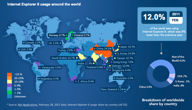
If you’ve ever designed for the Web, you know what a pain it is to get your work to look right in Internet Explorer 6. It’s outdated, and it’s not standards compliant, so a design that looks good in Firefox, Chrome, or Safari might look horrible in IE6 (and subsequent versions for that matter). The good news is that Microsoft has started the countdown to the end with a map that shows IE6 browser share around the world. Twelve percent of the world still uses the browser as of February 2011, with a big chunk of that from China.
[Internet Explorer Countdown | via @mericson]
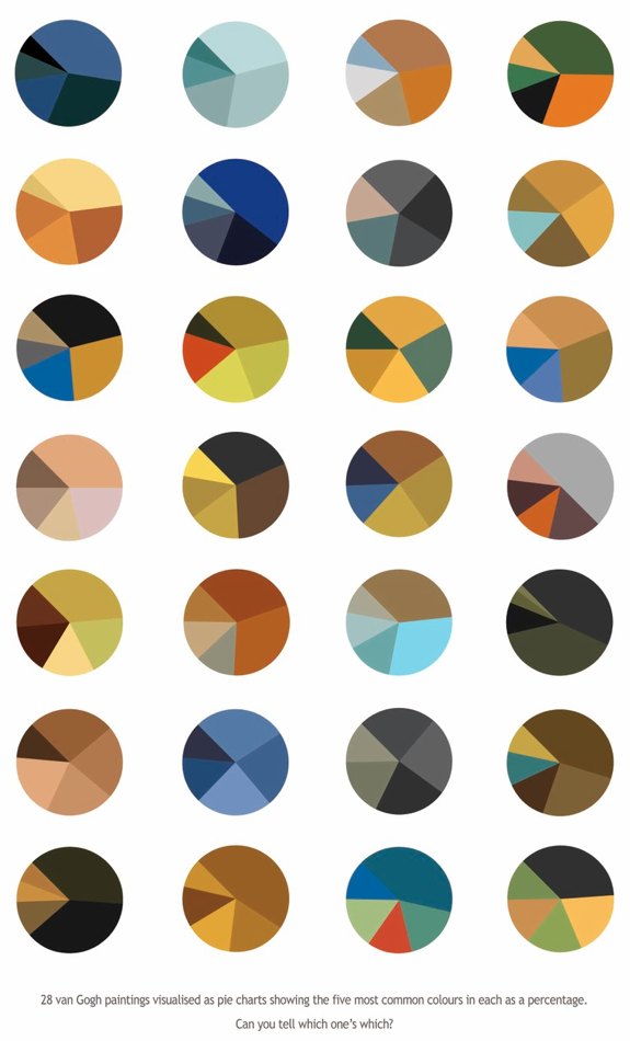
Arthur Buxton breaks down van Gogh paintings for a view of color schemes. My instincts tell me you are either loving this or hating it like the black plague.
[Arthur Buxton via Flavorwire | Thanks, Elise]
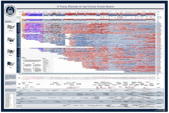
It’s Friday, and the weekend’s staring you in the face. You look like you need some free stuff. Timeplots has kindly put up three visual history prints up for grabs. In case you’re not familiar, Timeplots takes complex history stories, like the American presidency or the changing nature of the Senate, and puts them in visual form.
Read More

Continuing their series on world population, National Geographic focuses in on the “most typical” person in the world. The above image is an artist’s rendering of the average face computed by the Chinese Academy of Sciences in Beijing. Zoom in and you’ll see that the face is made of 7,000 human figures, as shown below. It’s true. I counted.
Read More
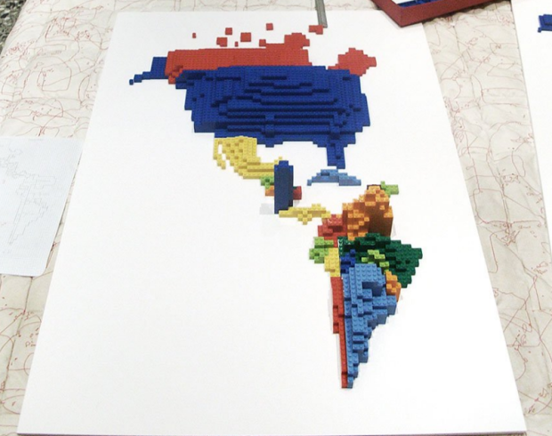
LEGOs were my favorite toy growing up. This was back when the pieces came in buckets rather than the instruction-filled Star Wars sets that we see nowadays, so it was more about building whatever popped into your head. Good memories. In any case, Samuel Granados took a big ol’ bucket of LEGOs and made some cartograms showing immigration and emigration in the Americas. Each piece represents 10,000 people.
Read More

There are no words. More tips on winning in the world found here.

As some of you might know, Germany’s defense minister, Karl-Theodor zu Guttenberg, resigned yesterday after admitting that he plagiarized his PhD dissertation. Pitiful, I know.
Gregor Aisch visualized Guttenberg’s dissertation, highlighting the plagiarized portions.
Read More
 Visualize This: The FlowingData Guide to Design, Visualization, and Statistics (2nd Edition)
New tools, refined process.


