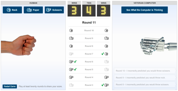
• Membership
  • Newsletter
  • Projects
  • Learning
  • About
  • Member Login
  • Hey Jude flowchart

    January 21, 2011

    Topic

    Miscellaneous  /  flowchart

    What day is it? Flowchart Friday of course. Old but new to me. Based on the Total Eclipse of the Heart flowchart, this one takes on Hey Jude. Don’t get stuck on an infinite loop of na na na na na na na na na…

    [Love All This via Laughing Squid | Thanks, John]

  • Tracking space garbage with Space Fence

    January 20, 2011

    Topic

    Statistics  /  garbage, space, video

    Lockheed Martin’s Space Fence, expected to be in initial operation in 2015, will track the junk floating in space:

    Space Fence is envisioned as a network of ground-based S-band radars that will detect, track, measure and catalog thousands of objects in low-Earth orbit. Expected to begin initial operation in 2015, the system will replace the existing Air Force Space Surveillance System, or VHF Fence, which has been in service since the early 1960s. A leader in S-band radar development, Lockheed Martin’s high-powered radar systems will find and follow the course of thousands of pieces of space debris to an accuracy of just meters.

    They provide this video (below) to explain the concept, of which I’m pretty sure most of is fake, but let’s pretend it’s real. It’s more exciting that way.
    Read More

  • State of Wikipedia, 10 years later

    January 19, 2011

    Topic

    Infographics

    In their most recent video (below) to their “State of…” series, JESS3 takes a look at the State of Wikipedia:

    The State of Wikipedia not only explores the rich history and inner-workings of the web-based encyclopedia, but it’s also a celebration of its 10th anniversary. With more than 17 million articles in over 270 languages, Wikipedia has undoubtedly become one of the most visited and relied upon sites on the web today.

    It’s really light on the data and kind of fluffy, but Jimmy Wales narrates, so it’s worth it to watch just for that. For some reason I expected him to have a grittier voice. It must be the beard.
    Read More

  • Data Underload  /  firearms, murder

    States with the most and fewest firearms murders

    According to 2009 numbers reported by the Federal Bureau of Investigation, DC, Louisiana,…

    Read More
  • How Starbucks’ new Trenta compares to your stomach

    January 18, 2011

    Topic

    Infographics

    Starbucks recently announced their next size up from 591-milliliter Venti: the Trenta. It’s 916 milliliters, which happens to be slightly more than the average capacity of the human stomach, as illustrated by Andrew Barr for The National Post.

    I don’t know why everyone’s getting their panties in a bundle though. If it’s too big for you, then don’t buy it. Besides, 7-Eleven has Starbucks beat with their line of Big Gulp drinks ranging from 0.59 to 1.9 liters.

    I’m thirsty.

    [National Post]

  • Open thread: Is this map too confusing?

    January 18, 2011

    Topic

    Discussion, Maps  /  census

    This map, a collaboration between Good and Gregory Hubacek, shows three metrics from the most recent American Community Survey by the US Census: high school graduates, college graduates, and median household income. The goal was to see if there’s a correlation between education and income. Does it work?
    Read More

  • A guide for scraping data

    January 17, 2011

    Topic

    Data Sources  /  scraping

    Data is rarely in the format you want it. Dan Nguyen, for ProPublica, provides a thorough guide on how to scrape data from Flash, HTML, and PDF. [via @JanWillemTulp]

  • Size of the Universe

    January 17, 2011

    Topic

    Misc. Visualization  /  universe, video

    Because you can never get enough videos to remind you how tiny you are compared to the rest of the world. Catch the video below. And a good MLK day to you.
    Read More

  • Falling in the fountain

    January 15, 2011

    Topic

    Miscellaneous  /  humor

    Focus too hard on individual points, and ignore what’s around, and you too might fall in the metaphorical fountain. Yes, this is my excuse for posting this hilarious video, and I’m sticking to it.
    Read More

  • Flowchart: Should I work for free?

    January 14, 2011

    Topic

    Miscellaneous  /  flowchart, freelancing

    Designer Jessica Hische gets her flowchart on to help you decide whether you should work on that project for free. In short, if the client is not your mom or a friend you owe big, they better pay up. Love the blunt honesty from Hische, who I’m sure gets all sorts of odd offers. See full flowchart here.

    [Jessica Hische via @MacDivaONA]

  • T-shirt life cycle

    January 14, 2011

    Topic

    Miscellaneous  /  comic, tshirt

    Nick Foster has some fun with t-shirt classification after cleaning out his closet:

    I have a T-shirt problem: after years of buying them, my house is now full. Whilst recently trying to tidy up the situation I realised that I was subconsciously categorising them.

    Ten types are identified, although half of my shirts probably belong in the above three. I’m a bum. But I have golden voice.

    [sleepinginmyhead via kottke]

  • Visualize This: Where the public gets its news

    January 13, 2011

    Topic

    Visualize This  /  media, news

    According to polls from the Pew Research Center, the Internet gained on Television as the public’s primary news source in 2010. Poll results are shown in their graph below.

    The graph isn’t too bad, but it’s kind of busy and could use some design. Can we do better? I think so. Here’s the data as a CSV file. Get your graph on, and link to your efforts in the comments below.
    Read More

  • In investing, timing is everything

    January 13, 2011

    Topic

    Infographics  /  grid, investments, nytimes

    When you invest in stocks, it’s not just what you invest in, but also when you put the money in and when you get it out. The New York Times explains with this grid diagram:

    This chart at right shows annualized returns for the S.& P. 500 for every starting year and every ending year since 1920 — nearly 4,000 combinations in all. Read across the chart to see how money invested in a given year performed, depending on when it was withdrawn.

    Darker red represents greater loss while darker green represents the greater gains. Tan color indicates more modest gains.

    The method probably isn’t new, but it’s the first time I’ve seen it. I like it. I’ve only seen those “what if” calculators where you enter a value to see how it would’ve paid off. That only lets you see one scenario at a time. This type of chart lets you see multiple time spans at once.

    [New York Times]

  • Haiti’s earthquake in context

    January 12, 2011

    Topic

    Maps  /  animation, earthquake

    Haiti’s earthquake in 2010 was by far the most devastating in a long time. There were an estimated 222,570 casualties as a result. However, as Peter Aldhous shows in this graphic, the Haiti quake was not the most powerful.
    Read More

  • Aerial photos of destruction in Haiti, one year later

    January 12, 2011

    Topic

    Maps  /  earthquake, Haiti, interactive, nytimes

    In memory of the devastating earthquake that hit Haiti one year ago on January 12, 2010, the New York Times shows aerial photos of Port-au-Prince from GeoEye and Google in this interactive. See views form before the earthquake, a few days after, and now.
    Read More

  • Mapping and documenting a year of travels

    January 12, 2011

    Topic

    Maps, Self-surveillance  /  Andy Woodruff, travel

    Cartographer Andy Woodruff documents all the places he goes, resulting in the pretty map above.
    Read More

  • Price and adoption timeline of gadgets

    January 11, 2011

    Topic

    Statistical Visualization  /  bubbles, gadgets, interactive, Washington Post

    New gadgets, from Web-connected TVs, to smartphones, to Fax machines, always seem to start expensive and then decrease in price a few months later. We all know this. But by how much? Alicia Parlapiano of The Washington Post takes a look in this interactive. It shows units sold by year for different gadgets. Bubble size indicates average price.

    Poor tape player. The Consumer Electronics Association didn’t even bother tracking its sales after 2005.

    [Washington Post]

  • Visualizing deletion discussions on Wikipedia

    January 11, 2011

    Topic

    Data Art  /  edits, tree, Wikipedia

    Fact is not always clear cut. Sometimes fact is driven by opinion. People might have conflicting points of view or maybe the truth is simply unknown. We can see this via Wikipedia, where anyone can edit and create documents. Sometimes people propose that articles should be taken down, and if the proposal is approved, people can discuss. Dario Taraborelli, Giovanni Luca Ciampaglia, and Moritz Stefaner have a look at the most active of these discussions.
    Read More

  • Football supporter map of London

    January 11, 2011

    Topic

    Maps  /  choropleth, football, London

    Map of London colored by what team the majority supports. Not much of a soccer… ahem, sorry, football fan. Accurate? [QPRdotorg via We Love Datavis]

  • Our changing world in cartograms

    January 10, 2011

    Topic

    Maps  /  demographics, FedEx, interactive

    In this series of interactive cartograms, FedEx shows our changing world (and I guess, how they are changing with it) through a variety of worldwide demographics such as access to mobile Web, growth, and happiness. Above is the cartogram for richest countries i.e. GDP. Choose a topic, press play, and the cartogram changes accordingly to match the current metric.
    Read More

  • Page 324 of 392
  • <
  • 1
  • ...
  • 321
  • 322
  • 323
  • 324
  • 325
  • 326
  • ...
  • 392
  • >

Analyze, visualize, and communicate data usefully, beyond the defaults.

Become a member →

Recently for Members

May 15, 2025
Step Chart, Enhanced

May 8, 2025
When the data is not what it seems

May 1, 2025
Finding the Right Charts

April 24, 2025
Visualization Tools, Datasets, and Resources – April 2025 Roundup

April 17, 2025
Breaking Out of Chart Software Defaults

Browse by Chart Type See All →

Donut Chart Venn Diagram Step Chart Organogram Box Plot Small Multiples Baseline Chart Area Chart Barcode Chart Variable Width Bar Chart

Browse By Topic

  • Visualization

    Seeing data

  • Maps

    Seeing geographic data

  • Infographics

    Explaining data

  • Networks

    Connecting data

  • Statistics

    Analyzing data

  • Software

    Working with data

  • Sources

    Getting data

  • Design

    Making data readable

Get the Book

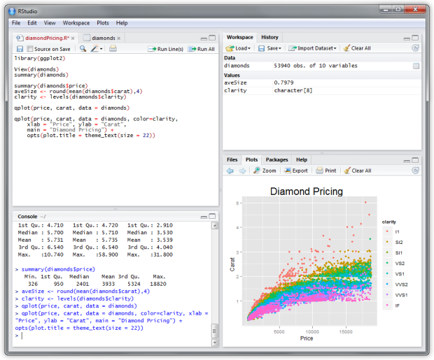
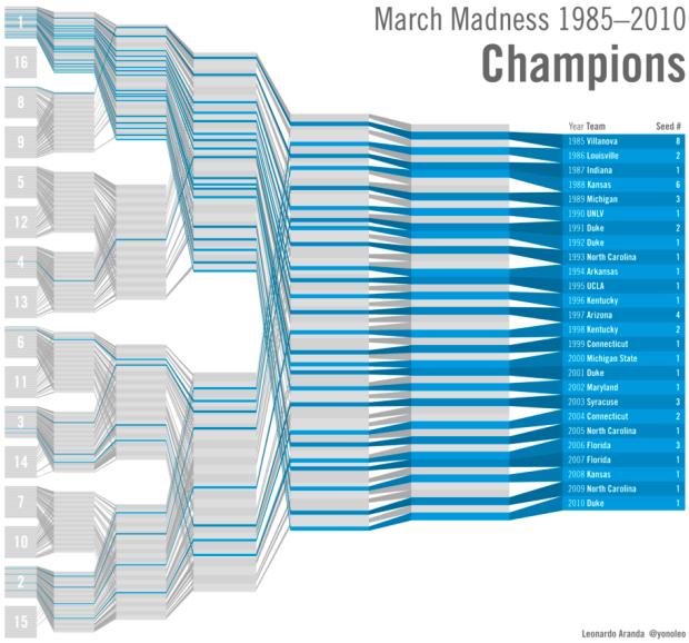
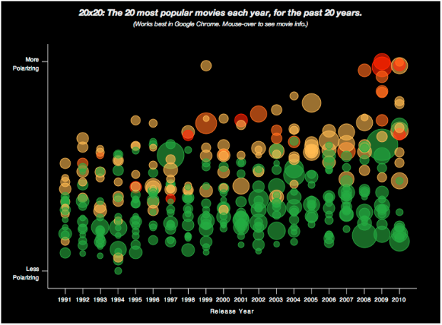
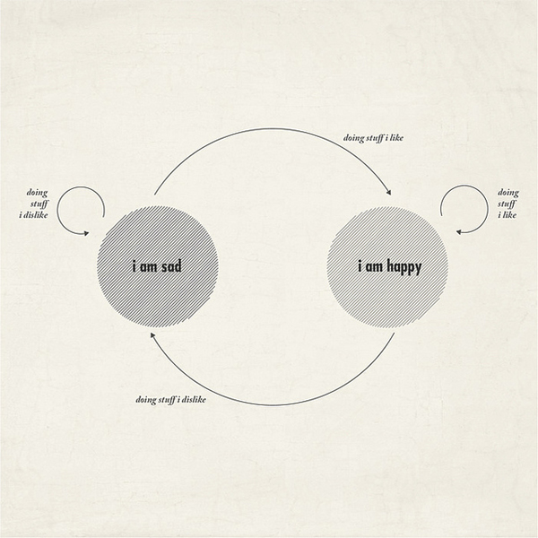
Visualize This: The FlowingData Guide to Design, Visualization, and Statistics

Available now.

Order: Amazon / Bookshop

Made by FlowingData

  • The Process

  • Data Underload

  • Chart Everything

  • Guides

  • Books

  • Shop

  • About
  • Contact
  • Newsletter
  • LinkedIn
  • Instagram
  • Bluesky
  • RSS
Copyright © 2007-Present FlowingData. All rights reserved.