• This animation by Scott Manley of the Armagh Observatory shows a beautiful view of the past 30 years of asteroid discoveries, using data culled by Ted Bowell and company.

    As time passes, asteroids are highlighted white and then colored by how closely they come to our inner solar system. Earth crossers are red, Earth approachers are yellow, and all others are colored green.

    What you get is a view of the solar system’s planets and asteroids orbiting the sun and these beautiful sparkles in sky. As automated sky scanning systems come online in the 1990s, we see waves of discoveries. Then starting at the beginning of 2010, we see a discovery pattern as a result of the Wide-field Infrared Survey Explorer, which has been tasked with mapping all infrared light in the sky.

    Watch the full video below.
    Read More

  • Do you know who owns the Arctic? As it turns out, it’s a pretty messy subject:

    In August 2007 Russian scientists sent a submarine to the Arctic Ocean seabed at 90° North to gather data in support of Russia’s claim that the North Pole is part of the Russian continental shelf. The expedition provoked a hostile reaction from other Arctic littoral states and prompted media speculation that Russia’s action might trigger a “new Cold War” over the resources of the Arctic.

    Luckily things are at least a little more in control now though. Well, sort of. Canada, Denmark and the US still need to define their continental shelf limits. Keep in mind that the shelf can be more than 200 nautical miles from these countries’ coastal baselines.

    The International Boundaries Research Unit provides this map [pdf] of claimed boundaries and areas that will potentially be claimed in the future.

    [via]

  • Nmap visualizes site popularity as scaled icons. Favicons, that is. They’re that little icon that shows in your address bar or when you bookmark a site in your browser. If you’re reading this on FlowingData, you should see a little red icon next to the URL. The larger the icon, the more popular the site is, based on Alexa traffic data. In whole, the image is a giant 37,440 by 37,440 pixels image. Google is 11,936 x 11,936 pixels. Facebook is 6,736 × 6,736 pixels. Yahoo is 6,544 × 6,544 pixels.
    Read More

  • Guides  / 

    This is part two in a seven-part series on basic rules for graph…

  • Wilson Andrews and Alicia Parlapiano report for The Washington Post on how the fight over tax breaks affects your bottom line:

    Tax cuts enacted under former president George W. Bush are set to expire at year’s end, and lawmakers are battling over whether to extend them before the November elections. Most Republicans want to extend all of the cuts, saying that any increase in taxes will hold back the economic recovery. President Obama and Democratic leaders would extend many of the cuts but say tax breaks for top earners should expire to pare down deficits. Each plan would affect average tax rates for income groups differently.

    Each row represents an income group, and you can flip between letting Bush’s tax cuts expire, shifting to Obama’s plan, and extending the current cuts. Bubbles on the right show the average tax change per taxpayer for each income group. Switch from the first option (letting all cuts expire) to the second (Obama’s plan), and you’ll notice some changes for top earners.
    Read More

  • What country has the best education? Health? Quality of life? Thomas Klepl and Adam Clarkson of Newsweek take a look at important metrics for the world’s best countries. It’s basically a parallel coordinates plot turned on its side. Each represents a metric, and each circle in a row is a country.

    Select a country from the list on the left or by directly interacting with the plot. If a country is top in all categories, like Finland, then all of the scores are going to be on the right. Burkina Faso, on the other hand, is all the way to the left. Of course, this is only the “top” 100 countries.

    You can also filter by geographic regions, income, and population groups.

    While I’m not totally sure about the ranking system and methodology, it’s an interesting look.

    [Thanks, Adam]

  • Private browsing. All the modern browsers have it. Turn it on, and the browser won’t keep your history during the session. Sometimes it’s used to pay bank bills on a public computer. Sometimes it’s used for other stuff. In an opt-in study looking at a week in the life of a browser, Mozilla looked at how people use private browsing.

    Again, it’s worth noting that people opted in to this study (about 4,000 of them), and Mozilla only recorded when users started and stopped private browsing. Nothing in between.

    That said, they came up with two basic findings. The first is when people typically use private browsing (above).

    They saw usage spikes during the lunch hours as well as just before the work day ended. The other spike is after the dinner hours and then finally, in the late hours of the night.
    Read More

  • It was election night a few days ago in Australia, and News.com.au ran this graphic to show results in real-time during the election:

    Instead of presenting the count as a map, we’ve made each electorate into a little ball, which pulses and swings and fights for position against 149 others.

    As the votes come in, the balls spring to life, changing colour and moving towards the larger ball representing the party leading the vote. The colour will get deeper as the percentage of the vote counted rises.

    At first it displays the primary vote, then when it’s time to call the seat for that party it switches to the two-party preferred or two-candidate preferred vote.

    There’s also a scroll bar and a speed option so that you can go back and forth in time. Enter a postal code to highlight specific areas.

    I lack the context to fully appreciate this, but several Aussies have sent me the link, so maybe someone can highlight some of the interesting points. It’s easy to see though how this could be fascinating during any election in your country or city, even if the floating animation is more for flash. A lot of the time we don’t care so much about the geography as we do the party splits and our particular area.

    [Thanks, all]

  • When major environmental disasters occur, thousands of people are often affected, but it’s hard to put it all in perspective when it’s not actually happening to you. When the BP oil spill was in full force we saw this simple mashup that placed the oil blob over your area. In the natural iteration to that, BBC Dimensions maps the outcome of other environmental disasters in your neighborhood, including Chernobyl explosion, the 2010 Pakistan floods, and Bhopal chemical accident. Enter your location, and put things into perspective.

    [via]

  • When you buy soft drinks and other beverages at the grocery store, most likely you’re buying something that is part of a bigger brand. We know this. When you buy Powerade or Sprite, you’re buying from the Coca-Cola brand. When you buy Gatorade or Mountain Dew, you’re buying from Pepsi. Canada Dry and 7-Up come from the Dr. Pepper Snapple group. How far is this reach though?
    Read More

  • Shakespeare literature is confusing. That’s not even an opinion. It’s a fact. Stephan Thiel, for his B.A. thesis at the University of Applied Sciences Potsdam, takes a wack at understanding Shakespeare through a series of visualizations.

    As a result, and based on data from the WordHoard project of the Northwestern University, an application of computational tools was explored in order to extract and visualize the information found within the text and to reveal its underlying narrative algorithm. The five approaches presented here are the first step towards a dicussion of this potentionally new form of reading in an attempt to regain interest in the literary and cultural heritage of Shakespeare’s works among a general audience.

    The above is a sample from an exploration of the most frequently used words for each character. The major characters’ speeches are highlighted in yellow.
    Read More

  • Shady research from Harvard scientist Marc Hauser is confirmed:

    On Friday, Michael D. Smith, dean of the Harvard faculty of arts and sciences, issued a letter to the faculty confirming the inquiry and saying the eight instances of scientific misconduct involved problems of “data acquisition, data analysis, data retention, and the reporting of research methodologies and results.” No further details were given.

    This is why we don’t just accept any old data and why we care about the methodology behind the numbers. Stuff like this always reminds me of an exam question that asked us to investigate the data from an article in a prominent scientific journal. The analysis was all wrong.

    Sometimes data is wrong out of ignorance. Other times it’s wrong because people make stuff up. I can understand the former, but why you would ever do the latter is beyond me.

    [via]

    Update: More details on what happened from research assistants’ point of view on the Chronicle. [thx, Winawer]

  • In a collaboration between SimpleGeo, who makes location data easier to access, and Stamen, who does all kinds of wonderful with maps, announced Polymaps today. It’s a free and open-source JavaScript library for image- and vector-tiled maps using SVG.

    Polymaps provides speedy display of multi-zoom datasets over maps, and supports a variety of visual presentations for tiled vector data, in addition to the usual cartography from OpenStreetMap, CloudMade, Bing, and other providers of image-based web maps.

    Because Polymaps can load data at a full range of scales, it’s ideal for showing information from country level on down to states, cities, neighborhoods, and individual streets. Because Polymaps uses SVG (Scalable Vector Graphics) to display information, you can use familiar, comfortable CSS rules to define the design of your data. And because Polymaps uses the well known spherical mercator tile format for its imagery and its data, publishing information is a snap.

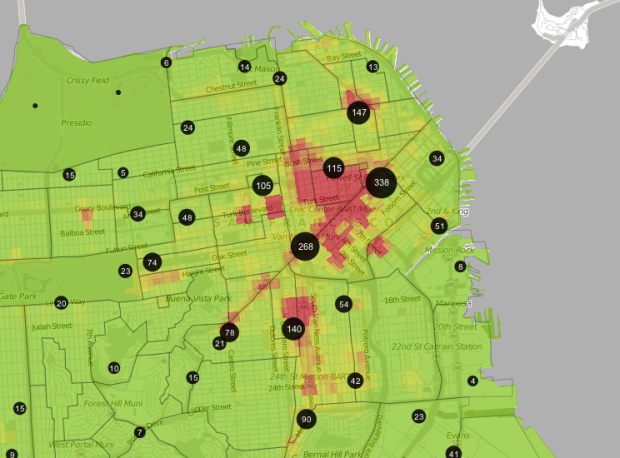
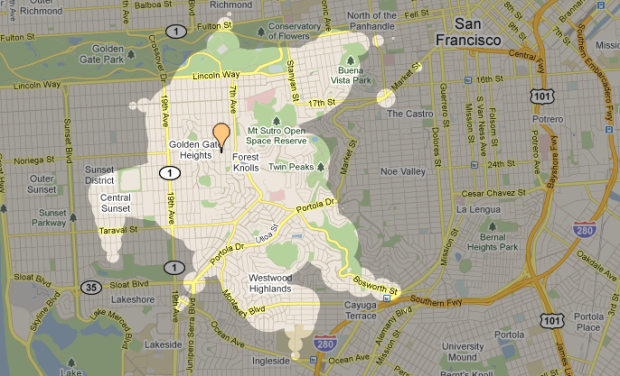
    The above is map using Flickr shapefiles. Here’s a map of pavement quality in San Francisco.
    Read More

  • Dating can be tough. What should you talk about? Where should you go? Most importantly, should you even be dating that person? Erik Bryan and Jennifer Daniel help you out with that last one. Not sure whether it’s appropriate to date that person or not? Consult this detailed flowchart. I know you’ve got a hot date tomorrow night.

    Do you have a pre-exisiting personal relationship? Are you related? Is it your brother’s wife’s cousin? Make it happen, captain.

    Is it your Xbox? Are you over 18? Do you want to not be alone for the rest of your life? Put down the controller and go take a shower. Your genitals will thank you. If, however, you are under 18… game on. Although, please proceed with caution. [via @jenniferdaniel]

  • We saw this handy dandy coffee guide by Plaid Creative a while back. Oh so clean. Oh so informative. The world of fancy pants coffee drinks can be confusing, but it doesn’t have to be with this poster on your wall to guide you through the most difficult challenge in life: ordering coffee.

    With some updates and corrections to the original, The Perfect Pour is now in poster form.
    Read More

  • Eric Fischer has been having a good bit of fun with maps lately. In his latest, he animates movements of the San Francisco MUNI (that’s their bus system) over the month of June 2010. Each second of in the video represents about an hour in real life.

    As you might expect, traffic dwindles during the late/early hours from midnight to four in the morning. Then like clockwork, it picks up again. My knowledge of San Francisco geography has always sucked, so maybe a local can point out some of the interesting areas. If my orientation is correct though, that main street that runs from southwest to northeast and seems to stay lit through the night is Market.

    This of course is reminiscent of Stamen’s Cabspotting, but much more raw, without any trails or ghostly footprints.

    [Thanks, Laurie]

  • Weather in the private sector is over a $1.5 billion industry, and it’s largely because of the government’s open weather data. You can find what the weather is just about anywhere with just a few clicks of the mouse. It wasn’t always like that though. Clay Johnson, former director of Sunlight Labs, describes the history of open weather data, starting with Thomas Jefferson in the late 1700s.
    Read More

  • In a collaboration between GOOD and Hyperakt, they come out with a bold statement: driving is why you’re fat. They follow with a graphic that shows rankings by state for amount of driving, walking, biking, and use of mass transit.

    Each state is represented by a four-square grid, colored so that lighter indicates more physical activity. Each grid is complemented with a fat/skinny icon, which represents rank for obesity.

    I like how the grids are geographically-placed, but I’m not so sure about coloring by rank. Would it have been better to color by the actual metrics the ranks were based on? Does driving a lot really lead to obesity or do obese populations collectively prefer to drive more? Sound off with your constructive comments below.

  • Wired has declared that the Web is dead in their September cover story, and they lead off with this stacked area chart showing the decline of browser-based consumption. Each layer represents a way to consume media via the Internet. Instead of the browser, the majority of US traffic, as estimated by Cisco, has shifted towards peer-to-peer, video, and tiny apps over browsers. Data accuracy questions aside, let’s not forget though that the number of total users is still growing, and that smaller portion using the Web is still billions of people.

    My main concern is that the graphic only goes up to 2005. That’s ages ago by Internet time. What do the numbers look like now?

    [via TechCrunch]

    Update: Graphic now has correct timespan labels. So now it’s back to the debate of relative vs absolute values. [thx, Joanna]

    Update again: What if the article had been about the growth in the number of ways we can interact with online media? Would we see this distribution differently?

  • Guides  / 

    Now that we’ve covered the 7 basic rules to graph design, it’s time…