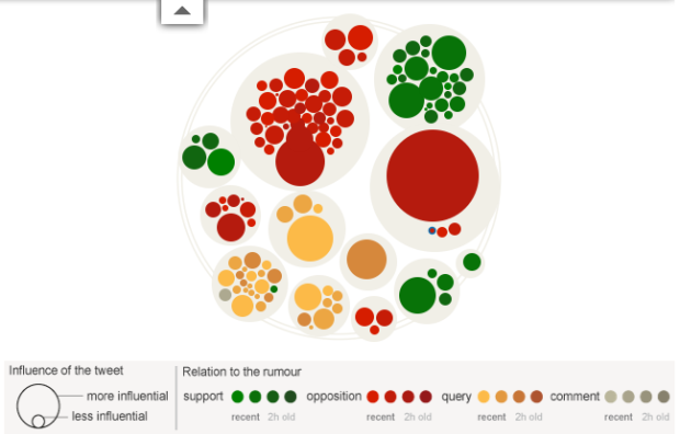
Files and folders on your computer look and feel the same regardless of how much space on your hard drive they take up. Delete a 5-gigabyte file or a 5-kilobyte file with a simple click and drag of the mouse. Sure, one might take a little longer to delete than the other, but there’s no change in effort on your part. In the real world, we know that’s not true. Otherwise, shipping would probably be free for everything (or at least a flat rate). Jan Barth and Roman Grasy experiment with this idea with DataBot.
Read More
-
-
Motion designer Patrick Clair tells the story of Stuxnet, “a Microsoft Windows computer worm discovered in July 2010 that targets industrial software and equipment.” Unlike many viruses and worms, Stuxnet was designed with a specific target — Siemens Supervisory Control And Data Acquisition (SCADA) systems — and left any other systems unharmed. Stuxnet could then increase pressure in nuclear reactors and turn off oil pipelines, all the while showing monitors everything was fine.
Get the full skinny in Clair’s well done motion graphic video below.
Read More -
For several decades, Harvard Laboratory of Adult Development has chronicled the lives of hundreds of men from adolescence through adulthood for “an unprecedented database of life histories with which to view the dynamic character of the aging process.” Designer Laura Javier took ten of those cases and visualized them in the Elements of Happiness.
Read More -
Last year Stamen Design received a grant from the Knight News Challenge to design and implement Citytracking, a project to help people gather data about their cities and gain some kind of understanding about it. Dotspotting, the phase of the project, just launched. It makes it much easier to put dots on a map.
Read More -
The color of the sky changes through the day and into the night and there are subtle differences every day with clouds, pollution, etc. Mike Bodge use this idea in N SKY C, a project with a simple concept. Take a picture with a webcam of the New York City sky every five minutes, take the average color, and post it to the site. N SKY C is the result. Roll over grids to see the picture that was taken.
Read More -
As comic Saturday Morning Breakfast Cereal explains, this is what happens when a powerful weapon falls into the wrong hands. Or when someone in power is just plain dumb.
-
While information graphics have been around for decades, their current form is brand new (or kind of old, if you’re counting in Internet years). Just like the Web, information and data graphics will continue to evolve in line with improving technology and growing amounts of data.
Sarah Slobin, of The Wall Street Journal, follows up on her previous article on successful infographics with an imagined future of what is to come in the next few decades.
Read More -
If you’ve visited YouTube in the past couple of weeks, you’ve probably noticed the links to this year’s commencement speeches by all the famous people (Conan O’Brien’s at Dartmouth has been my favorite so far). Most speakers seem to base a lot on their own experiences, but they tend to revolve around the same themes like meeting challenges, don’t fear failure, and love what you do. Of course, there’s still plenty of variance across speeches though.
Read More -
Dorothy Gambrell of very small array continues with her fascination of movie quality and money gross. This time around she looks looks at the overlap between Academy Award nominees and highest grossing films from 1928 to present. While the two categories are not mutually exclusive, the overlap isn’t incredible common. [very small array]
-
Data is everywhere, but use of data is not. So many of our efforts are centered around making money or getting people to buy more things, and this is understandable; however, there are neglected areas that could actually have a huge impact on the way we live. Jake Porway, a data scientist at The New York Times, has a proposition for you, tentatively called Data Without Borders.
[T]here are lots of NGOs and non-profits out there doing wonderful things for the world, from rehabilitating criminals, to battling hunger, to providing clean drinking water. However, they’re increasingly finding themselves with more and more data about their practices, their clients, and their missions that they don’t have the resources or budgets to analyze. At the same time, the data/dev communities love hacking together weekend projects where we play with new datasets or build helpful scripts, but they usually just culminate in a blog post or some Twitter buzz. Wouldn’t it be rad if we could get these two sides together?
Yes. It would be rad. If you’re an NGO looking for help or a data hacker with a desire to provide some, sign up to the mailing list, and help Jake get the ideas rolling.
[Doing Good With Data via @ireneros]
-
While browser plugins like Rapportive tell you the social networks that people in your email belong to, Inbox Influence, from the Sunlight Foundation, uses their data from Influence Explorer, Transparency Data, and Party Time to show a different type of network in your inbox.
Read More -
Some people use a passcode on their iPhones simply to prevent their kids from mucking around with it or accidentally calling the police. Others use it for actual security reasons — because there’s private information on your phone that you wouldn’t want a stranger to have access to. If you’re in the latter group, hopefully you use a passcode that isn’t easy to guess.
Daniel Amitay, developer of the Big Brother Security Camera app (now removed from the App Store), added some code to the app to record user passcodes anonymously. Here are his findings.
Read More -
Accompanying an article on the changing family dynamic, The New York Times provides an interactive graphic that lets you see how many households in America are like yours.
You start with the primary residents in your household such as single male or married couple, and then add those who live with you, such as a parent or child. The graphic updates as you do, showing the U.S. count and percentage on top and the breakdown by time, race, and household income on the bottom. Simple and straight to the point of interest.
-
Some little birds told me that they received their “coming soon” notifications from Amazon about Visualize This. Exciting. (Thanks, pre-orderees :). I just got the PDF of the book not too long ago, but I can’t wait to get the physical copy resting in my hands. Paper! In anticipation of the upcoming release, I’ve posted some previews of what you can expect.
Read More -
A lot of fun and interesting projects seem to spring up when you force students to sit down and work (or else they fail), and with summer break just about in full swing, many of these projects are going up online now. For example: Professor Golan Levins’ students’ projects at Carnegie Mellon:
Thirty students, spanning eight departments, created personal research investigations into arts-engineering, freestyle computing, and new media practice. These projects explored experimental interfaces, information visualization, games, real-time audiovisuals, computationally generated forms, interactive robotics, 3D scanning and depth imaging, crowd-sourcing, physical computing, and many other topics.
The above image is a shot of James Mulholland’s take on the family tree.
Read More -
Trulia Insights sure has been having fun lately. In their most recent dig into housing trends, the team maps international searches for American homes.
Read More -
Terrance Chang shows us flight patterns at San Francisco International Airport using long-exposure photography so that over time, you can see where airplanes take off from and land.
It’s true. Anything that moves at night and emits light is bound to be interesting via long-duration shutter speed (e.g. a Roomba, fireflies, and WiFi networks).
Catch the full set of photos here, which are also available as prints.
Gold star if you can think of other interesting paths or phenomena that’d look amazing via long-exposure.
-
This seems obvious, but apparently there are people who are unsure of what to do with Twitter and social norms. Now you know. Thanks, Good Magazine for your clear guide.
[GOOD | Thanks, @unchillbill]
-
Digital artist Jer Thorp discusses the algorithm and tool used to arrange 9/11 victims’ names based on who they were with when they died. The process started with the collection of data.
Read More -
In an effort to decrease obesity and improve general health, the US government announced their newest guide to food proportions: the food plate. This of course is a departure from the food pyramid that has been around in one form or another since the 1990s. Instead of slivers or sections on a pyramid, we now have a pie chart type of thing. Well, more like a Simon.
So here’s the question: Does the plate work better than the pyramid?
Read More