• Membership
  • Newsletter
  • Projects
  • Learning
  • About
  • Member Login
  • Access to education where you live

    July 6, 2011

    Topic

    Infographics  /  education, interactive

    If you’re a parent, most likely you want your children to go to the best schools available, but what if you found out that the school that they attend didn’t measure up to the school a couple miles away? Using previously unreleased federal education data, ProPublica helps you compare.
    Read More

  • When crime happens in major cities

    July 5, 2011

    Topic

    Statistical Visualization  /  crime, interactive, small multiples, Trulia

    Does more crime happen during the late hours of the night or in the middle of the afternoon? Trulia Insights uses small multiples to look at crime by hour in major cities, or rather, when it is reported, according to SpotCrime. There appears to be a dip during the 3 a.m. to 7 a.m. hours for all crime types, across all cities. Well, except for Indianapolis, which seems to report incidents with rounded off hours.
    Read More

  • FlowingData is brought to you by…

    July 5, 2011

    Topic

    Sponsors

    A big thank you to the FlowingData sponsors. This little blog wouldn’t be what it is now without them. Check them out. They help you make sense of and communicate with data.

    Tableau Software — Combines data exploration and visual analytics in an easy-to-use data analysis tool you can quickly master. It makes data analysis easy and fun. Customers are working 5 to 20 times faster using Tableau.

    Column Five Media — Whether you are a startup that is just beginning to get the word out about your product, or a Fortune 500 company looking to be more social, they can help you create exciting visual content – and then ensure that people actually see it.

    InstantAtlas — Enables information analysts and researchers to create highly-interactive online reporting solutions that combine statistics and map data to improve data visualization, enhance communication, and engage people in more informed decision making.

    IDV Solutions Visual Fusion — Business intelligence software for building focused apps that unite data from virtually any data source in a visual, interactive context for better insight and understanding.

    Want to sponsor FlowingData? Contact me at [email protected] for more details.

  • Sales receipt redesign

    July 5, 2011

    Topic

    Infographics  /  receipt, redesign

    Design firm Berg rethinks the everyday sales receipt under the premise that registers nowadays are connected to a central system, which has access to data about sales, food, etc.
    Read More

  • Hitler learns topology

    July 1, 2011

    Topic

    Miscellaneous  /  humor, topology

    In another reword of the pivotal scene in Der Untergang, Adolf Hitler learns topology. Still makes me laugh every time.
    Read More

  • Organizational charts in major tech

    June 30, 2011

    Topic

    Miscellaneous  /  humor, org

    Manu Cornet caricaturizes org charts of major tech companies, such as Amazon with its top-down structure and Google with its slightly less structured structure. Drop it like it’s hot.

    [Organizational Charts | Thanks, Ian]

  • Custom maps in Processing

    June 30, 2011

    Topic

    Quicklinks  /  maps, Processing, TileMill

    Till Nagel teaches you how to design custom maps in Processing with TileMill. Could come in handy one day. Saving for later. [via]

  • Takin’ data to the streets. Word.

    June 30, 2011

    Topic

    Infographics  /  Golan Levin, graffiti

    Whenever I’m out late at night with my bottle of black spray paint while climbing onto the highway overpass, I’m always like, “I wish there was an easier way to make pie charts on this street sign. There has to be a better way!” I am sure you can identify. Well fret no more. Golan Levin, an artist and educator, provides you with the open-source pie chart stencil.
    Read More

  • A year of food consumption visualized

    June 29, 2011

    Topic

    Self-surveillance  /  food

    My pending thesis is on personal data collection (i.e. quantified self, personal informatics, self-surveillance, or whatever you wanna call it), so there’s a special place in my heart for projects with data about an individual, no matter who they are. It’s like taking a peek at part of someone’s journal that they’ve decided to make public.

    Designer and architecture student Lauren Manning has documented her life for the past two years, and for her thesis project, she visualized a subset of that data — her food consumption in 2010 — with a variety of over 40 graphics. Instead of sticking with a single, optimized view of her data, she stood back and let the data fly to see what would happen.
    Read More

  • DataBot mouse makes larger files physically harder to move

    June 29, 2011

    Topic

    Internet of Things  /  feedback, mouse

    Files and folders on your computer look and feel the same regardless of how much space on your hard drive they take up. Delete a 5-gigabyte file or a 5-kilobyte file with a simple click and drag of the mouse. Sure, one might take a little longer to delete than the other, but there’s no change in effort on your part. In the real world, we know that’s not true. Otherwise, shipping would probably be free for everything (or at least a flat rate). Jan Barth and Roman Grasy experiment with this idea with DataBot.
    Read More

  • Anatomy of a computer virus explained

    June 28, 2011

    Topic

    Infographics  /  animation, video, virus

    Motion designer Patrick Clair tells the story of Stuxnet, “a Microsoft Windows computer worm discovered in July 2010 that targets industrial software and equipment.” Unlike many viruses and worms, Stuxnet was designed with a specific target — Siemens Supervisory Control And Data Acquisition (SCADA) systems — and left any other systems unharmed. Stuxnet could then increase pressure in nuclear reactors and turn off oil pipelines, all the while showing monitors everything was fine.

    Get the full skinny in Clair’s well done motion graphic video below.
    Read More

  • Elements of Happiness: A happy life depicted in diagrams

    June 27, 2011

    Topic

    Data Art  /  book, happiness, Harvard

    For several decades, Harvard Laboratory of Adult Development has chronicled the lives of hundreds of men from adolescence through adulthood for “an unprecedented database of life histories with which to view the dynamic character of the aging process.” Designer Laura Javier took ten of those cases and visualized them in the Elements of Happiness.
    Read More

  • Dotspotting to make city data more legible

    June 27, 2011

    Topic

    Apps  /  city, dots, interactive, Knight, Stamen

    Last year Stamen Design received a grant from the Knight News Challenge to design and implement Citytracking, a project to help people gather data about their cities and gain some kind of understanding about it. Dotspotting, the phase of the project, just launched. It makes it much easier to put dots on a map.
    Read More

  • Average color of NYC skies, every five minutes

    June 26, 2011

    Topic

    Misc. Visualization  /  New York, sky

    The color of the sky changes through the day and into the night and there are subtle differences every day with clouds, pollution, etc. Mike Bodge use this idea in N SKY C, a project with a simple concept. Take a picture with a webcam of the New York City sky every five minutes, take the average color, and post it to the site. N SKY C is the result. Roll over grids to see the picture that was taken.
    Read More

  • Sufficiently large X

    June 24, 2011

    Topic

    Miscellaneous  /  humor

    As comic Saturday Morning Breakfast Cereal explains, this is what happens when a powerful weapon falls into the wrong hands. Or when someone in power is just plain dumb.

    [SMBC via @eagereyes]

  • Imagining the future of information graphics

    June 23, 2011

    Topic

    Infographics  /  future, timeline

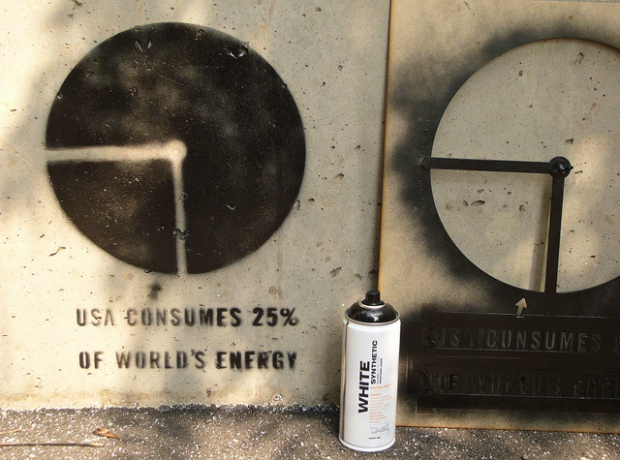
    While information graphics have been around for decades, their current form is brand new (or kind of old, if you’re counting in Internet years). Just like the Web, information and data graphics will continue to evolve in line with improving technology and growing amounts of data.

    Sarah Slobin, of The Wall Street Journal, follows up on her previous article on successful infographics with an imagined future of what is to come in the next few decades.
    Read More

  • Words used in commencement speeches

    June 23, 2011

    Topic

    Infographics  /  bubbles, commencement, NYT, words

    If you’ve visited YouTube in the past couple of weeks, you’ve probably noticed the links to this year’s commencement speeches by all the famous people (Conan O’Brien’s at Dartmouth has been my favorite so far). Most speakers seem to base a lot on their own experiences, but they tend to revolve around the same themes like meeting challenges, don’t fear failure, and love what you do. Of course, there’s still plenty of variance across speeches though.
    Read More

  • Award-nominated movies vs. highest grossing

    June 22, 2011

    Topic

    Statistical Visualization  /  gross, movies, nominees

    Dorothy Gambrell of very small array continues with her fascination of movie quality and money gross. This time around she looks looks at the overlap between Academy Award nominees and highest grossing films from 1928 to present. While the two categories are not mutually exclusive, the overlap isn’t incredible common. [very small array]

  • Data Without Borders

    June 21, 2011

    Topic

    Statistics  /  non-profit

    Data is everywhere, but use of data is not. So many of our efforts are centered around making money or getting people to buy more things, and this is understandable; however, there are neglected areas that could actually have a huge impact on the way we live. Jake Porway, a data scientist at The New York Times, has a proposition for you, tentatively called Data Without Borders.

    [T]here are lots of NGOs and non-profits out there doing wonderful things for the world, from rehabilitating criminals, to battling hunger, to providing clean drinking water. However, they’re increasingly finding themselves with more and more data about their practices, their clients, and their missions that they don’t have the resources or budgets to analyze. At the same time, the data/dev communities love hacking together weekend projects where we play with new datasets or build helpful scripts, but they usually just culminate in a blog post or some Twitter buzz. Wouldn’t it be rad if we could get these two sides together?

    Yes. It would be rad. If you’re an NGO looking for help or a data hacker with a desire to provide some, sign up to the mailing list, and help Jake get the ideas rolling.

    [Doing Good With Data via @ireneros]

  • Page 311 of 391
  • <
  • 1
  • ...
  • 308
  • 309
  • 310
  • 311
  • 312
  • 313
  • ...
  • 391
  • >

Analyze, visualize, and communicate data usefully, beyond the defaults.

Become a member →

Recently for Members

May 8, 2025
When the data is not what it seems

May 1, 2025
Finding the Right Charts

April 24, 2025
Visualization Tools, Datasets, and Resources – April 2025 Roundup

April 17, 2025
Breaking Out of Chart Software Defaults

April 15, 2025
Line Chart with Decorative Neon Accents

Browse by Chart Type See All →

Dot Density Map Ternary Plot Bump Chart Timeline Difference Chart Stacked Area Chart Moving Bubbles Calendar Area Chart Gantt Chart

Browse By Topic

  • Visualization

    Seeing data

  • Maps

    Seeing geographic data

  • Infographics

    Explaining data

  • Networks

    Connecting data

  • Statistics

    Analyzing data

  • Software

    Working with data

  • Sources

    Getting data

  • Design

    Making data readable

Get the Book

Visualize This: The FlowingData Guide to Design, Visualization, and Statistics

Available now.

Order: Amazon / Bookshop

Made by FlowingData

  • The Process

  • Data Underload

  • Chart Everything

  • Guides

  • Books

  • Shop

  • About
  • Contact
  • Newsletter
  • LinkedIn
  • Instagram
  • Bluesky
  • RSS
Copyright © 2007-Present FlowingData. All rights reserved.