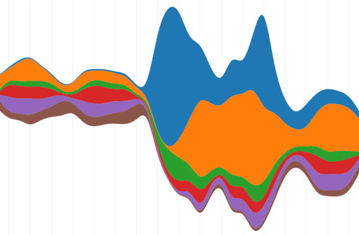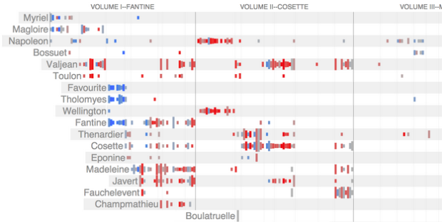
• Vulture illustrated the subtle changes in Louis C.K.’s face to express varying levels of discomfort. I only recently discovered him, but man, I’m glad I did. FYI: With the start of season three, the second season became available on Netflix, in case you want to catch up.

  • In the 1960s, the basketball uniform was about small, tight shorts and form-fitting tank top. It’s grown longer since then. Andrew Bergmann sifted through the archives and illustrated the changes over the decades.

    The arm-length “shooter sleeves” that Lebron, Carmelo and Pierce sport on a regular basis are one of the most interesting of recent accoutrements. These covers can directly be traced back to former 76ers point guard Allen Iverson, who by legend wore one to conceal a controversial tattoo, but in actuality had bursitis in his right elbow. Somehow the sleeves caught on and are now believed to improve your shot. I guess I should get one.

    I can’t wait until players are out there in full tights, and then as fashion always turns around on itself, speedos and thigh-high socks.

  • Information video designer Marco Bagni abstracted the meaning of life in his short video, Getting Lost. It doesn’t show real data, placing it in the genre of Chad Hagen’s nonsensical infographics, so this piece by Bagni is interesting not for the information it shows but how he used infographics as a way to express a message: “Getting lost is only way to find your own path.”

    [Thanks, Nigel]

  • Last week, Australia released data for their 2011 Census. Small Multiples, in collaboration with Special Broadcasting Service, put the data to use and built an interactive that compares demographics based on primary language or location. Choose a language from the dropdown menu on both the left and right, and your selections are presented side-by-side. The graphics themselves are fairly straightforward, showing estimates of things like gender and household income, but the key is in the comparison, which provides a sense of scale to what would otherwise be a bunch of percentages.

  • While we’re on the subject of stars, developer Riley Davis modeled the ones in the zodiac constellations and color-coded them by temperature. He also labeled the constellations and included the celestial equator (the projection of Earth’s equator into space), ecliptic (path of the sun), and the sun, which moves in real-time. The interactive starts with a view from space, where the little blue dot is Earth, and when you release the camera, you see the stars from our point of view.

    I was disoriented at first with the navigation but got used to it quickly. Movement of the mouse left to right zooms in and out, and movement top to bottom rotates the perspective. Feels a lot like flying through space. Well how I imagine it to be, at least.

  • When we look up at the night sky to gaze at the stars, we see small, glowing dots that we perceive almost as if they were drawn on a flat surface. However, all these dots vary in distance from us. View of the Sky by visualization developer Santiago Ortiz shows this third dimension of depth.

    The constellations are placed on a sphere that you can zoom and rotate. This is an interesting view in itself, but select the perspective for absolute distance and magnitude, and you’ll see something completely different. It’s no longer a network that resembles a globe, and instead it morphs to a cloud of stars and randomness. Also see Ortiz’s first view of the sky that includes stars not part of major constellations.

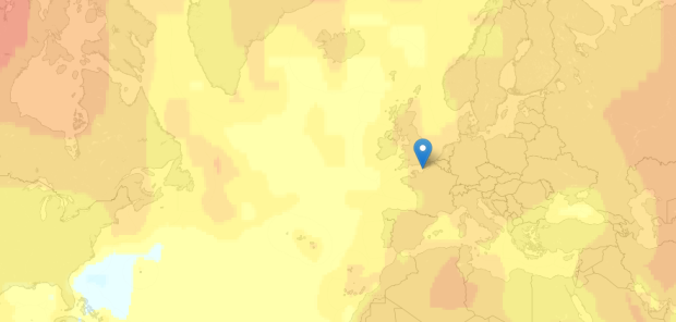
  • When you look for a place to live, there are outside factors to consider other than price and square footage. You want to know what the area is like. How’s the crime? Are the schools nearby good or bad? Housing search site Trulia provides this information with Trulia Local. Using data from OpenStreetMaps and General Transit Feed Specification feeds, it just got better with their most recent addition that maps commute times.

    Commuting sucks. It’s stressful, and no amount of Sirius radio can make a traffic jam fun. Because of this, we know that commuting is an important consideration when choosing where to live, whether you’re in Los Angeles or Boston. So, launching today is Trulia’s first iteration of the Commute Map, a way to visualize driving and public transit times. With this new product, we aim to give Trulia users a better understanding of commute times to work or anywhere important, to help them find the best place to live.

    Put in your location, and the heatmap indicates areas you can get to in less than thirty minutes. If you want to see places farther away, you can use the slider to adjust the time, up to an hour away.

    I found myself just punching in addresses for fun and emphatically dragging the slider back and forth. The map is responsive, and most importantly informative, especially if you’re planning a move.

  • There are a lot of charts to choose from, and if you pick the wrong one you’ll end up communicating the wrong message or make it hard for others to read your data. Luckily, Juice Analytics has you covered with an interactive Chart Chooser, based on Andrew Abela’s flowchart from a few years ago.

    There are toggle buttons on the top that let you filter based on what you’re looking for, such as a trend or relationship. For example, if you select comparison, distribution, and composition, you’re left with a bar chart. Don’t care about distribution? You can also try a stacked bar chart.

    There is a second set of buttons that let you choose between Powerpoint or Excel. Once you find the appropriate chart type, you can download the template for the software you selected. Of course, if you’re not an Office user, you can always just use it for the choice making.

  • Google, in collaboration with Vizzuality, are trying to catalog endangered languages before they are gone forever in the Endangered Languages Project.

    Humanity today is facing a massive extinction: languages are disappearing at an unprecedented pace. And when that happens, a unique vision of the world is lost. With every language that dies we lose an enormous cultural heritage; the understanding of how humans relate to the world around us; scientific, medical and botanical knowledge; and most importantly, we lose the expression of communities’ humor, love and life. In short, we lose the testimony of centuries of life.

    A map on the homepage gets the most attention. Each small dot represents a language, and they are color-coded by endangerment risk. Click on one to get more details about the language or add information yourself to improve the records. Zoom out and the counts aggregate for an overview.