Presented mostly for my fond memories as a grade schooler, with a fresh 2400 bps modem in the 486, who recently discovered something called a BBS. Those were the good old days. My dad got me a 50-foot phone line to run from the computer to the phone jack in the back corner of another room.
-
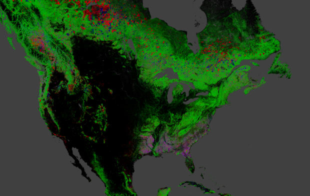
Hansen, Potapov, Moore, Hancher et al. produced high-resolution maps of global forestry to estimate change between 2000 and 2012.
Quantification of global forest change has been lacking despite the recognized importance of forest ecosystem services. In this study, Earth observation satellite data were used to map global forest loss (2.3 million square kilometers) and gain (0.8 million square kilometers) from 2000 to 2012 at a spatial resolution of 30 meters. The tropics were the only climate domain to exhibit a trend, with forest loss increasing by 2101 square kilometers per year. Brazil’s well-documented reduction in deforestation was offset by increasing forest loss in Indonesia, Malaysia, Paraguay, Bolivia, Zambia, Angola, and elsewhere. Intensive forestry practiced within subtropical forests resulted in the highest rates of forest change globally. Boreal forest loss due largely to fire and forestry was second to that in the tropics in absolute and proportional terms. These results depict a globally consistent and locally relevant record of forest change.
Be sure to select the various data products and zoom in on example locations via the dropdown menus on the right of the map.
-
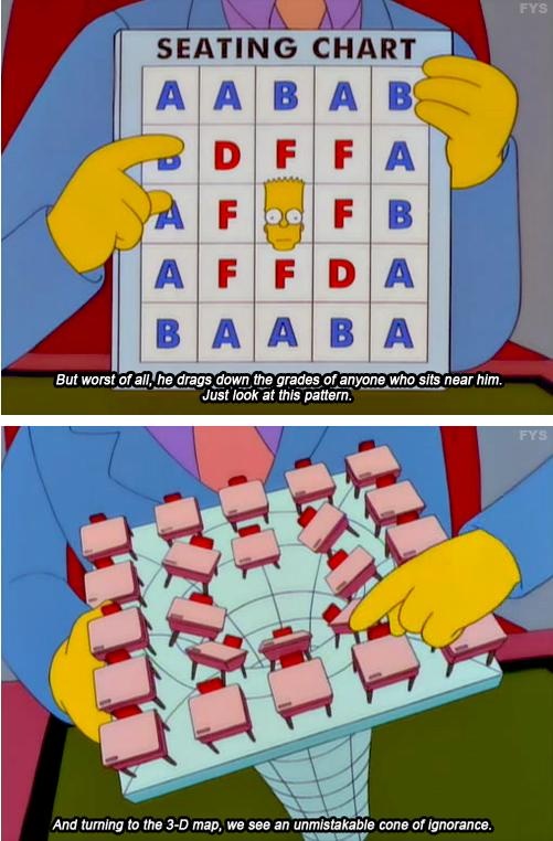
Nice. See also Lisa Simpson on the curve of knowledge. [via reddit]
-
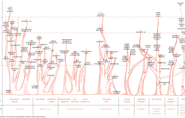
Colin Spoelman for GQ illustrated an educated guess of the bourbon family tree.
This chart shows the major distilleries operating in Kentucky, Tennessee, and Indiana, grouped horizontally by corporate owner, then subdivided by distillery. Each tree shows the type of whiskey made, and the various expressions of each style of whiskey or mash bill, in the case of bourbons. For instance, Basil Hayden’s is a longer-aged version of Old Grand-Dad, and both are made at the Jim Beam Distillery.
This is important.
-
Friedrich Lindenberg and Gregor Aisch recently released dataset, a Python library to take the grunt work out of using databases in Python.
Although managing data in relational database has plenty of benefits, they’re rarely used in day-to-day work with small to medium scale datasets. But why is that? Why do we see an awful lot of data stored in static files in CSV or JSON format, even though they are hard to query and update incrementally?
The answer is that programmers are lazy, and thus they tend to prefer the easiest solution they find. And in Python, a database isn’t the simplest solution for storing a bunch of structured data. This is what dataset is going to change!
So many times I start with a dataset, try to avoid the busy work in creating a database for a smallish project, and eventually dig up an old script or the most recent version of it. Saving this one for later.
-
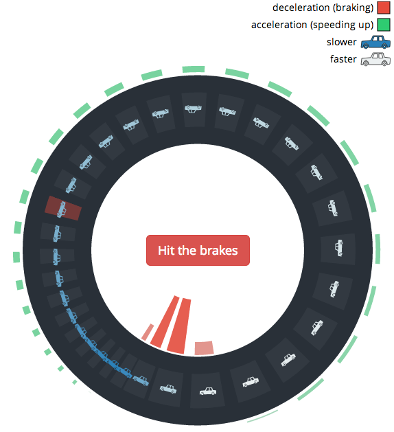
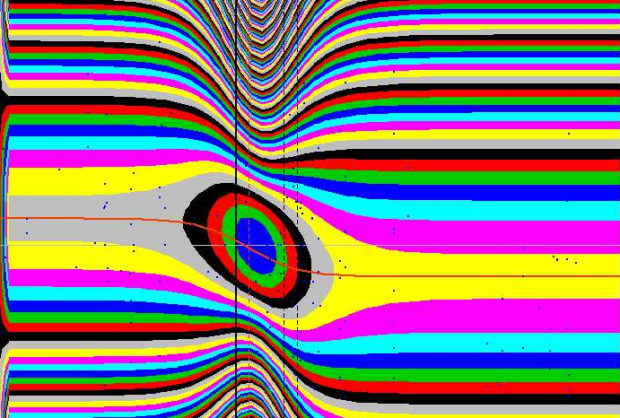
You’re on the freeway, traffic is moving along, and for no apparent reason everyone slows down. And eventually, for no apparent reason, traffic starts back up again. What the what? Lewis Lehe and Matthew Green explain why these waves occur with a couple of interactives.
The simplest explanation for why traffic waves happen is that drivers have relatively slow reaction times: if the car in front of you suddenly slows down, it’ll likely take you a second or so to hit the brakes. The slower your reaction time, the harder you have to brake to compensate and keep a safe distance. The same goes for the car behind you, which has to brake even harder than you did in order to slow down faster. And so on down the road, in a domino-like effect.
Hit the brakes in the simulation, and you’ll see what happens. Naturally this is a simplified version of traffic conditions and assumes some things about how people drive and react, but you’ll get the idea.
It might remind you of this real world experiment a few years ago.
-
Neuroscience students at the University of California, San Diego made a music video parody of Daft Punk’s “Get Lucky.” It’s about gathering data in the lab. Graduate students are such nerds.
-
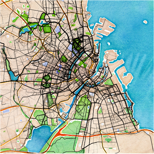
The Endomondo app lets you keep track of your workouts, namely running and cycling, so it records your location, and then estimates your speed, calories burned, and elevation changes. And workouts are set to public by default. Nikita Barsukov used the public traces to make some quick and dirty maps of workouts in major European cities. Above is Copenhagen.
I’m curious about how these compare to car traffic or social media usage. Are they opposites or are they roughly the same, corresponding to number of people who live in an area? And, of course, I want to know what this looks like for American cities.
-
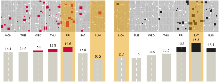
As we’ve seen, there are more fatal car crashes during the weekend and summer months, which is some time between May and September in the United States. The Guardian took a different approach to look at road fatalities in Australia.
The bottom section is your standard bar charts that show an average, but on top are mini-simulations that represent the averages. Small cars move in the background and squares appear on top to at different volumes. I originally thought the cars actually collided with each square, but it looks like they’re independent of each other. Nevertheless, an interesting approach.
-
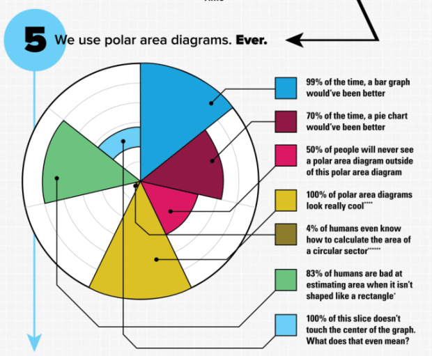
SMBC pokes fun at big “informational” graphics with a self-referencing graphic that displays 6 reasons why said graphic is useful.
It’s not so much the size as it is the non-information displayed as something worth knowing.
At least one of these things lands in my inbox per day, and it always surprises me. Do people still share these things? I mean, these non-information graphics were popular five years ago, and there was a novelty aspect, but I rarely see them in my feed these days.
See also the big graphic blueprint and a tall infographic.
-
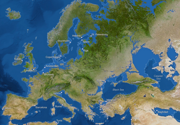
National Geographic imagined new coastlines (and the cities that would go under) if all the ice melted, raising sea level by 216 feet.
There are more than five million cubic miles of ice on Earth, and some scientists say it would take more than 5,000 years to melt it all. If we continue adding carbon to the atmosphere, we’ll very likely create an ice-free planet, with an average temperature of perhaps 80 degrees Fahrenheit instead of the current 58.
The light blue borders represent present day, and the land shows estimates. London, Venice, Bangladesh, and all of Florida would be submerged, and Australia would gain a new inland sea. Of course, estimates assume not much else changes. [via kottke]
-
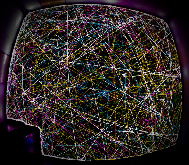
We’ve seen what happens when you turn on a Roomba and track its vacuum path with long-exposure photography. The LED on top provides a point of focus, and the visual represents an odd blend of chaos and order. Above is what happens when you set different colored LEDs on seven Roombas and let them loose. Don’t miss all the other (clean) messes in the Flickr pool. [via Radiolab]
-
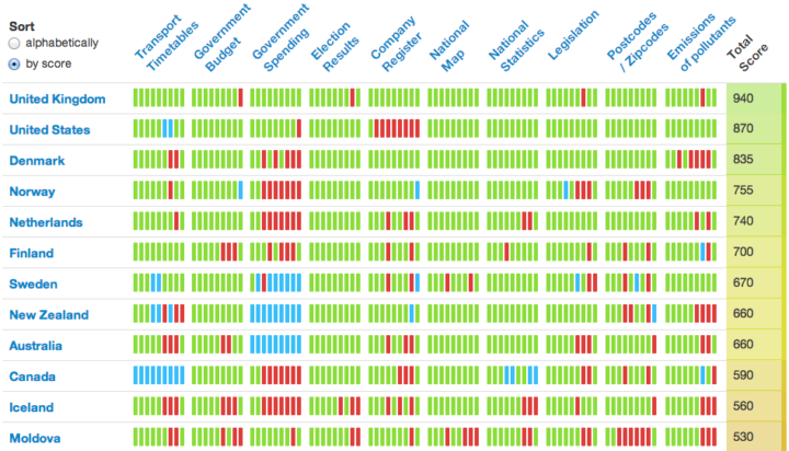
The Open Knowledge Foundation launched the Open Data Index, so you can see what data countries provide to their citizens.
An increasing number of governments have committed to open up data, but how much key information is actually being released? Is the available data legally and technically usable so that citizens, civil society and businesses can realise the full benefits of the information? Which countries are the most advanced and which are lagging in relation to open data? The Open Data Index has been developed to help answer such questions by collecting and presenting information on the state of open data around the world – to ignite discussions between citizens and governments.
Based on community editor contributions, the index assesses the availability of datasets such as transportation timetables, election results, and legislation, and provides a single-number score. The higher the score is, the more data a government makes available to the public. Of the 70 participating countries, the UK leads the way, followed by the United States and Denmark.
-
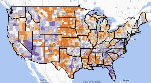
We know that millions of Americans move to different counties every year, and when you look at the net totals, you see a pattern of people migrate from the midwest to the coasts. However, look at migration across demographic categories, and you see more detailed movement. This was the goal of researchers at the University of Wisconsin-Madison, and they recently released their estimates, in map form.
Read More -
The Centers for Disease Control and Prevention released their most recent cancer data a few days ago. It’s the numbers for 2010, which feels dated. However, the annual data goes back to 1999, across demographics and states, which makes this data worth a look. You can download the delimited files here.
A browser accompanies the release, as shown below. It’s really just that though, leaving analysis up to you, and it’s rough around the edges.
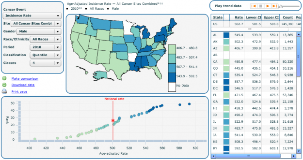
So if you’re looking for a weekend project, this is a good place to go. I’d probably start with the age breakdowns and work from there.
-
There comes a time late at night when your screen grows fuzzy and the code runs together. Mistakes happen, and with visualization, the bugs often manifest themselves into abstract images that sort of resemble data. The Accidental aRt tumblr highlights these visual mistakes through the eyes of buggy R code. Ooo, infinite rainbow.
-
The Simply Statistics unconference just started a few minutes ago. Tune in live below. (Or, catch the recorded version if you’re late.)
-
With a $250,000 grant from the Knight Foundation, Waldo Jaquith pushes forward with the U.S. Open Data Institute, an effort to link government data sources and organizations over the next year.
I’m convinced that we already have many of the right people, organizations and businesses working on open data in the United States. They just don’t know about each other. (The organization certainly won’t duplicate any of the efforts of the folks in this space.) And we have nearly all of the necessary software, but so much of it is only known within its narrow domain, despite its broad applicability. The institute will connect all of these entities, promote the work of those who are leading the way and provide supportive, nonjudgmental assistance to those who need help. We don’t have all the answers, but we know the folks who do. We want to amplify their message and connect them to new collaborators and clients.
This could be fun.
Recently for Members
Second Edition
 Visualize This: The FlowingData Guide to Design, Visualization, and Statistics (2nd Edition)
 Visualize This: The FlowingData Guide to Design, Visualization, and Statistics (2nd Edition)
New tools, refined process.
Browse by Chart Type See All →


