Nice. See also Lisa Simpson on the curve of knowledge. [via reddit]
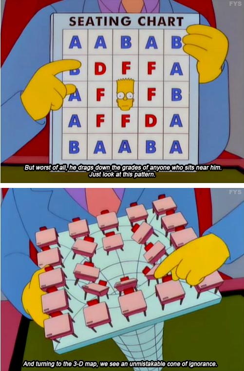
Bart Simpson and the cone of ignorance
Second Edition
 Visualize This: The FlowingData Guide to Design, Visualization, and Statistics (2nd Edition)
 Visualize This: The FlowingData Guide to Design, Visualization, and Statistics (2nd Edition)
New tools, refined process.