• Membership
  • Newsletter
  • Projects
  • Learning
  • About
  • Member Login
  • FlowingData Job Board, January 2014

    January 28, 2014

    Topic

    Job Board

    Looking for a job in data science, visualization, or statistics? There are openings on the board.

    Senior Game Analytics Specialist for Activision Publishing, Inc. in Santa Monica, CA

    Data Scientist for Thumbtack in San Francisco, CA

    Instructional Technologist for Quantitative Applications for Reed College in Portland, OR

  • Public transit times in major cities

    January 27, 2014

    Topic

    Maps  /  interactive, transportation

    Last year, WNYC made an interactive map that shows transit times in New York, based on where you clicked. Geography graduate student Andrew Hardin expanded on the idea for San Francisco, Seattle, Boulder, and Denver, with additional options and more granular simulations.
    Read More

  • Facebook debunks Princeton study

    January 24, 2014

    Topic

    Statistics  /  facebook, Princeton

    Researchers at Princeton released a study that said that Facebook was on the way out, based primarily on Google search data. Naturally, Facebook didn’t appreciate it much and followed up with their own “study” that debunks the Princeton analysis, blasted with a healthy dose of sarcasm. They also showed that Princeton is on their way to zero-enrollment.

    This trend suggests that Princeton will have only half its current enrollment by 2018, and by 2021 it will have no students at all, agreeing with the previous graph of scholarly scholarliness. Based on our robust scientific analysis, future generations will only be able to imagine this now-rubble institution that once walked this earth.

    While we are concerned for Princeton University, we are even more concerned about the fate of the planet — Google Trends for “air” have also been declining steadily, and our projections show that by the year 2060 there will be no air left

    Crud. Dibs on the oxygen tanks.

  • Bird flight paths

    January 23, 2014

    Topic

    Data Art  /  birds, nature

    Dennis Hlynsky, an artist and a professor at the Rhode Island School of Design, recorded videos of flying birds and in post-processing shows previous flight positions for less than a second. The results are beautiful. It’s like the video version of long-exposure photography.

    [arve url=”https://vimeo.com/81624972″ /]

    This is just one video in the series. Also see this, this, and this. [via Colossal]

  • Using data to find a girlfriend

    January 23, 2014

    Topic

    Statistics  /  dating, OkCupid, Wired

    Remember when Amy Webb created a bunch of fake male profiles to scrape data from two dating sites and analyze it to find a husband? Mathematician Chris McKinlay took a similar route to find a girlfriend (and now fiancee). However, unlike Webb who used a relatively small sample, McKinlay scraped data for thousands of profiles in his area and analyzed the data more thoroughly, in search of the perfect mate.

    For McKinlay’s plan to work, he’d have to find a pattern in the survey data—a way to roughly group the women according to their similarities. The breakthrough came when he coded up a modified Bell Labs algorithm called K-Modes. First used in 1998 to analyze diseased soybean crops, it takes categorical data and clumps it like the colored wax swimming in a Lava Lamp. With some fine-tuning he could adjust the viscosity of the results, thinning it into a slick or coagulating it into a single, solid glob.

    He played with the dial and found a natural resting point where the 20,000 women clumped into seven statistically distinct clusters based on their questions and answers. “I was ecstatic,” he says. “That was the high point of June.”

    He selected the two clusters most to his liking, looked at what interested the women, and then adjusted his profile accordingly. He didn’t lie. He just emphasized the traits that he possessed and that women tended to like. Then he waited for women to notice him.

    It’s kind of like he built a targeted advertising system for himself and then cast a really wide net. Even though McKinlay is engaged now, I still wonder if it actually worked or if something similar might have happened if he left it to chance. I like to believe in the latter. He did after all go on dates with 87 other people before finding a match.

  • A century of passenger air travel →

    January 22, 2014

    Topic

    Maps  /  flights, Guardian, Kiln

    Kiln and the Guardian explored the 100-year history of passenger air travel, and to kick off the interactive is an interactive map that uses live flight data from FlightStats. The map shows all current flights in the air right now. Nice.

    Be sure to click through all the tabs. They’re worth the watch and listen, with a combination of narration, interactive charts, and old photos.

    And of course, if you like this, you’ll also enjoy Aaron Koblin’s classic Flight Patterns.

  • Movie quotes as charts, poster edition

    January 21, 2014

    Topic

    Projects

    Famous movie quotesSince so many of you kind people asked, the movie-quotes-as-charts graphic is now coming to a poster near you. Take advantage of the early-bird pricing and pre-order the print now.

    The poster is 24 inches wide by 36 inches tall, printed on 80lb cover and with a matte finish. I’ll sign and hand-number each of them.

    I’ll take orders for a week, and then it’s off to the printers. Printing usually takes a week or two, depending on how many there are, and then I’ll roll and mail everything myself. So if all goes as planned, the posters go out in February.

    Thanks all for your interest. And one more time: Get your pre-order in here.

  • Disney MagicBands track your theme park activities

    January 21, 2014

    Topic

    Statistics  /  Disney, MagicBand

    You can now wear a MagicBand when you enter Disneyland to get a more personalized experience, and in return, the park gets to know what their customers are up to. John Foreman, the chief data scientist at MailChimp, describes the new data toy after a trip to the happiest place on Earth.

    What does Disney get out of the deal? In short, it tracks everything you do, everything you buy, everything you eat, everything you ride, everywhere you go in the park. If the goal is to keep you in the park longer so you’ll spend more money, it can build AI models on itineraries, show schedules, line length, weather, etc., to figure out what influences stay length and cash expenditure. Perhaps there are a few levers they can pull to get money out of you.

    I knew Disney imagineers kept track of park activity, such as line length and congestion areas, but this takes it to the next level. Is it weird that I’m curious how this would work at home?

  • Music timeline of plays and history

    January 17, 2014

    Topic

    Statistical Visualization  /  Google, interactive, music

    Two Google research groups, Big Picture and Music Intelligence, got together and made a music timeline baby.

    The Music Timeline shows genres of music waxing and waning, based on how many Google Play Music users have an artist or album in their music library, and other data (such as album release dates). Each stripe on the graph represents a genre; the thickness of the stripe tells you roughly the popularity of music released in a given year in that genre. (For example, the “jazz” stripe is thick in the 1950s since many users’ libraries contain jazz albums released in the ’50s.) Click on the stripes to zoom into more specialized genres.

    As you’d expect, the initial view is a stacked area chart that represents the popularity of genres over time, which feels fairly familiar, but then you interact with the stacks and it gets more interesting and almost surprisingly fast. The best part is the pointers to specific albums as you mouse over.

  • Famous Movie Quotes as Charts →

    January 16, 2014

    Topic

    Chart Everything  /  featured

    In celebration of their 100-year anniversary, the American Film Institute selected the 100 most memorable quotes from American cinema, and a few years ago, for kicks and giggles, I put the first eight quotes into chart form. I planned to chartify all 100, but I got distracted.

    Lately though, finishing what I started became my distraction. So here it is: the 100 most memorable quotes in chart form and I can finally put it to rest. See the big version for more detail.

    Also available in print.

  • Donald Duck family tree

    January 15, 2014

    Topic

    Network Visualization  /  Disney, Donald Duck, family tree

    The Donald Duck family tree is huge. Who knew? Above is only a sample. See the full version here.

  • Lexical distance between European languages

    January 14, 2014

    Topic

    Network Visualization  /  Europe, language

    Using data from linguistics research by Kostiantyn Tyshchenko, Teresa Elms clustered European languages in this network graph. If you look closely, you might wonder why English is considered a Germanic language. Elms explains:

    So why is English still considered a Germanic language? Two reasons. First, the most frequently used 80% of English words come from Germanic sources, not Latinate sources. Those famous Anglo-Saxon monosyllables live on! Second, the syntax of English, although much simplified from its Old English origins, remains recognizably Germanic. The Norman conquest added French vocabulary to the language, and through pidginization it arguably stripped out some Germanic grammar, but it did not ADD French grammar.

  • Map projections illustrated with a face

    January 13, 2014

    Topic

    Maps  /  face, projections

    Most people, at least those who visit sites like FlowingData, know about map projections. You have to do math to get the globe, a thing that exists in this 3-dimensional world, into a two-dimensional space. The often-noted scene from the West Wing explains a bit, some demos help you compare, and there are map games that highlight distortions.

    But, it can still be fuzzy because most of us don’t deal with the true shape and size of countries regularly. These figures from Elements of map projection with applications to map and chart construction, published in 1921, take a different route and place a face — something familiar — to show distortions. Foreheads get bigger, ears get smaller, noses change sizes, and projections are easier to understand. [via io9]

  • Religion and life expectancy

    January 10, 2014

    Topic

    Miscellaneous  /  humor

    Religion and life expectancy
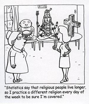
The person in this cartoon nailed it. I’m going to do the same starting this weekend, and I recommend that you do too, if you want to live longer.

    (Couldn’t find where this is from. Anyone know?)

  • A visual exploration of refugee migrations

    January 9, 2014

    Topic

    Maps  /  Ekene Ijeoma, Hyperakt, migration, refugees

    Hyperakt and Ekene Ijeoma visualized migrations over time and space in The Refugee Project. The interactive is based on United Nations data, which is naturally limited in scope, because it’s difficult to count undocumented migrations, but there is plenty to learn here about major political and social events in history.

    The map starts in 1975, and with each tick of a year, the circles adjust to show outgoing numbers. Mouse over a circle, and you can see estimates for where people went, which is represented with extending lines.

    Document icons appear over major event locations which provide more context about what happened in the country. This is key. I just wish there were more of them. It’d provide an even better history lesson.

  • Cherry picking years for random sports statements

    January 9, 2014

    Topic

    Statistical Visualization  /  d3js, interactive, sports

    When you watch sports, it can sometimes feel like the stat guy pulls random numbers for the talking heads to ponder, and you can’t help but wonder who significant the numbers actually are. Benjamin Schmidt shows all the possibilities for a common statement during baseball games, and it turns out there are a lot of statements to pick from.

    Statements of the form “Jack Morris won more games in the 1980s than anyone else” are fascinating. Although they’re true, they rest on cherry-picked years that may or may not illustrate a deeper truth in context. (And we see them all the time: see my college degrees cherry-picker for another area.) For baseball, there are thousands of statements just like the ones here that you can make about any single cumulative stat over the game’s history–10,296, to be exact. Printed out, all the statements you could make with the data here would take about 15,000 pages: this visualization lets you hone in on the patches of interest.

  • Facial hair trends over time

    January 8, 2014

    Topic

    Statistical Visualization  /  beards, economy

    In 1976, Dwight E. Robinson, an economist at the University of Washington, studied facial hair of the men who appeared in the Illustrated London News from 1842 to 1972 [pdf].

    The remarkable regularity of our wavelike fluctuations suggests a large measure of independence from outside historical events. The innovation of the safety razor and the wars which occurred during the period studied appear to have had negligible effects on the time series. King C. Gillette’s patented safety razor began its meteoric sales rise in 1905. But by that year beardlessness had already been on the rise for more than 30 years, and its rate of expansion seems not to have augmented appreciably afterward.

    Someone has to update this to the present. I’m pretty sure we’re headed towards a bearded peak, if we’re not at the top already.

  • Introducing R to a non-programmer, in an hour

    January 7, 2014

    Topic

    Coding  /  R

    Biostatistics PhD candidate Alyssa Frazee was tasked with teaching her sister, an undergraduate in sociology, how to use R. She had only one hour.

    Once you load in a dataset, things start to get fun. We learned a whole bunch of stuff from this data frame, like how to do basic tabulations and calculate summary statistics, how to figure out if you have missing data, and how to fit a simple linear model. This part was pretty fun because my sister started leading the session: instead of me saying “I’m going to show you how to do this,” it was her asking “Hey, could we make a scatterplot?” or “Do you think we could put the best-fit line on that plot?” I was really glad this happened — I hope it meant she was engaged and enjoying herself!

    This is the nice thing about R. There are so many built-in functions and packages that you can get something useful with a few lines of code, and you don’t really even have to know what a function is to get started (although you should eventually). Then you can go as far down the rabbit hole as you want.

  • Timeline shows a century of rock history

    January 6, 2014

    Topic

    Network Visualization  /  animation, music, rock

    Jessica Edmondson visualized the history of rock music, from foundations in the pre-1900s to a boom in the 1960s and finally to what we have now. Nodes represent music styles, and edges represent musical connections. There are a lot of them and as a whole it’s a screen of spaghetti, but it’s animated, which is key. It starts at the beginning and develops over time, so you know where to go and what to look at. Music samples for each genre is also a nice touch. [Thanks, Jessica]

  • Happy new year around the world

    January 6, 2014

    Topic

    Statistical Visualization  /  language, Twitter

    New Year’s is a worldwide event, but as we know, it doesn’t happen simultaneously everywhere. Midnight happens in different time zones and in various languages, so Krist Wongsuphasawat from Twitter visualized the event in an animated interactive, as people tweeted happy new year around the world. Press play and see how it happened.

    The best part is that UTC+01:00 area that covers Central Europe and Western Africa. Spikes in 16 languages by my count.

  • Page 227 of 392
  • <
  • 1
  • ...
  • 224
  • 225
  • 226
  • 227
  • 228
  • 229
  • ...
  • 392
  • >

Analyze, visualize, and communicate data usefully, beyond the defaults.

Become a member →

Recently for Members

May 15, 2025
Step Chart, Enhanced

May 8, 2025
When the data is not what it seems

May 1, 2025
Finding the Right Charts

April 24, 2025
Visualization Tools, Datasets, and Resources – April 2025 Roundup

April 17, 2025
Breaking Out of Chart Software Defaults

Browse by Chart Type See All →

Treemap Stacked Bar Chart Baseline Chart Difference Chart Cartogram Bar Chart Frequency Trails Unit Chart Chord Diagram

Browse By Topic

  • Visualization

    Seeing data

  • Maps

    Seeing geographic data

  • Infographics

    Explaining data

  • Networks

    Connecting data

  • Statistics

    Analyzing data

  • Software

    Working with data

  • Sources

    Getting data

  • Design

    Making data readable

Get the Book

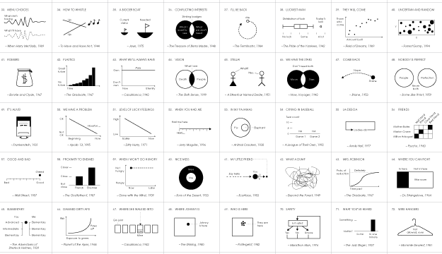
Visualize This: The FlowingData Guide to Design, Visualization, and Statistics

Available now.

Order: Amazon / Bookshop

Made by FlowingData

  • The Process

  • Data Underload

  • Chart Everything

  • Guides

  • Books

  • Shop

  • About
  • Contact
  • Newsletter
  • LinkedIn
  • Instagram
  • Bluesky
  • RSS
Copyright © 2007-Present FlowingData. All rights reserved.