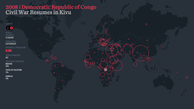
Hyperakt and Ekene Ijeoma visualized migrations over time and space in The Refugee Project. The interactive is based on United Nations data, which is naturally limited in scope, because it’s difficult to count undocumented migrations, but there is plenty to learn here about major political and social events in history.
The map starts in 1975, and with each tick of a year, the circles adjust to show outgoing numbers. Mouse over a circle, and you can see estimates for where people went, which is represented with extending lines.
Document icons appear over major event locations which provide more context about what happened in the country. This is key. I just wish there were more of them. It’d provide an even better history lesson.
 Visualize This: The FlowingData Guide to Design, Visualization, and Statistics (2nd Edition)