Most people, at least those who visit sites like FlowingData, know about map projections. You have to do math to get the globe, a thing that exists in this 3-dimensional world, into a two-dimensional space. The often-noted scene from the West Wing explains a bit, some demos help you compare, and there are map games that highlight distortions.
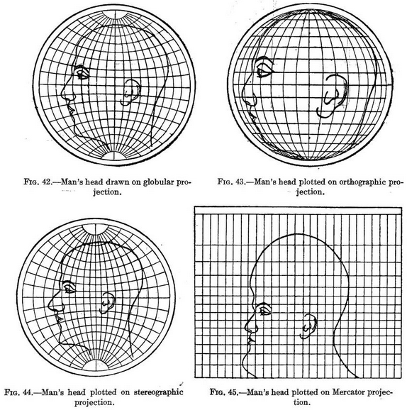
But, it can still be fuzzy because most of us don’t deal with the true shape and size of countries regularly. These figures from Elements of map projection with applications to map and chart construction, published in 1921, take a different route and place a face — something familiar — to show distortions. Foreheads get bigger, ears get smaller, noses change sizes, and projections are easier to understand. [via io9]
 Visualize This: The FlowingData Guide to Design, Visualization, and Statistics (2nd Edition)