• It’s just metadata. What can you do with that? Kieran Healy, a sociology professor at Duke University, shows what you can do, with just some basic social network analysis. Using metadata from Paul Revere’s Ride on the groups that people belonged to, Healy sniffs out Paul Revere as a main target. Bonus points for writing the summary from the point of a view of an 18th century analyst.

    What a nice picture! The analytical engine has arranged everyone neatly, picking out clusters of individuals and also showing both peripheral individuals and—more intriguingly—people who seem to bridge various groups in ways that might perhaps be relevant to national security. Look at that person right in the middle there. Zoom in if you wish. He seems to bridge several groups in an unusual (though perhaps not unique) way. His name is Paul Revere.

    You can grab the R code and dataset on github, too, if you want to follow along.

  • A few years ago I downloaded speed dating data from experiments conducted by…

  • Damien Hirst is an artist known for a number of works, one of those being his large production of spot paintings. There are over a thousand of them painted by him and his assistants, varying in size, number of dots, density, and color. Amanda Cox of The New York Times plotted paintings sold from 1999 to present, topping out at $3.4 million. That’s a whole lot of dottage.

  • The Onion tackles data privacy:

    “As a law-abiding resident of this nation, I have the right to do whatever I want without a shadowy organization recording my every move, unless of course it’s part of an electronic campaign designed to figure out, based on all of my emails and phone conversations, what types of clothes, shoes, and houseware products I like. Then it’s fine.” Sources later confirmed that Landler had posted a Facebook rant on the issue, which had generated a pop-up ad from a company that restores lost PC data.

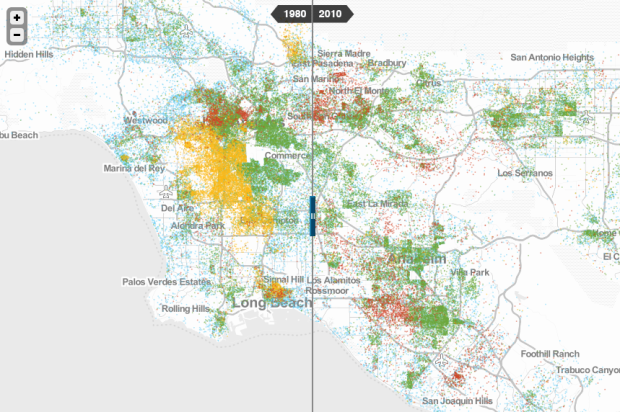
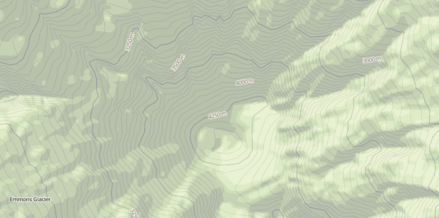
  • It seems like the technical side of map-making, the part that requires code or complicated software installations, fades a little more every day. People get to focus more on actual map-making than on server setup. Map Stack by Stamen is the most recent tool to help you do this.

    We provide access to different parts of the map stack, like backgrounds, roads, labels, and satellite imagery. These can be modified using straightforward controls to change things like color, opacity, and brightness. So within a few minutes you can have a map of anywhere in the world with dark green parks and blue buildings. You can get very precise with image overlays and layer effects, using layers as cut-out masks for other layers. Or just make a regular-looking map in the colors you want.

    The idea is to make it radically simpler for people to design their own maps, without having to know any code, install any software, or even do any typing.

    It’s completely web-based, and you edit your maps via a click interface. Pick what you want (or use Stamen’s own stylish themes) and save an image. For the time being, the service is open only from 11am to 5pm PST, so just come back later if it happens to be closed.

    See here for a taste of what others have done so far.

  • OpenStreetMap, the free wiki world map that offers up high quality geographic data, has grown a lot in the past eight years. The OpenStreetMap Data Report shows all these changes. Says the report: “The database now contains over 21 million miles of road data and 78 million buildings.”
    Read More

  • June 10, 2013

    Topic

    News  / 

    With all the stuff going on with surveillance and data privacy — especially the past week — it’s worthwhile to revisit this essay by Daniel J. Solove, a professor of law at George Washington University, on why privacy matters even if you “have nothing to hide.”

    “My life’s an open book,” people might say. “I’ve got nothing to hide.” But now the government has large dossiers of everyone’s activities, interests, reading habits, finances, and health. What if the government leaks the information to the public? What if the government mistakenly determines that based on your pattern of activities, you’re likely to engage in a criminal act? What if it denies you the right to fly? What if the government thinks your financial transactions look odd—even if you’ve done nothing wrong—and freezes your accounts? What if the government doesn’t protect your information with adequate security, and an identity thief obtains it and uses it to defraud you? Even if you have nothing to hide, the government can cause you a lot of harm.

    “But the government doesn’t want to hurt me,” some might argue. In many cases, that’s true, but the government can also harm people inadvertently, due to errors or carelessness.

    You might not have anything to hide right now, but maybe a random string of choices that was completely harmless looks a lot like something else a few years from now, to someone sniffing around the archives. The patterns when there are no patterns sort of thing. Personal data without the person. [via @hmason]

  • The Brewers Association just released data for 2012 on craft beer production and growth. The New Yorker mapped the data in a straightforward interactive.

    As of March, the United States was home to nearly two thousand four hundred craft breweries, the small producers best known for India pale ales and other decidedly non-Budweiser-esque beers. What’s more, they are rapidly colonizing what one might call the craft-beer frontier: the South, the Southwest, and, really, almost any part of the country that isn’t the West or the Northeast.

    Most articles and lists on craft beer tend to focus on total production and breweries, so California, a big state with a lot of people, always ends up on top. And as a Californian, I’m more than happy with my access to all the fine brews around here, but clearly, there are many more states to visit. RV trip anyone? [via @kennethfield]

  • Because every day is a good day to listen to Hans Rosling talk numbers. In this short video, Rosling uses Lego bricks to explain population growth and the gaps in wealth and carbon footprint.

  • When you talk to different people across the United States, you notice small differences in how people pronounce words and phrases. Sometimes different terms are used to describe the same thing. Bert Vaux’s dialect survey tried to capture these differences, and NC State statistics graduate student Joshua Katz mapped the data.
    Read More

  • Josh Orter takes back-of-the-napkin math to the next level with Stupid Calculations, which promises to turn practical facts into utterly useless ones. Stupid calculation number one is the size of a giant iPhone screen if you combined all the iPhone screens ever sold into one.

    The eye-glazing calculations are laid out below for those who appreciate the dirty work but, skipping ahead, the Kubrick-inspired monophone would stretch 5,059 feet into the sky and have a base measuring 2,846 feet across (Central Park is 2,640 feet wide). Its surface area would take in 2.07 billion square inches. That’s 14.39 million square feet or 330.54 acres. The new World Trade Center, by comparison, will have a surface area of 23 glass-clad acres, giving us enough screenage to watch Game of Thrones on all four sides of fourteen WTCs.

    See also how long it would it take to drink the water in an olympic-sized pool through a straw.

  • Using data from the London Fire Brigade, James Cheshire mapped 144,000 incidents in London.

    This map shows the geography of fire engine callouts across London between January and September 2011. Each of the 144,000 or so lines represents a fire engine (pump) attending an incident (rounded to the nearest 100m) and they have been coloured according to the broad type of incident attended. These incident types have been further broken down in the bar chart on the bottom right. False alarms (in blue), for example, can be malicious (fortunately these are fairly rare), genuine or triggered by an automatic fire alarm (AFA). As the map shows, false alarms – thanks I guess to AFAs in office buildings – seem most common in central London.

    It looks a lot like a sky of fireworks in this view. I bet a map for each category might help flesh out different patterns.

  • Microsoft researcher Kate Crawford describes several myths of big data. Myth #4: It makes cities smarter.

    “It’s only as good as the people using it,” Ms. Crawford said. Many of the sensors that track people as they manage their urban lives come from high-end smartphones, or cars with the latest GPS systems. “Devices are becoming the proxies for public needs,” she said, “but there won’t be a moment where everyone has access to the same technology.” In addition, moving cities toward digital initiatives like predictive policing, or creating systems where people are seen, whether they like it or not, can promote lots of tension between individuals and their governments.

    Yep. I hear those people things can introduce a lot of challenges.

  • Data Points: Visualization that Means SomethingIt seems like ages since we ran one of these.

    It’s hard to believe Data Points hit the shelves two months ago. (Thank you to everyone who got a copy!) It still feels brand new in my head. I kind of thought that time would slow down after I finished the book (and dissertation), but it seems to be moving even faster now.

    Anyways, if you’d like a chance to win a copy of Data Points blemished by my signature, leave a comment below by Wednesday, June 5, 2013 11:59pm PST. Tell us what your favorite number is and why. One entry per person please. I’ll pick a winner at random via sample() in R. Good luck.

    And of course, if you can’t wait, have never been lucky at cards, or want a blemish-free version of the book, you can get it at online and physical bookstores everywhere.

  • Members Only

    Also known as specialized or custom line charts. Figure out how to draw lines with the right spacing and pointed in the right direction, and you’ve got your slopegraphs.

  • The central limit theorem:

    In probability theory, the central limit theorem (CLT) states that, given certain conditions, the mean of a sufficiently large number of independent random variables, each with a well-defined mean and well-defined variance, will be approximately normally distributed.

    Victor Powell animated said random variables falling into a normal distribution (which should look familiar to those who have seen that ping pong ball exhibit in exploratoriums and science museums). Play around with the number of bins and delay time and watch it go.

  • June 2, 2013

    Topic

    Maps  / 

    Twitter mapped all the geotagged tweets since 2009. There’s billions of them, so as you might expect, roads, city centers, and pathways emerge. And it only took 20 lines of R code to make the maps.