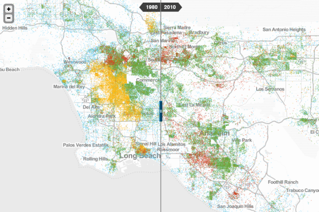
To better understand race and poverty, MetroTrends maps where people live whose income is below the poverty line.
The history, geography, and politics of individual metro regions all matter profoundly, and any serious policy strategy must be tailored to local realities.
To help take the policy conversation from the general to the specific, we offer a new mapping tool. It lets you explore changes from 1980 to 2010 in where poor people of different races and ethnicities lived, for every metropolitan region nationwide.
Each dot, color-coded by race, represents 20 people. So when you slide between views for 1980 and 2010, you see how areas have grown more or less diverse, increased or decreased in covered areas, and perhaps areas in need of more attention.
 Visualize This: The FlowingData Guide to Design, Visualization, and Statistics (2nd Edition)