Looking For the Closest Casino
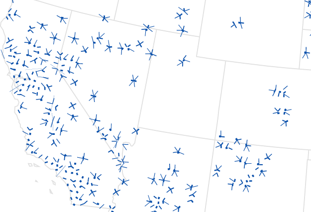
The New York Times covered casinos in the Northeast and noted that more than half of the population is within 25 miles of a casino. Naturally, I wondered what it is like in other parts of the country, so I sampled uniformly across the United States looking for the nearest casino. The results are shown in the map above.
Using the Google Places API, I took about 7,500 samples in twenty-mile increments, east to west and north to south. Of those samples, 36 percent of them are 25 miles or less from a casino.
This is significantly lower than the Northeast’s 50 percent mark, but keep in mind that the sample also includes uninhabited areas. Lots of deserts and mountains. So the national percentage for population is likely higher. After all, some 80 percent of the country’s population lives in urban areas.
However, it’s tough to say what the actual percentage is based on this data. Google classifies places as casinos based on their own criteria, and not everything is an actual casino by a legal definition. For example, there’s one Utah casino location in my sample, but gambling is illegal in the state, and there are no Indian reservation casinos. This particular place is a poker party business.
So think estimate rather than concrete count.
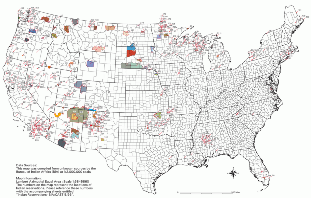
But, speaking of reservations, also of note: how this map coincides with Indian reservations, especially in the west.
In any case, if you’re in the mood to lose money, alongside a three-dollar prime rib dinner, it’s likely you’re not too far off.
Become a member. Support an independent site. Get extra visualization goodness.
See What You Get