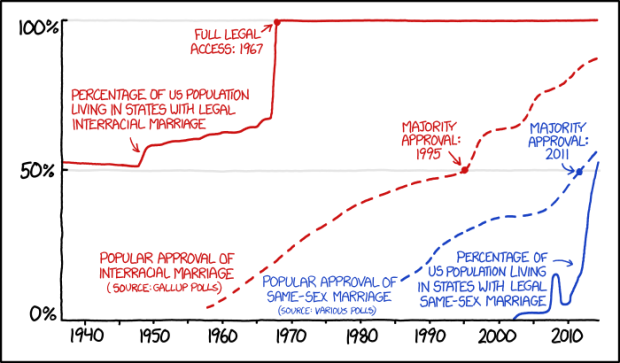
xkcd doing what xkcd does. Randall Munroe charts a brief timeline of interracial and same-sex marriage, through the lens of popular approval and population.
xkcd doing what xkcd does. Randall Munroe charts a brief timeline of interracial and same-sex marriage, through the lens of popular approval and population.
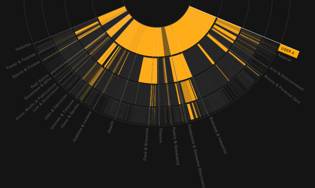
We browse online, we see ads, and we buy stuff. The better-targeted the ads are, the more likely that we buy stuff. So of course advertisers continue on ways to guess who you are and what you might want to increase the chances that you click and spend. Floodwatch, a Chrome extension by the Office for Creative Research and Ashkhan Soltani, lets you turn it around ever so slightly so that you can track what the advertisers serve you.
Read More
Philip Guo provides three practical reasons on why it’s worth pursuing a PhD.
Worth considering if you’re hemming and hawing about graduate school. Then again, it’s just as easy to come up with three practical reasons on why it’s not. Let’s not get into that though. Yeah, good luck with that.
Already on you way to a PhD? See also a survival guide to finishing.
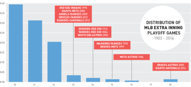
As a way to bring context to the rarity of the 18-inning baseball game between the Washington Nationals and the San Francisco Giants this past weekend, Ross Benes compared other things that are 9.1 standard deviations from the mean.
An NBA team losing by 83 points. A 13.4-inch penis.
I’m not so sure how comparable those distributions are (as in deviations from the mean doesn’t always mean the same thing), but it’s an interesting exercise. At the very least, it’s a new tumblr in the making.

Remember that time you were sitting by the fire reading The Lord of the Rings and thought to yourself, “Gee golly. I sure wish I could have a map of my hometown drawn in the style of J. R. R. Tolkien’s map of Middle-earth. That sure would be swell. Gee willikers. If only.” Well, your dreams have come true. Geographer Stentor Danielson has an Etsy store called Mapsburgh where he draws real cities as Tolkien maps. He also takes custom orders.
I thought I linked to csvkit a while ago, but apparently not. If you deal with CSV data at all, you should know about the utilities suite that helps you format and re-format in various ways. Christopher Groskopf posted a list of quick things you can do with csvkit.
Over the last several months there have been two major releases of csvkit. These releases have brought long-awaited features such as Python 3 support, a csvformat utility and a new csvkit tutorial—not to mention a slew of bug fixes. To celebrate the latest release, here are eleven of my favorite awesome things you can do with csvkit. If you aren’t using it yet, hopefully this will convince you.
Fun things include a quick one-liner to convert an Excel file to CSV, switching to JSON, and easy CSV export from a database.
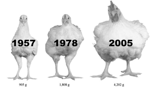
From Vox and research from Zuidhof et al., chickens are quite big these days.
The one on the left is a breed from 1957. The middle one is a 1978 breed. And the one on the right is a commercial 2005 breed called the Ross 308 broiler. They’re all the same age. And the modern breed is much, much, much larger.
When I was learning to cook, I’d follow recipes from my mom’s old cookbooks that she had when she was in college. One of my favorite dishes, steamed chicken with ginger and scallions, called for a three- to four-pound chicken. It totally screwed up my cooking times, and we ended up with many undercooked and overcooked chickens.
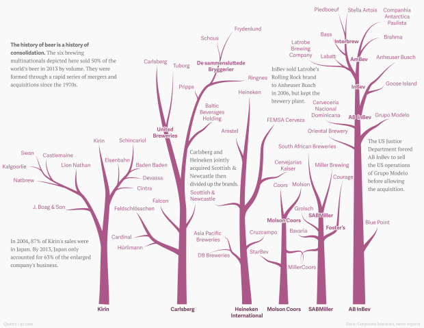
With Anheuser-Busch InBev rumored to have an interest in acquiring SABMiller and SABMiller trying to acquire Heineken, David Yanofsky for Quartz had a look at the structure of global beer distribution. The companies above, summing to six big beer distributors, accounted for half of the world’s beer sales, by volume.
This is important. And sorry AB InBev, FlowingData county ales isn’t for sale, no matter how many millions of dollars you throw my way. I’m serious. Stop calling me.
See also the network of beer brands and soda pop. And the bourbon family tree. And the much more dispersed wine industry.

Can you experience data? Sometimes visualization gets you part of the way there, putting data into context, serving as a trigger for your memory, and all that. But only so much can happen through the computer screen.
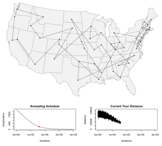
In a nutshell, the traveling salesman problem is as follows: “Given a list of cities and the distances between each pair of cities, what is the shortest possible route that visits each city exactly once and returns to the origin city?” Todd Schneider made an interactive that lets you punch in the cities yourself and then watch the process look for an optimum route. Fun to play with even if you’re not into processes. [Thanks, Todd]
After you’ve collected data about yourself for a while, you tend to go one of two ways. You either quit completely because it’s no longer interesting, or you obsesses over your data points constantly trying to one-up yourself. David Sedaris took the latter and wrote about his experience for the New Yorker.
At the end of my first sixty-thousand-step day, I staggered home with my flashlight knowing that I’d advance to sixty-five thousand, and that there will be no end to it until my feet snap off at the ankles. Then it’ll just be my jagged bones stabbing into the soft ground. Why is it some people can manage a thing like a Fitbit, while others go off the rails and allow it to rule, and perhaps even ruin, their lives? While marching along the roadside, I often think of a TV show that I watched a few years back—”Obsessed,” it was called. One of the episodes was devoted to a woman who owned two treadmills, and walked like a hamster on a wheel from the moment she got up until she went to bed. Her family would eat dinner, and she’d observe them from her vantage point beside the table, panting as she asked her children about their day. I knew that I was supposed to scoff at this woman, to be, at the very least, entertainingly disgusted, the way I am with the people on “Hoarders,” but instead I saw something of myself in her. Of course, she did her walking on a treadmill, where it served no greater purpose. So it’s not like we’re really that much alike. Is it?
I wonder which direction people choose when they start to track their heartbeat with the Apple Watch next year. My hope is for a peaceful middle ground, but I suspect it’ll fall into the category of not-that-interesting-after-first-week.

As you may or may not know, climate change could bring with it other effects besides our average days getting warmer. Flooding is one of these other things. Based on data from research by Climate Central, Gregor Aisch, David Leonhardt and Kevin Quealy for the New York Times mapped flood risk by country with a cartogram.
Globally, eight of the 10 large countries most at risk are in Asia. The Netherlands would be the most exposed, with more than 40 percent of its country at risk, but it also has the world’s most advanced levee system, which means in practice its risk is much lower.
Some countries in Asia may choose to emulate the Dutch system in coming decades, but some of the Asian nations are not wealthy and would struggle to do so.
Each rectangle represents a country, and the size represents how many people are expected to experience regular flooding by the year 2100. Color indicates the estimated percentage of a country’s population to feel the effects. So as expected, you see a lot of big rectangles and dark colors in the Asian countries.
See also Stamen Design’s flood maps, also in collaboration with Climate Central, from a couple of years ago.

What do you get when you put LEDs on a system of drones and then program them to fly in formation? Spaxels from the Ars Electronic Futurelab.
Read More
No Ceilings: The Full Participation Project, an initiative from the Clinton Foundation, aims to highlight progress towards global gender equality using data.
Read More

This is beautiful to watch. Graham Roberts, Daniel J. Wakin, and others from the New York Times, along with OpenShades, sat down with the Kronos Quartet to collect point cloud data. The visualization of the data shows the musicians at work.
One day earlier this year at a studio in downtown Manhattan, the members — David Harrington and John Sherba, violinists; Hank Dutt, violist; and Sunny Yang, cellist — were game for an experiment: to create a video that would serve as a new way to explain the special mystery of how a quartet communicates. They found themselves surrounded by a battery of laptops, video cameras and microphones as well as sensors that turned their movements into data that eventually rendered the players kind of as “dot clouds” who would appear and disappear according to their individual participation in the music.
Brings back memories of Radiohead’s House of Cards music video from 2008.
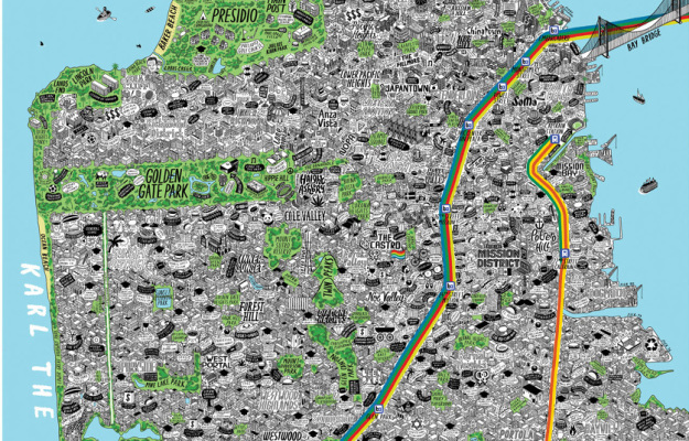
Maps can be about a lot of things, from strictly geography and location down to the individuals who reside in an area. Illustrator Jenni Sparks embeds herself in a city, takes copious notes, and draws detailed maps about what she learns. Her style lends to the community side of the spectrum.
Read More

Google explained the process of a web search with a scrolling infographic. Might be old news for some, but the layout and flow work nicely, guiding you through each step. [Thanks, @amyleerobinson]
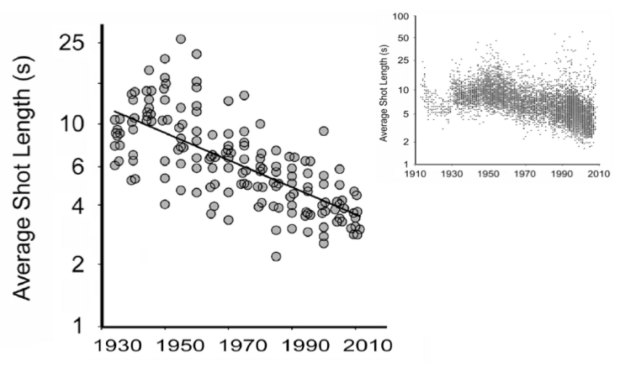
We know that movies have changed over the decades. We’ve seen it in declining ratings and box office hits versus Oscar winners. However, these are changes that come along with movies rather than the movies themselves. Cornell University psychologist James Cutting looked closer at the construction of movies over the years, such as shot length, amount of motion, and use of light.
The charts above show a decrease in shot length (smaller sample of movies on the left and larger sample in the top right).
The average shot length of English language films has declined from about 12 seconds in 1930 to about 2.5 seconds today, Cutting said. At the Academy event he showed a scatter plot with data from the British film scholar Barry Salt, who’s calculated the average shot duration in more than 15,000 movies made between 1910 and 2010. That’s a lot of shots. In a 2010 study, Cutting found an average of 1,132 shots per film in a smaller sample of 150 movies made between 1935 and 2010; the King Kong remake, incidentally, had the most: A whopping 3,099 shots packed into 187 minutes.
The decrease isn’t quite as linear as the smaller sample shows, as you can see in the larger one. But the downwards trend seems clear. I hope the trend continues towards movies composed entirely of one-frame scenes.

You have a list of things that can be ordered by different values. Let them sort themselves out.
 Visualize This: The FlowingData Guide to Design, Visualization, and Statistics (2nd Edition)
New tools, refined process.