-
After you’ve collected data about yourself for a while, you tend to go one of two ways. You either quit completely because it’s no longer interesting, or you obsesses over your data points constantly trying to one-up yourself. David Sedaris took the latter and wrote about his experience for the New Yorker.
At the end of my first sixty-thousand-step day, I staggered home with my flashlight knowing that I’d advance to sixty-five thousand, and that there will be no end to it until my feet snap off at the ankles. Then it’ll just be my jagged bones stabbing into the soft ground. Why is it some people can manage a thing like a Fitbit, while others go off the rails and allow it to rule, and perhaps even ruin, their lives? While marching along the roadside, I often think of a TV show that I watched a few years back—”Obsessed,” it was called. One of the episodes was devoted to a woman who owned two treadmills, and walked like a hamster on a wheel from the moment she got up until she went to bed. Her family would eat dinner, and she’d observe them from her vantage point beside the table, panting as she asked her children about their day. I knew that I was supposed to scoff at this woman, to be, at the very least, entertainingly disgusted, the way I am with the people on “Hoarders,” but instead I saw something of myself in her. Of course, she did her walking on a treadmill, where it served no greater purpose. So it’s not like we’re really that much alike. Is it?
I wonder which direction people choose when they start to track their heartbeat with the Apple Watch next year. My hope is for a peaceful middle ground, but I suspect it’ll fall into the category of not-that-interesting-after-first-week.
-

As you may or may not know, climate change could bring with it other effects besides our average days getting warmer. Flooding is one of these other things. Based on data from research by Climate Central, Gregor Aisch, David Leonhardt and Kevin Quealy for the New York Times mapped flood risk by country with a cartogram.
Globally, eight of the 10 large countries most at risk are in Asia. The Netherlands would be the most exposed, with more than 40 percent of its country at risk, but it also has the world’s most advanced levee system, which means in practice its risk is much lower.
Some countries in Asia may choose to emulate the Dutch system in coming decades, but some of the Asian nations are not wealthy and would struggle to do so.
Each rectangle represents a country, and the size represents how many people are expected to experience regular flooding by the year 2100. Color indicates the estimated percentage of a country’s population to feel the effects. So as expected, you see a lot of big rectangles and dark colors in the Asian countries.
See also Stamen Design’s flood maps, also in collaboration with Climate Central, from a couple of years ago.
-

What do you get when you put LEDs on a system of drones and then program them to fly in formation? Spaxels from the Ars Electronic Futurelab.
Read More -

No Ceilings: The Full Participation Project, an initiative from the Clinton Foundation, aims to highlight progress towards global gender equality using data.
Read More -

This is beautiful to watch. Graham Roberts, Daniel J. Wakin, and others from the New York Times, along with OpenShades, sat down with the Kronos Quartet to collect point cloud data. The visualization of the data shows the musicians at work.
One day earlier this year at a studio in downtown Manhattan, the members — David Harrington and John Sherba, violinists; Hank Dutt, violist; and Sunny Yang, cellist — were game for an experiment: to create a video that would serve as a new way to explain the special mystery of how a quartet communicates. They found themselves surrounded by a battery of laptops, video cameras and microphones as well as sensors that turned their movements into data that eventually rendered the players kind of as “dot clouds” who would appear and disappear according to their individual participation in the music.
Brings back memories of Radiohead’s House of Cards music video from 2008.
-

Maps can be about a lot of things, from strictly geography and location down to the individuals who reside in an area. Illustrator Jenni Sparks embeds herself in a city, takes copious notes, and draws detailed maps about what she learns. Her style lends to the community side of the spectrum.
Read More -

Google explained the process of a web search with a scrolling infographic. Might be old news for some, but the layout and flow work nicely, guiding you through each step. [Thanks, @amyleerobinson]
-
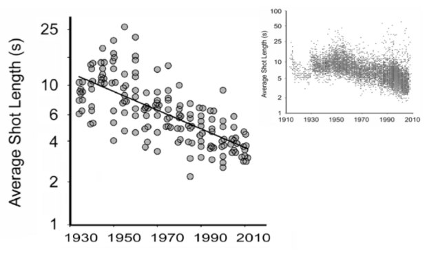
We know that movies have changed over the decades. We’ve seen it in declining ratings and box office hits versus Oscar winners. However, these are changes that come along with movies rather than the movies themselves. Cornell University psychologist James Cutting looked closer at the construction of movies over the years, such as shot length, amount of motion, and use of light.
The charts above show a decrease in shot length (smaller sample of movies on the left and larger sample in the top right).
The average shot length of English language films has declined from about 12 seconds in 1930 to about 2.5 seconds today, Cutting said. At the Academy event he showed a scatter plot with data from the British film scholar Barry Salt, who’s calculated the average shot duration in more than 15,000 movies made between 1910 and 2010. That’s a lot of shots. In a 2010 study, Cutting found an average of 1,132 shots per film in a smaller sample of 150 movies made between 1935 and 2010; the King Kong remake, incidentally, had the most: A whopping 3,099 shots packed into 187 minutes.
The decrease isn’t quite as linear as the smaller sample shows, as you can see in the larger one. But the downwards trend seems clear. I hope the trend continues towards movies composed entirely of one-frame scenes.
-

How to Make an Animated, Self-Sorting List
You have a list of things that can be ordered by different values. Let them sort themselves out.
-
When you hear about sports analytics in the news or when announcers talk about it during a game, it seems like really advanced stuff is going on behind the scenes. There must be huge computers chugging away at tons of data finding the best player for a team, the best defensive scheme against other teams, and how to get the most bang for the buck. There must be genius Billy Beane assistants for every team of every sport now. Right? Right?
But then you see a job listing for the Director of Basketball Analytics of the Brooklyn Nets and remember that sports analytics is still in its early stages.
The duties and responsibilities section sounds fine. The qualifications section, less so. You have to be good at Microsoft Office and Outlook, you have to be a well-balanced and sane person who doesn’t look like a bum, and you must be able to lift at least ten pounds.
Nice. That pretty much rules me out completely.
-
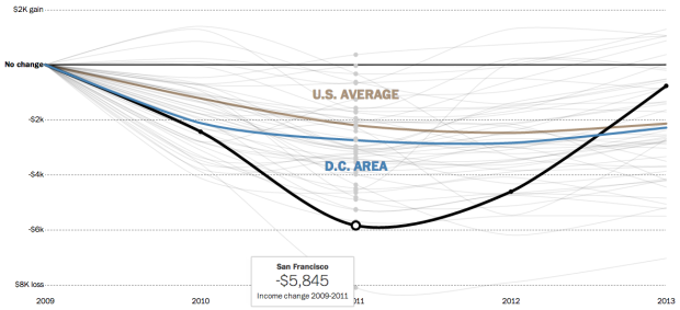
Since the recession, it’s taken a while for household incomes to come back to where they were in 2009. In most parts of the country, incomes are still lower, however, it appears they are making their way back to 2009 levels. With the Census Bureau’s recent release of data from their American Community Survey, the Washington Post charted the annual difference from 2009 to 2013.
Each line represents a metropolitan area’s difference in household income of a current year, compared to that of 2009. So the closer to or higher above the thin black baseline the better.
-
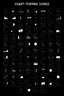 Today is the last day to pre-order a song chart poster. Now is the best time to get it, since after this it’s probably going to cost like a billion times more. Bonus: It’s also a great way to support FlowingData.
Thanks to all those who ordered already. I’m expecting to ship late October.
P.S. There’s discounted shipping when you order more than one or order it along with the famous movie quotes poster.
-
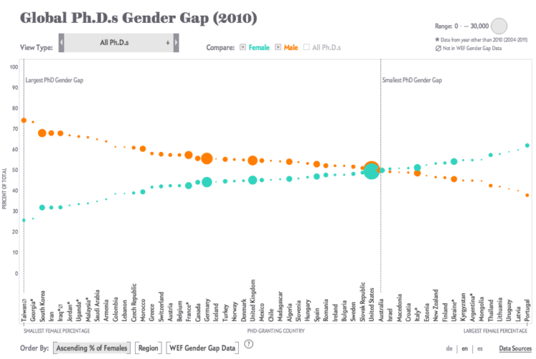
Periscopic, for Scientific American, visualized the number of PhDs awarded in various countries. You might expect men to be in high percentages and women to be in low, but it’s not always in that direction.
In the U.S., women are going to college and majoring in science and engineering fields in increasing numbers, yet here and around the world they remain underrepresented in the workforce. Comparative figures are hard to come by, but a disparity shows up in the number of Ph.D.s awarded to women and men. The chart here, assembled from data collected by the National Science Foundation, traces the gender gap at the doctoral level for 56 nations. The situation in individual countries varies widely, but as the numbers make clear, there are interesting exceptions to the global trend.
Each view shows a vertical dotted line to indicate where PhDs awarded are an even split between men and women. To the left of that dotted line shows where men earn more PhDs than women, and on the right, where women earn more than men.
-
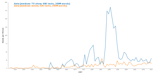
Movies and television shows often reflect cultural trends of the time they are made in. Even movies that take place during the past or future can say something about the present through metadata or production style. Benjamin Schmidt, an assistant professor of history at Northeastern University, provides a tool that lets you see trends in movie and television dialogue.
Read More -

You’ve likely seen the classic Powers of Ten video from 1977. It starts on an individual and continues to zoom out farther to a view of galaxies. The video provides a sense of scale that makes really big (and really small) numbers more relatable. We’re just not very good at picturing scales beyond a certain range.
So when you hear that retired baseball player Derek Jeter took an estimated 342,000 swings during his professional career, you get that it’s a lot, but only kind of. The New York Times went all Powers of Ten on the Jeter swing count to help you see better.
The piece starts with a single swinging Jeter, and as you scroll down you get the average swings per at-bat, then practice swings per game. Keep going, and you get the career total.
-
Graphic designer Txaber created beer can labeling to match the typical color of each beverage to its Pantone color.
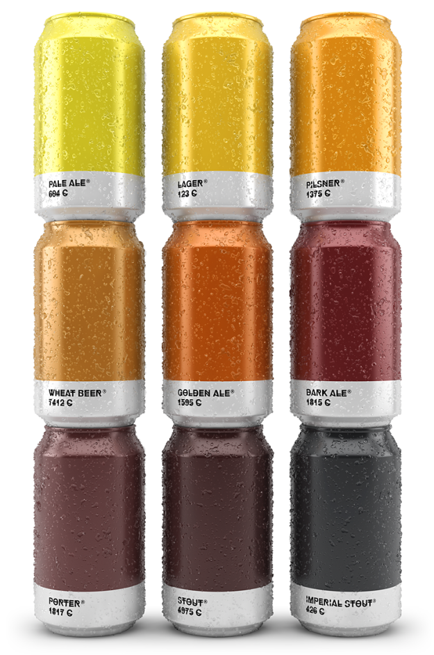
I probably wouldn’t buy beer with this labeling though. Usually you look for more complexity in your beverage, and these colored cans say flat and single-noted beer to me. Fun though. And maybe useful for beer beginners. [via Boing Boing]
-
Recurring TED talker Hans Rosling returns with his son and Gapminder Foundation co-founder Ola Rosling and an update on their latest work: the Ignorance Project. They hope to shift people’s biased perception of world progress towards the statistics — and to surpass chimps in correctness.
The audience quiz and real-time results work perfectly. I’m guessing the audience answers on their keypads, Ola enters the results backstage, and then the audience sees the finished slide by the time Hans gets there.
-

In high school health class, where I learned about contraceptives and the dangers of pre-marital sex, my teacher spouted rates to scare. He would say something like condoms are 98 percent effective but never explained what that meant. Do they break 2 percent of the time? Do couples get pregnant 2 percent of the time? STDs?
These charts from Gregor Aisch and Bill Marsh might help. They show the probability of an unplanned pregnancy, categorized by contraceptive and over a span of ten years. The top solid lines represent probabilities with “typical use” and the dashed lines on the bottom represent probabilities with “perfect use.”
Maybe it’s time for better instructions on how to use these things.
Update: The calculation of long-term probabilities is likely on the pessimistic side and makes too many assumptions about the data and population. Andrew Whitby critiques.
-
Malke Rosenfeld uses percussive dance to teach math to her elementary students. The program is called Math in Your Feet. Through learning dance patterns, students also pick up on math concepts such as “congruence, symmetry, transformation, angles and degrees, attributes, pattern recognition, symbols, and mapping on a coordinate grid.” Rosenfeld explains in the video below.
Too bad it’s not learning dance through math. I could’ve used some carefully drawn diagrams to get through the awkward dance portion of physical education.

Recently for Members
Browse by Chart Type See All →


Browse By Topic
Get the Book
 Visualize This: The FlowingData Guide to Design, Visualization, and Statistics
 Visualize This: The FlowingData Guide to Design, Visualization, and Statistics
Available now.