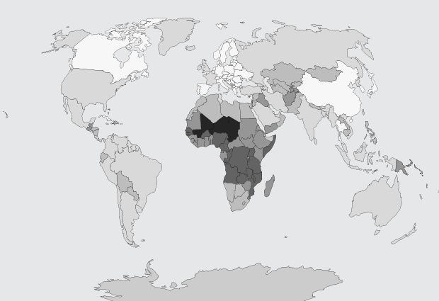
There are an estimated 60 million more men than women on this planet, based on data from World Bank. David Bauer takes a look at the places where the male majority is largest.
Read More
-
-
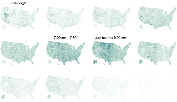
We don’t all start our work days at the same time, despite what morning rush hour might have you think.
-

In Soundweaving, Zsanett Szirmay used embroidery as a score to feed into a music box. Each stitching square is a punch hole, and because of the repeating patterns in “embroidered shirts and pillows from the Transylvanian Bukovina,” the results aren’t so farfetched as musical notes.
Read More -
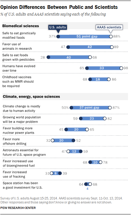
Pew Research Center released a report that compares the public and scientists’ views on science and society.
On some things, such as the space station, fracking, and bioengineered fuel, U.S. adults and scientists a part of the American Association for the Advancement of Science share similar sentiments. On other issues, such as genetically modified foods, animals in research, and climate change, there are big differences.
-
Here’s a fun searchable map from the New York Times. Enter a street’s name, and you can see how many other streets have the same name in other states. Based on Zillow data, you also get a quick comparison of estimated worth of houses on your street versus homes with the same street name but different suffix.
Read More -
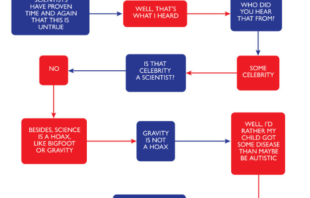
Yes. Yes. Yes. Yes. Yes. Yes. Yes. Yes. Yes. Yes. Yes. Yes. Yes. Yes. Yes. Yes. Yes. Yes. Yes. Yes. Yes. Yes. Yes. Yes. Yes. Yes. Yes. Yes. Yes. Yes. Yes. Yes. Yes. Yes. Yes. Yes. Yes. Yes. Yes. Yes. Yes. Yes. Yes. Yes. Yes. Yes. Yes. Yes. Yes. Yes. Yes. Yes. Yes. Yes. Yes. Yes. Yes. Yes. Yes. Yes.
-

It’s a common belief that if someone has a medical condition, a patient can take a treatment and the condition gets better or goes away. That is, improvement is directly related to intake. However, as it turns out, there’s often a good chance the patient would have gotten better without the treatment. There’s also a chance a treatment does nothing.
Austin Frakt and Aaron E. Carroll for the Upshot describe these chances through a metric called number needed to treat, or N.N.T. The simple animations throughout the article provide a great dose of perspective to the odds.
-
A data-centric look at New England Patriots fumble rates at home made the rounds this week. The most cited tidbit was that there is only a 1 in 16,233 chance that the Patriots achieved the lower rate via randomness. Therefore, the Patriots must have cheated. Gregory J. Matthews and Michael Lopez explain, finding by finding, why the results from Sharp Football Analysis are suspect.
Even if you’re not into football, read it for the statistics lesson.
Read More -

I don’t know exactly how much data NASA has in the bank, but I think it’s a lot. Explained in the video below, they estimated the age of ice layers in Greenland by flying a plane over the Greenland Ice Sheet and pulsing radar to gather information.
Read More -
Celebrating the 100th year of the National Geographic cartographic department, they provide a truncated roundup of the thousands of maps they’ve made over the past century. I liked this tidbit about the Germany map above:
Our maps haven’t just chronicled history; they’ve made it. General Dwight D. Eisenhower carried our map of Germany during his 1945 offensive. When a B-17 carrying Admiral Chester Nimitz got lost in a rainstorm, the pilot landed safely using the Society’s map of the Pacific war theater. The map, Nimitz later wrote Gilbert H. Grosvenor, “lent an unexpected but most welcome helping hand.”
It’s true. Maps, even on paper, can be useful.
-

John Edmark made some pretty things.
Read More -
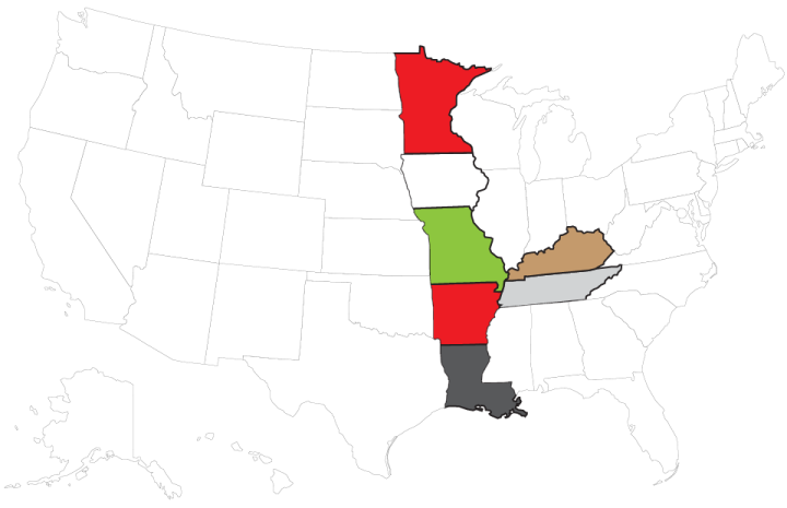
Choropleth Maps and Shapefiles in R
Fill those empty polygons with color, based on shapefile or external data.
-
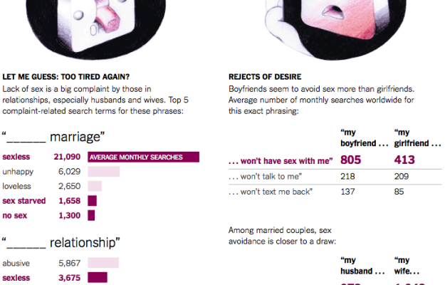
Seth Stephens-Davidowitz continues with his Google search data-related op-eds for the New York Times. This time he looks at the insecurities in sex, based on the search volume of various phrases.
Interesting. But preface the results with a big fat question of sample population before you make too many conclusions.
For example, a straightforward conclusion from the above graphic is that boyfriends avoid sex way more than girlfriends. That seems off. Could it be that boyfriends avoiding sex confuses the girlfriends more than the other way around, thus making it more likely for girlfriends to search?
-
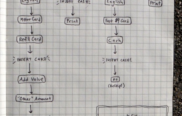
The process to purchase a MetroCard for the New York Subway is different from the process to purchase tickets for the Bay Area Rapid Transit in San Francisco. From the flowchart above by Aaron Reiss, it’s clear that it takes a lot more screen touches to get a MetroCard, but that’s only part of the story. The interesting part is why the two systems’ machines are so different. Different timing means different goals.
-
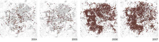
The simple analysis is to approach data blind, as machine output. But this almost always produces an incomplete analysis and a detached, less than meaningful visualization. Jacob Harris, a developer at the New York Times, talks context, empathy, and what the dots represent.
In reference to the New York Times’ map of deaths in Baghdad after receiving the Wikileaks war logs:
Before it was a final graphic though, it was a demo piece I hastily hacked into Google Earth using its KML format. I remember feeling pretty proud of myself at how cool even a crude rendering like this looked, and the detailed work I had done to pull out all the data within reports to see these dots surge and wane as I dragged the slider. Then I remembered that each of those data points was a life snuffed out, and I suddenly felt ashamed of my pride in my programming chops. As data journalists, we often prefer the “20,000 foot view,” placing points on a map or trends on a chart. And so we often grapple with the problems such a perspective creates for us and our readers—and from a distance, it’s easy to forget the dots are people. If I lose sight of that while I am making the map, how can I expect my readers to see it in the final product?
-
Think big data, and it’s tough not to associate it with big corporations who have their own interests in mind. Use data. Make money. It doesn’t have to always be like that though. Jen Lowe, for the Deep Lab Lecture Series, talks about reclaiming some of that power with silent gestures through the web and using data for good.
Read More -
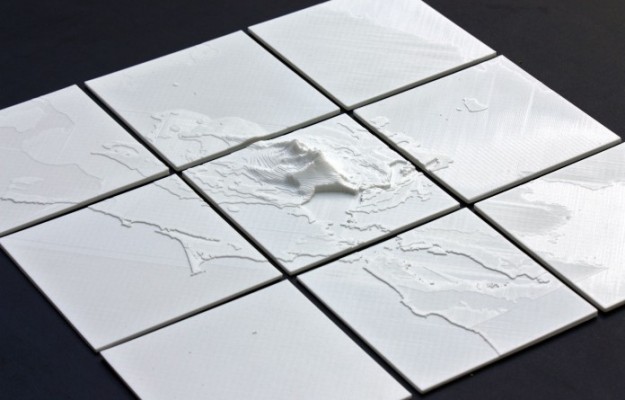
This seems like fun. The NodeJS package shp2stl by Doug McCune lets you convert a shapefile to a 3-D model, which can then send to your favorite 3-D printer (because you know we all have at least two of them lying around). Assuming you have NodeJS setup, simply point the package to your shapefile, specify which attribute to use for height, and presto changeo there’s your 3-D model.
-
In efforts to emphasize the importance of the library (very), the British Library released a video that simply shows ten minutes of book checkouts. Nothing fancy. Just an updating log of activity — and yet there’s something mesmerizing about it.
Read More

Recently for Members
Second Edition
 Visualize This: The FlowingData Guide to Design, Visualization, and Statistics (2nd Edition)
 Visualize This: The FlowingData Guide to Design, Visualization, and Statistics (2nd Edition)
New tools, refined process.
Browse by Chart Type See All →


