
Here is the good stuff for October.
Here is the good stuff for October.
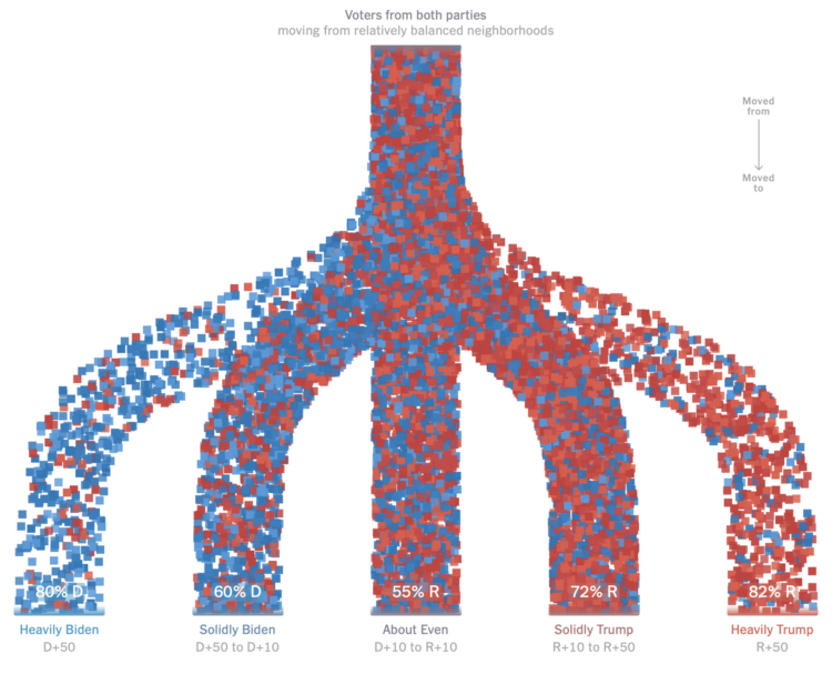
For NYT Upshot, Ronda Kaysen and Ethan Singer compared current voter registration data against 2020 data to estimate how people moved away from politically balanced neighborhoods. Those who voted for a given party were much more likely to move to places that were similar politically.
Particle-based flow charts are used to show the movements. They initially show Democrat and Republican moves separately, which provide percentage breakdowns between levels of political leanings. The percentages in the combined view above are less clear though. Are they the percentages of people who are affiliated with a party in those areas now?
In any case, the increased polarization doesn’t seem great for the country.
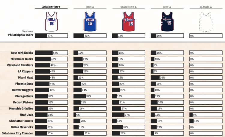
In NBA basketball, the home team used to almost always wear a white uniform and the away team would wear a non-white uniform that matched one of their team colors. Now it’s kind of all over the place. I assume it’s because Nike wanted to sell more jerseys. For The Pudding, Tyler Machado quantified the shift by manually counting uniform usage during the 2013-14 season and comparing it against data from last season collected via NBA LockerVision.
Select your team to see the changes, unless your team is the Chicago Bulls, in which case, not much has changed.
I’m so glad the basketball season is back.

For NYT Opinion, Gus Wezerek compared ad views per household:
To figure out which party won this election’s ad war, Times Opinion dug into data on 3.7 million political ad airings on broadcast TV from Aug. 1 to Oct. 25. We combined those records, provided by AdImpact, with TV viewership estimates from Comscore to calculate how many households saw each ad.
The inner semicircles represent views for presidential ads, and the less prominent outer semicircles represent views for other ads from the respective party.
I could’ve sworn I’ve seen this view for something election-related years ago, but I could not find it. The closest I could find was word usage during national conventions with vertically sliced circles and election ad topics with slice squares. Please let me know if you remember, as it will be lurking at the back of my mind until I do.
By now you’ve seen or chosen to ignore forecasts that provide probabilities for a presidential candidate winning the election. Run enough elections with a given probability and the results converge. On the other hand, individual outcomes are a lot less certain.

Early voting isn’t coming in as hot as in 2020, but there are still a lot. For the Washington Post, Alyssa Fowers and Hannah Recht are using estimates from Associated Press to keep a running tally nationally and by state. There are 46.4 million early votes as of October 28.
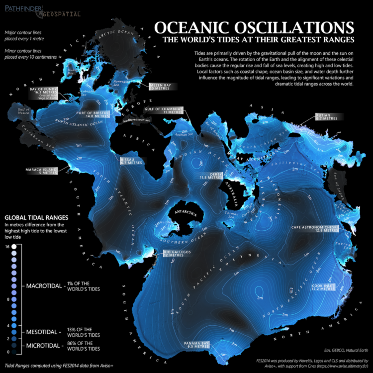
From Dave Taylor, this world map shows tidal ranges, from microtidal to macrotidal:
Created using FES2014 data from Aviso+, this map displays maximum tidal ranges (the difference between the lowest low tide and highest high tide) around the world. As tides are primarily an ocean phenomenon, the data is presented in an ocean-centric Spilhaus projection.
It’s soothing, almost like staring out at the ocean. In case you’re unfamiliar with the Spilhaus projection like I was, here’s more information. It emphasizes the connectedness of the large bodies of water surrounded by land instead of the other way around.
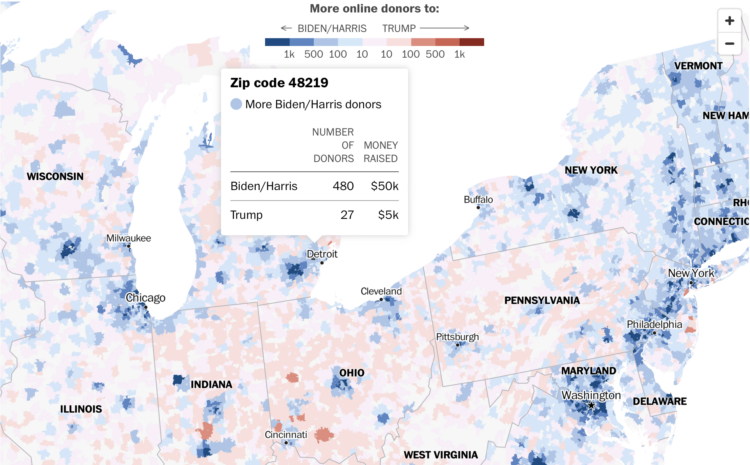
Using a combination of Federal Election Commission filings and voter registration, the Washington Post shows which presidential campaign has received more money from donors from each ZIP code. It’s only online donations, so it’s just a subset of where the money is coming from, but I imagine offline donations are tightly correlated.

This week we imagine what we would do if the tool we relied on the most were to disappear.

For NYT Opinion, Patrick Ruffini, with graphics by Quoctrung Bui and Aileen Clarke, argues that the election outcome is less about swing states and more about pockets within each state:
The best way to tell how a state will vote is to build from the precinct level up, to dig into neighborhood data and to look at the differences in demographics and voting patterns across those precincts. Using this approach, I assembled more than 100 political microcommunities in the battleground states.
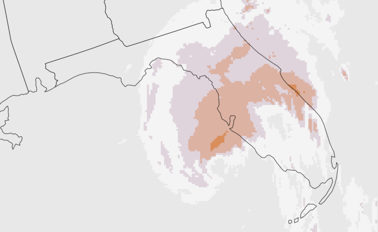
Weather. Data. Map. Animation. They go well together to show sudden changes over time.
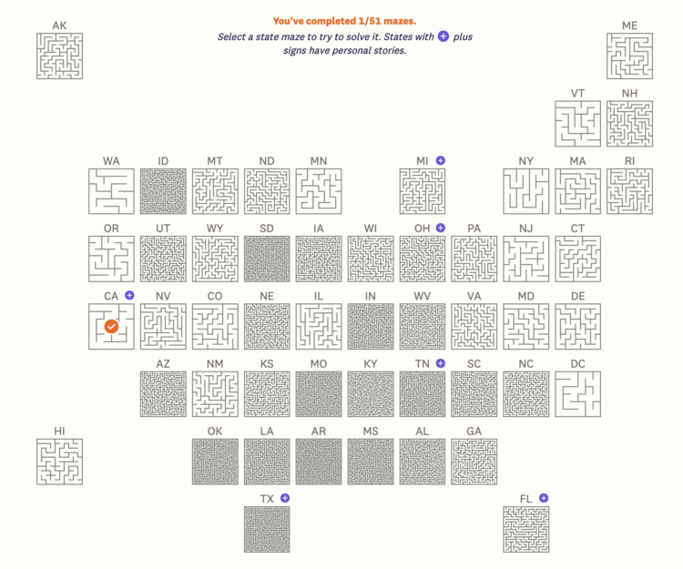
Speaking of grid maps and abortion access, Jan Diehm and Michelle Pera-McGhee, for The Pudding, estimated a complexity score (with variables from the Guttmacher Institute) for each state and made mazes to match the scores. Mazes are organized as a state grid map initially, but you can also sort by complexity, alphabetically, or by region.
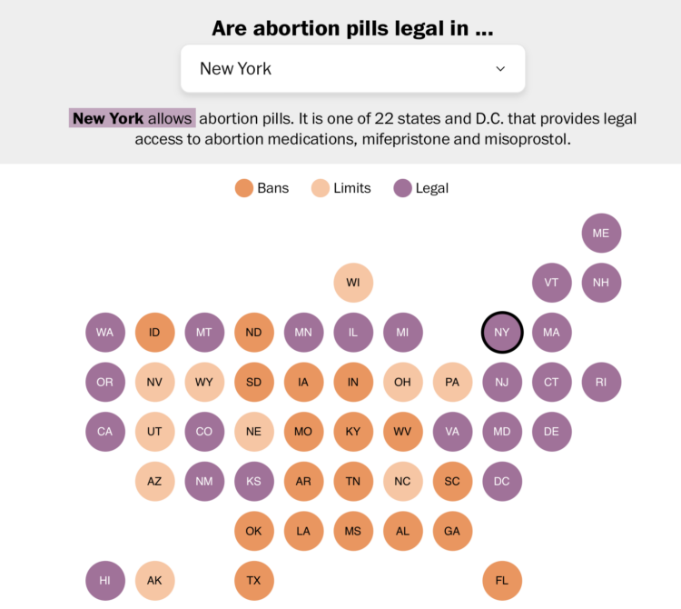
For the Washington Post, N. Kirkpatrick and Szu Yu Chen describe the legality of abortion pills in each state. There’s a grid map with a dropdown to select each state. I like the short summary sentence that updates with each selection. It makes the legality in your selected state obvious.

From Russell Samora for The Pudding, “Crokinole is like a mashup of shuffleboard and curling, played on a tabletop board.” There is even a playable simulation that you can practice on. I need to get myself a Crokinole board.
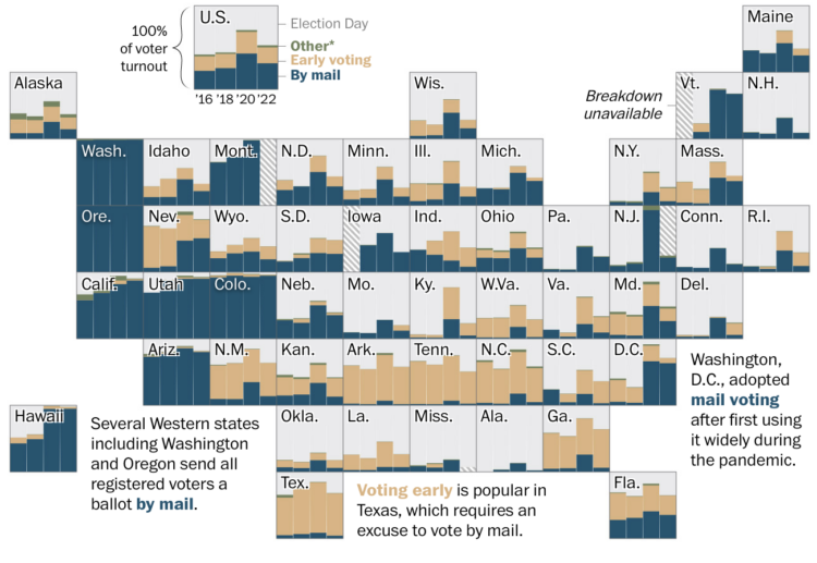
Some states have almost completely moved to voting by mail or early voting, whereas other states mostly vote in person on election day. For the Washington Post, Nick Mourtoupalas used a grid map to show how voting method changed each election since 2016.
Here in California, I voted by mail the last election, but I had no idea the percentages were that high. I’m also surprised by the high rates of early voting.
The estimates are based on data from the Election Administration and Voting Survey, which has run every two years since 2004.
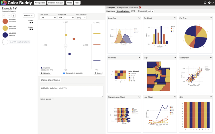
Picking colors for visualization can be tricky, because there are infinite possibilities across the color spectrums. Often you’ll want to adjust hue, saturation, and lightness separately or together. Then you need to know what it actually looks like with your charts. Color Buddy might be the tool you need.
The goal of Color Buddy is to help you make excellent color palettes for data visualization via a direct manipulation environment that evaluates your color palettes as you go.
You might think that there are enough color-picking tools for visualization, but you’re wrong. There’s never enough and there never will be.
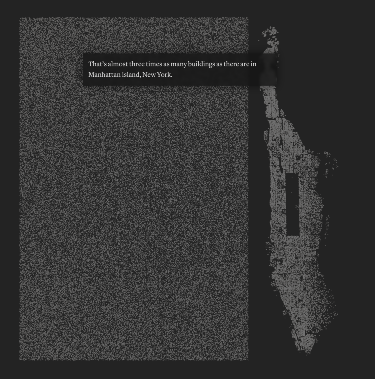
Damage assessments from UNOSAT estimate that 66% of structures in Gaza are damaged as of September 6, 2024, of which 78% are moderately to severely damaged or destroyed. This is about 128,000 buildings. For scale, Reuters compared the count to all the buildings in Manhattan.
This week, I heard that stats are for losers. I had to check it out, because I’ve always thought stats were for winners.
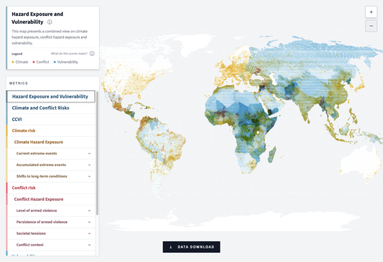
In an effort to measure and highlight risks globally, the German Federal Foreign Office released the Climate-Conflict-Vulnerability Index. It shows the risks of climate change, such as drought, floods, and wildfire. It shows conflict, such as armed violence and societal tensions. It shows vulnerability, such as gender inequality, food insecurity, and soil degradation.
An interactive map lets you see all the parts together or separately. It’s a lot of variables to take in at once, but the tool helps you sift to get a feel for risks everywhere. You can also download data quarterly or the full historical time series to analyze and visualize yourself.
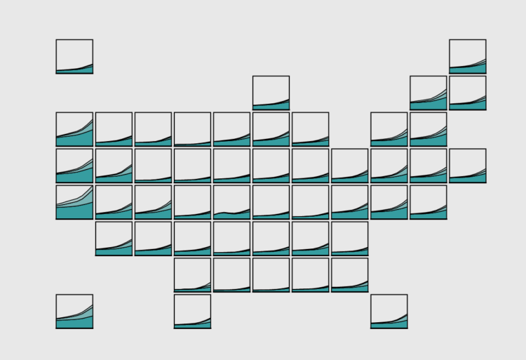
About 4% of registered light-duty vehicles in the United States are either electric, hybrid electric, or plug-in hybrid, as of 2023. That’s more than double than in 2016. However, electric adoption isn’t consistent across the country.
 Visualize This: The FlowingData Guide to Design, Visualization, and Statistics (2nd Edition)
New tools, refined process.


