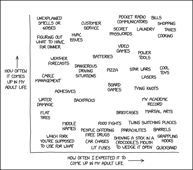
xkcd charted topics that seemed like they’d come up often with grown ups against what actually happened. Thinking back, it’s hard to believe how little quicksand seems to enter the everyday.
xkcd charted topics that seemed like they’d come up often with grown ups against what actually happened. Thinking back, it’s hard to believe how little quicksand seems to enter the everyday.
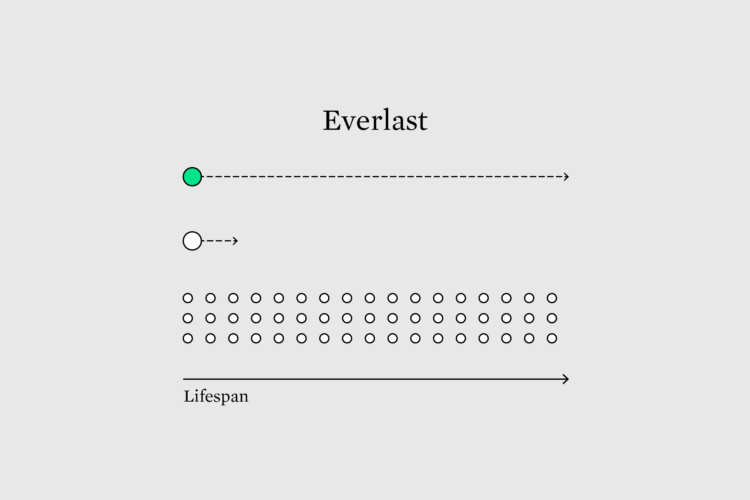
Visualization quality is often measured by speed and efficiency, which leads to temporary and fleeting presentation work. Maybe we optimize for longevity and see what happens.
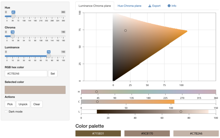
As we have learned over the years, there can never be enough color-picking tools. This one by Claus Wilke, powered by R in the backend, lets you poke around in the HCL space to put together your color palette.
The app visualizes colors either along the hue-chroma plane for a given luminance value or along the luminance-chroma plane for a given hue. Colors can be entered by specifying the hue (H), chroma (C), and luminance (L) values via sliders, by entering an RGB hex code, or by clicking on a color in the hue-chroma or luminance-chroma plane. It is also possible to select individual colors and add them to a palette for comparison and future reference.
It’s slow-ish when compared to other web-based color pickers, but it’s kind of neat to see R run in the browser.
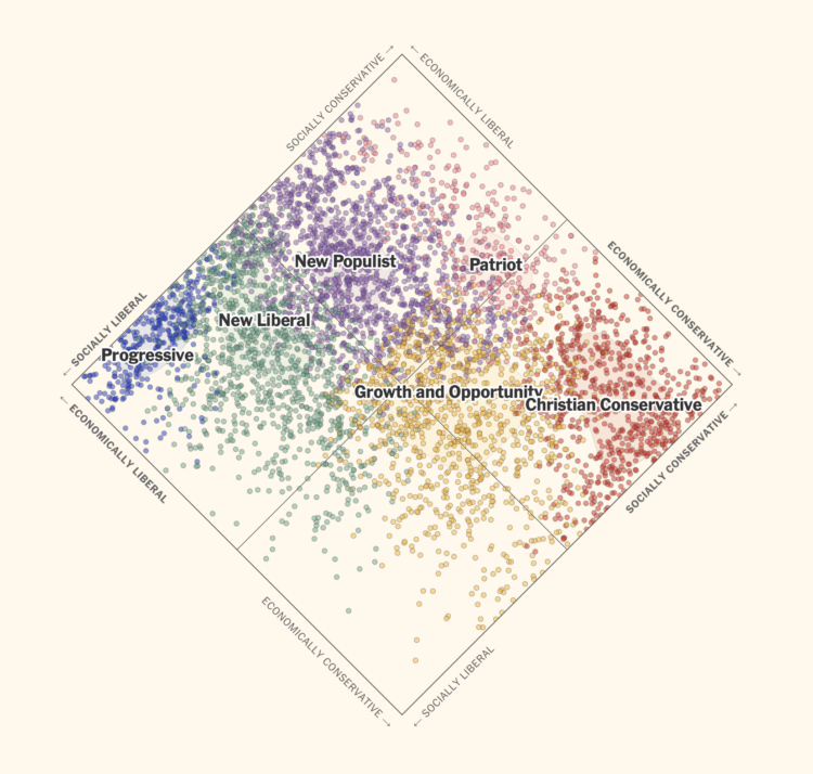
In the United States, a two-party system means that candidates, who are supposed to represent their constituents, are forced to run as Republican or Democrat. For NYT Opinion, Jesse Wegman and Lee Drutman, with graphics by Aileen Clarke, imagine if the country used proportional representation with multiple parties. People would more likely have representation who reflected their values more closely.
The piece walks you through the steps to understand such a system. It starts with the current system, then a simple example of proportional representation, to a spectrum of voters categorized by six parties, and finishes with the combination of these things applied to every state.
I like the scatterplot (above) rotated 45 degrees to show a spectrum of ideologies. It relieves the pressure of suggesting good and bad or high and low.
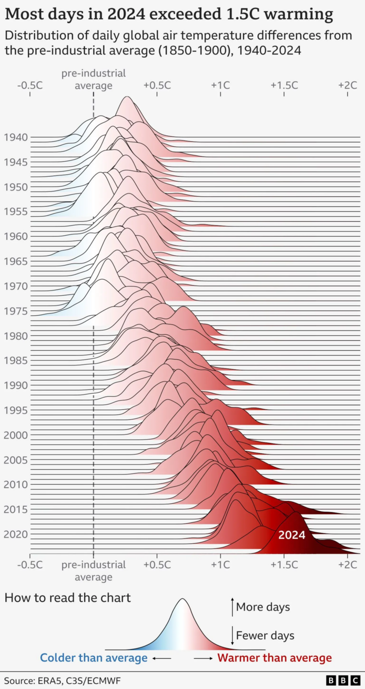
BBC went with the gradient-filled frequency trails to show the distribution of daily temperature differences compared to the pre-industrial global average. Note the overall shift of peaks towards warmer temperatures as you scan top to bottom and left to right.
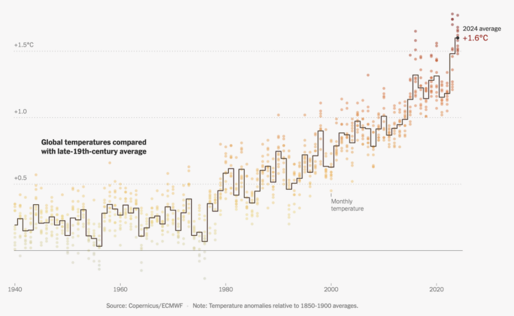
This is some good step charting by Mira Rojanasakul for the New York Times. As most people know but fewer seem to care, the average temperature on this planet continues to rise. Last year, 2024, was the hottest on record.
The line represents the average annual temperature compared against the 19th century average, and the monthly dots are colored by the same difference.
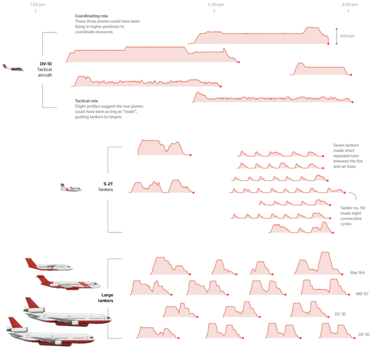
For Reuters, Simon Scarr, Vijdan Mohammad Kawoosa, and Sudev Kiyada use flight data to show how firefighters are extinguishing the Los Angeles fires. They visualized and illustrated the planes, cargo capacity, flight patterns, and timing between aircraft. It’s a very good breakdown.
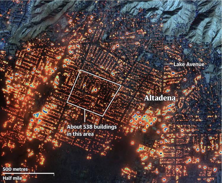
The Guardian provides a visual guide to the damage in Los Angeles with a combination of maps, photos, and video, categorized by location (Altadena, Pacific Palisades, and Malibu).
The underlying image in the above is a composite of infrared satellite imagery by Maxar. It is a lot.
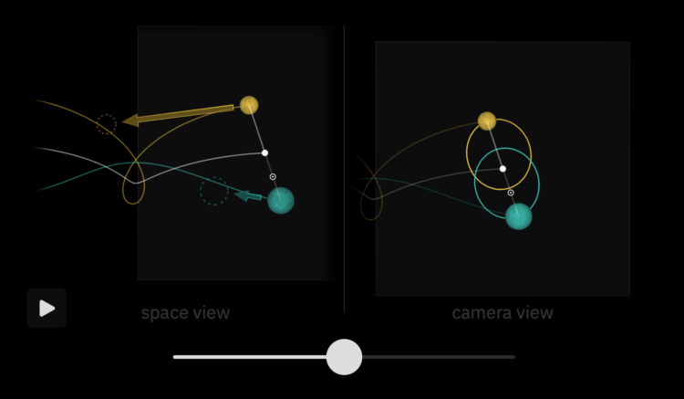
Bartosz Ciechanowski used his style of interactive essay, with many sliders, graphics, and simulations, to explain the movement of the Moon, its relationship to Earth, and why we see the Moon’s lighting differently through its phases.
The Moon may be just an unassuming neighbor in the sky, but its presence affects our lives in many subtle ways. When it reflects sunlight off its scarred surface to guide the way in the darkness of night, or as it breathes life into oceans by rhythmically raising tides, or when it cloaks the Sun in a rare and awe-inspiring total solar eclipse, the Moon reminds us of the celestial world right outside of the safe confines of our planet.
I’m fairly certain that Ciechanowski makes these explainers out of personal interest, and he just happens to also enjoy making physics-related graphics. I’m glad they exist.
Past and current charts influence future charts. Should you credit the past work? At what point does homage become plagiarism? If you’re the original creator, are you pleased or annoyed?
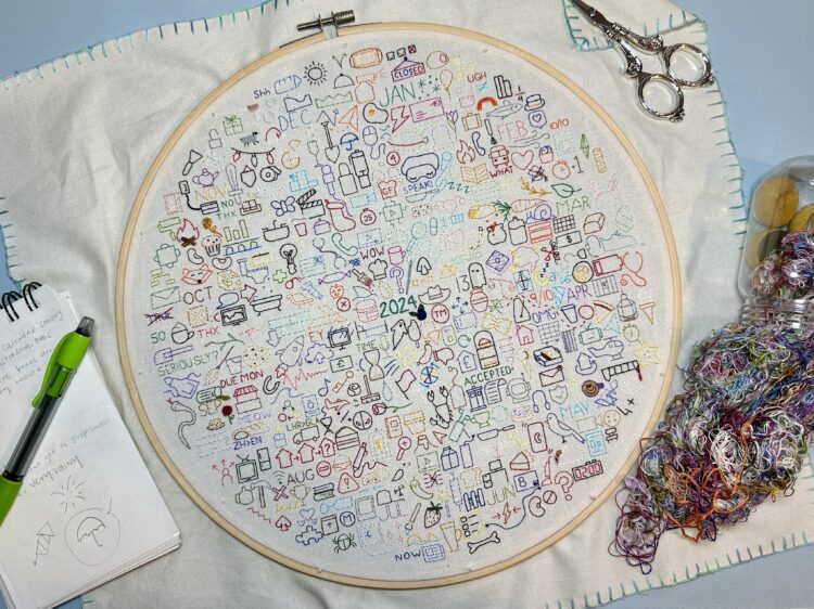
Those who keep a daily journal typically record with words, photos, and video. Since 2020, Sophie O’Neill has used embroidery as her medium. She embroiders an icon for each day to reflect an experience or memory. Each year gets a new journal. The above is the 2024 embroidery journal.
I guess this is kind of a thing? O’Neill shares others’ journals, and there is an active Facebook group.
I want to do this with data and charts, without falling into the personal annual report genre.
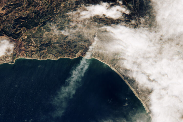
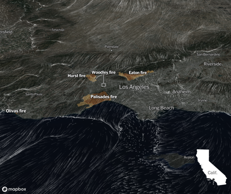
Sentinel-2 satellite of the European Space Agency captured an image of the Palisades fire when it began:
One of the wind-driven fires ignited during the morning of January 7, near the Pacific Palisades neighborhood. The image below, acquired by the European Space Agency’s Sentinel-2 satellite, shows the Palisades fire at 10:45 a.m. Pacific Time on January 7, soon after it ignited.
The Palisades is that area along the coast, right next to the narrow smoke plume in the middle.
Based on data from NOAA, the New York Times shows the direction and speed of wind over Los Angeles with an animated map, as of January 8, 2025 at noon.
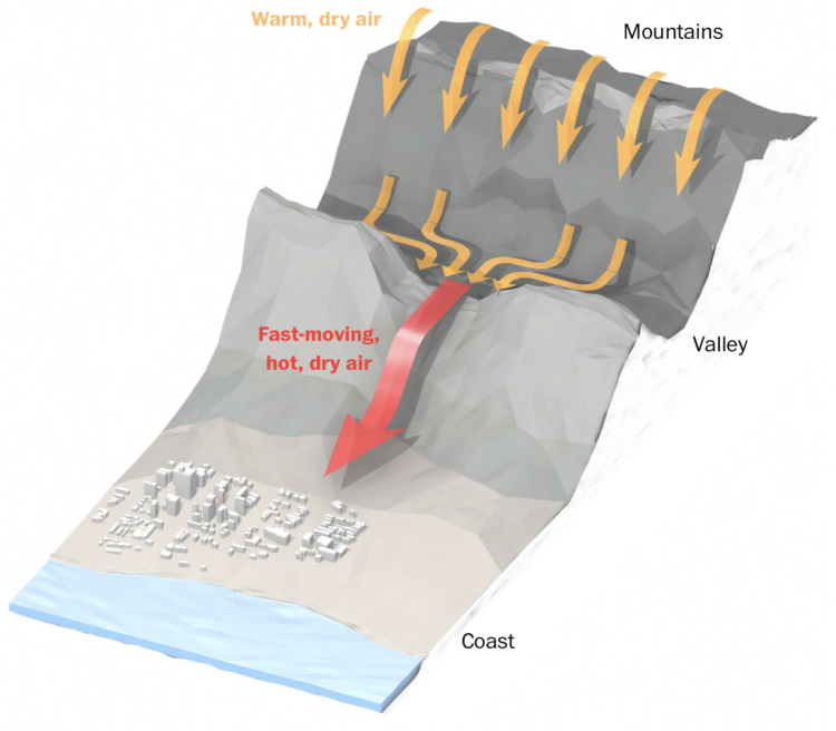
The Washington Post illustrates how air flows from the Great Basin, over the mountains, through the gaps, and into Los Angeles as the wind moves faster, hotter, and dryer.
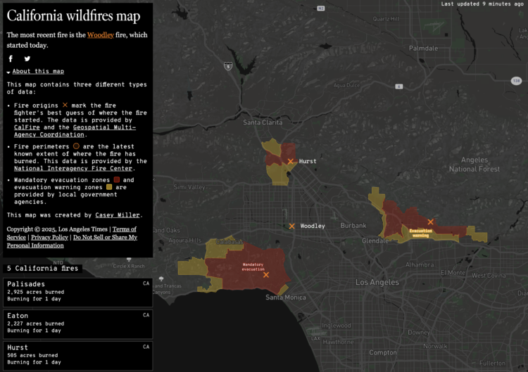
This California wildfires map from Los Angeles Times shows an up-to-date status in the Los Angeles area. It provides fire origin, perimeters, and evacuation areas. I hope everyone is keeping safe.
The original by Casey Miller was made in 2020, when a lot of California was burning. There were a couple more map layers for pollution and an aggregated view, but it’s good to see the app still running.
Incident data comes from Cal Fire, which makes the data available as CSV and via API. The data goes back to 2016. Props to them for running and maintaining a usable data feed for almost a decade.
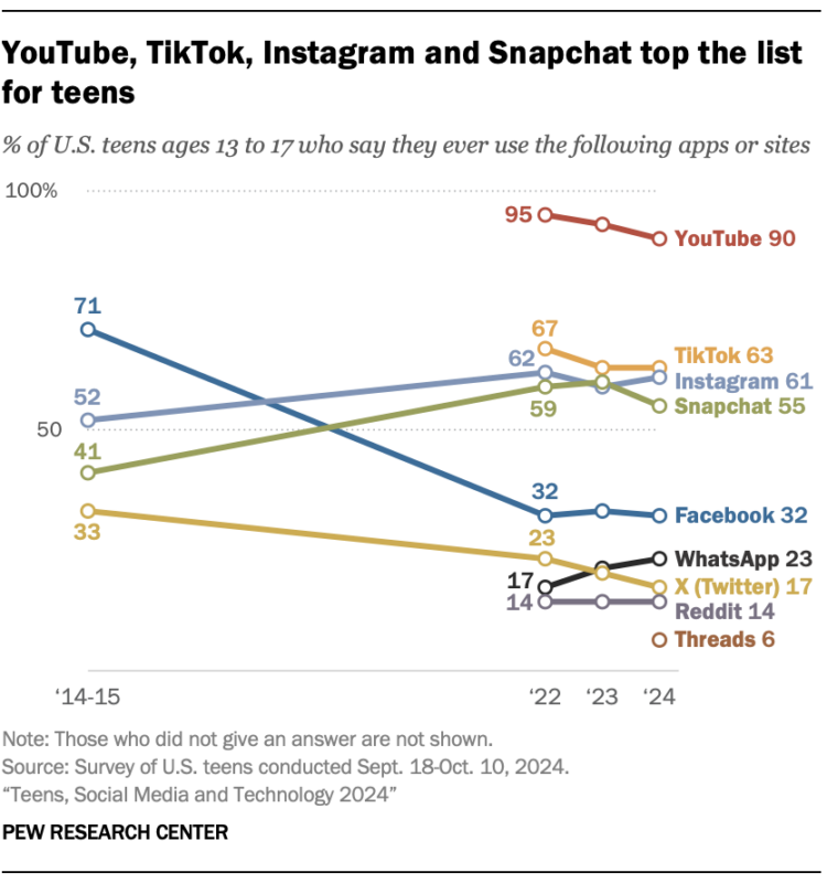
Pew Research published their annual report on what social media U.S. 13- to 17-year-olds are using these days. It looks like WhatsApp took some attention from Snapchat and X continued its downward trend. I would’ve expected Facebook to drop, but it flattened out the past couple years.
Areas represent total counts and the colors indicate categories. Together, the symbols show the distributions in a population.
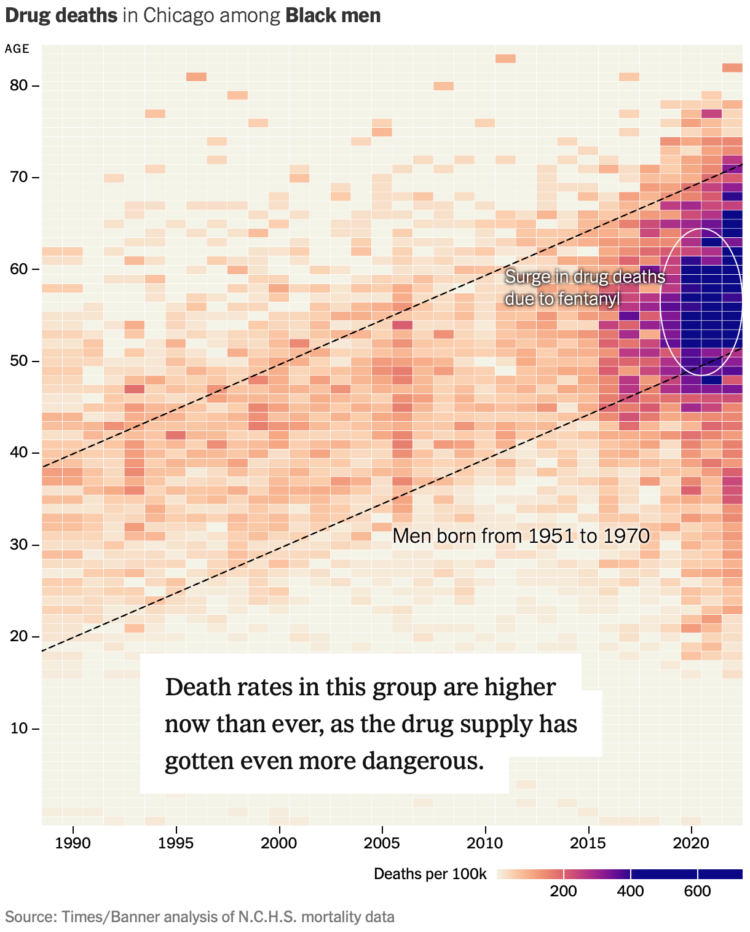
For NYT’s the Upshot, Josh Katz, Margot Sanger-Katz, and Nick Thieme report on the growing prevalence of drug overdose deaths among a generation of black men. This was a collaboration with Big Local News and The Baltimore Banner, who culled and analyzed overdose data to share with other newsrooms.
A heatmap with time on the x-axis and age on the y-axis provides a visual anchor. (Here’s a wideout view for different causes of death.) The first views setup how to read the patterns, which makes the trend among the cohort more obvious.
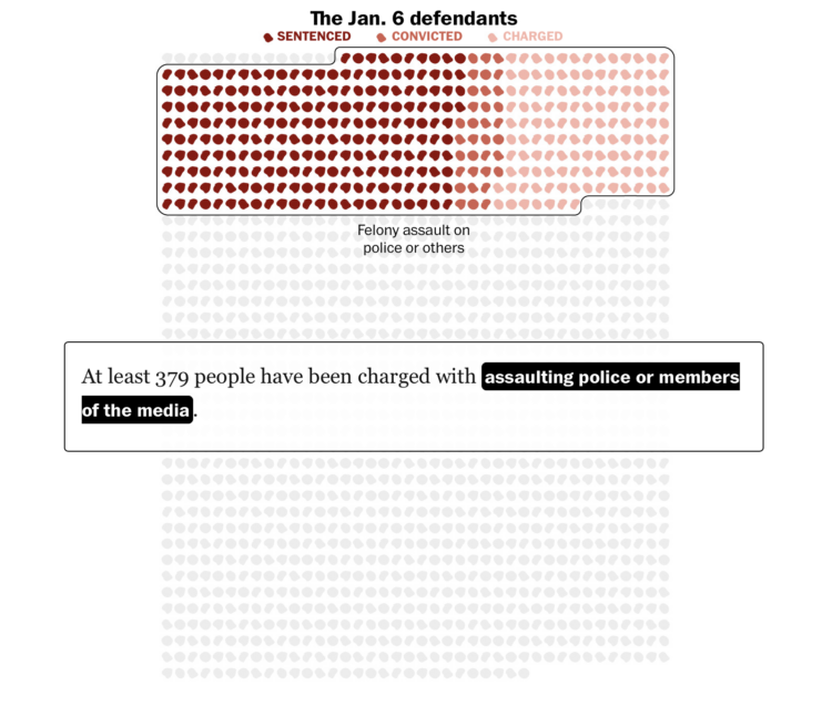
1,580 people were charged with federal crimes for the riot at the U.S. Capitol on January 6, 2021. The Washington Post shows the court status of each as of December 20, 2024. Many are expecting pardons.
I’m not sure what the icons are. Hair? Blobs for visual variation?
In an effort to reduce traffic, New York launched a program that charges a toll to enter defined areas that are often congested. To see if the program works, Joshua Moshes and Benjamin Moshes, as a student project, made a tracker that logs Google Maps traffic data at checkpoints. Current travel times are compared against average times before the program launch.
It looks like there’s a shift on this first day, and I am sure many other cities are watching.
 Visualize This: The FlowingData Guide to Design, Visualization, and Statistics (2nd Edition)
New tools, refined process.


