How Much More Time We Spent at Home
We had to do a lot more from home in 2020. Based on the American Time Use Survey, we spent about 62% of our waking time at home. In contrast, we only spent about 50% in 2019. Here is the breakdown by activity on a weekday.
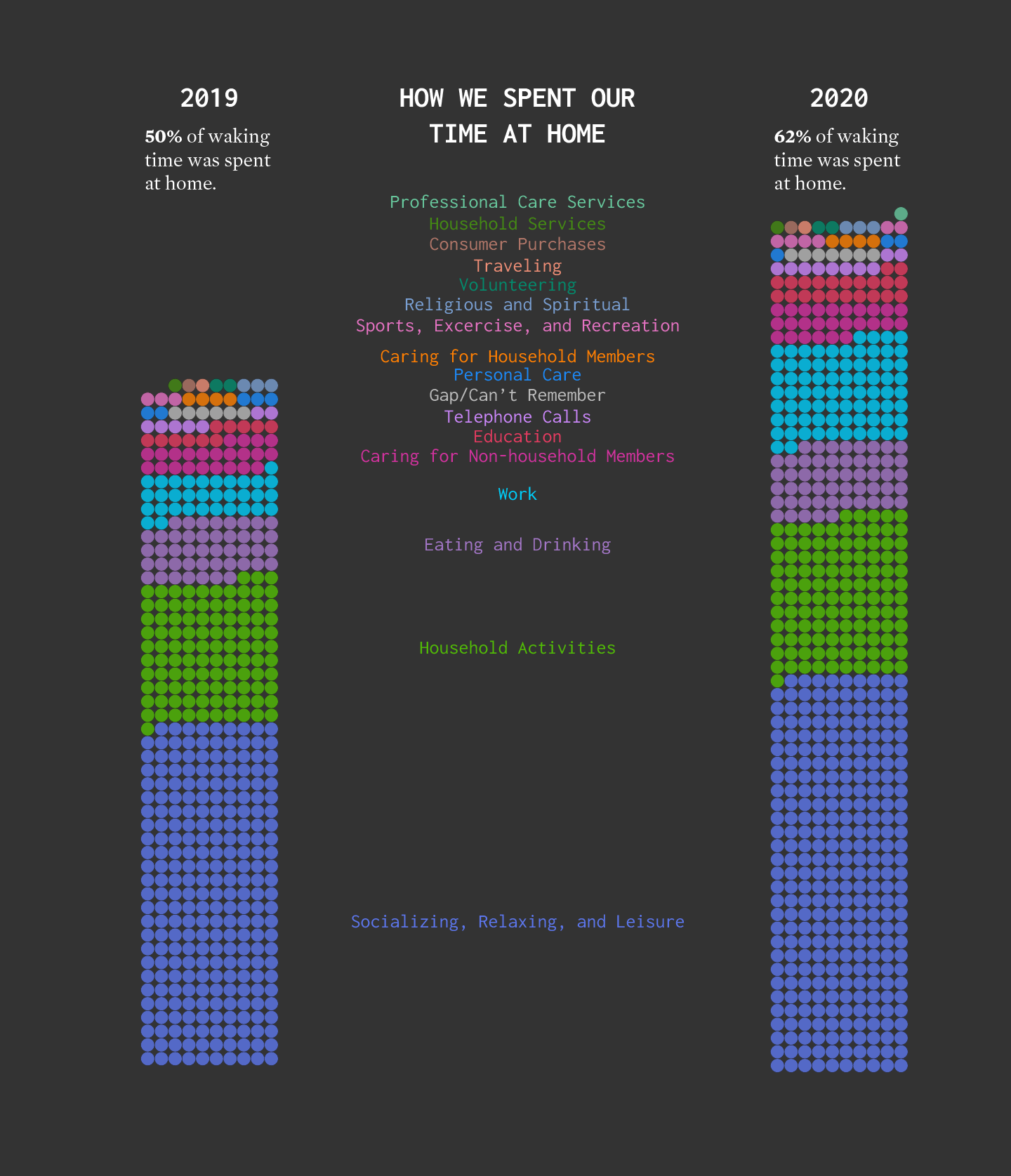
For each year, I counted the total minutes for each activity and divided by total waking time to estimate percentages. For privacy reasons, the where is not provided for when respondents were sleeping, grooming, or doing personal activities. I suspect the total percentage of time spent at home for both years would increase if these times were included.
For a better sense of how everything shifted, here’s a different view that shows the percentage of time spent at home, by activity, on a weekday.
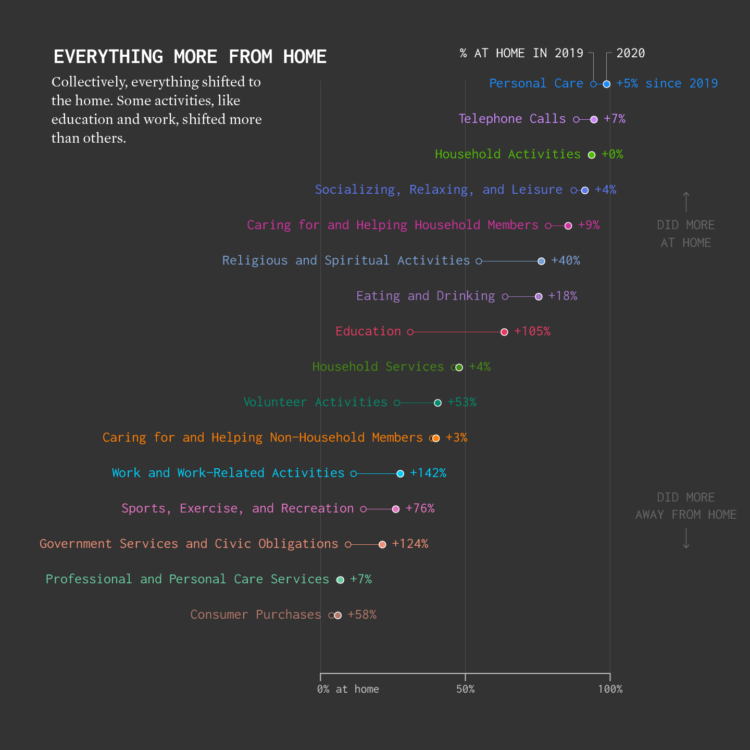
With the exception of household activities, which already happened mostly at home, there was an increase in every category. Work from home went up 142%. Education at home more than doubled. Good times.
Become a member. Support an independent site. Make great charts.
See What You GetFlowingData is made possible by supporting members. Since 2007, I, Nathan Yau, a real person, have been analyzing and visualizing data to help more people understand and appreciate it in their everyday lives.
If you liked this or want to make similar data things, please consider supporting this small corner of the internet. You get unlimited access to visualization courses, tutorials, and extra resources. Thanks. — Nathan
Chart Types Used

