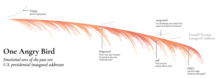
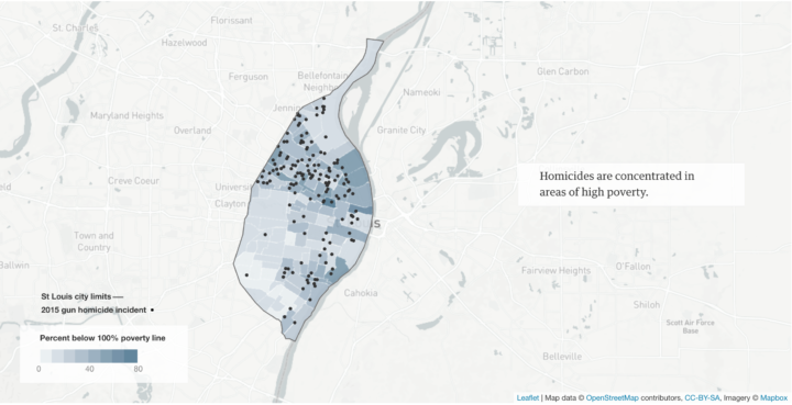
• Books
  • Membership
  • Projects
  • Learning
  • About
  • Member Login
  • Election DataBot provides a feed of the interesting data stories

    September 9, 2016

    Topic

    Data Sources  /  election, Google, ProPublica

    There is a ton of election-related data pushed out every day, so much it’s hard to keep track. ProPublica provides the Election DataBot to help bubble up the more interesting data points.

    Today ProPublica is launching a new tool, created in partnership with the Google News Lab, that makes it easier for journalists, researchers and citizens to quickly find newsworthy information about the presidential race and congressional campaigns in their states. We’re calling it the Election DataBot because it collects huge amounts of data and reports the most interesting details, in real time — details about campaign finance filings, congressional votes, polls and Google Trends data, among other things.

    Probably the best part is that you can quickly filter down to your state and election race. See what your representatives are doing and what’s trending.

  • Serena Williams, greatest of all time

    September 8, 2016

    Topic

    Infographics  /  Los Angeles Times, Serena Williams, sports, tennis

    Serena Williams, who plays tonight in the U.S. Open semifinal, might be the greatest tennis player of all time. Kyle Kim for the Los Angeles Times provides a numbers rundown to make the case.

  • How to Make Beeswarm Plots in R to Show Distributions

    Try the more element-based approach instead of your traditional histogram or boxplot.

  • Comma Chameleon, a stripped-down CSV editor

    September 8, 2016

    Topic

    Software  /  csv, editor

    CSV files are great, but every now and then you have to edit them for errors or format them for the next step. You could use Excel. I’ve been using Google Sheets. However, these applications are designed for general purposes to fulfill a lot of use cases. Comma Chameleon on the other hand is made specifically to get you in and out fast, so that you can use your CSV file elsewhere.

    Next CSV I get is going in here.

  • Radio station frequencies, by genre

    September 7, 2016

    Topic

    Statistical Visualization  /  radio

    In most areas in the United States, lower FM frequencies are reserved for non-commercial educational broadcasting, and the rest is for commercial broadcasting. (And suddenly, radio music availability during long drives makes sense to me.) Upon this trivia nugget, Bob Baxley wondered what the distribution of frequencies looked like across various genres. With a quick scrape and a plot, here’s what he got. [Thanks, Bob]

  • More global warming, more flooding

    September 6, 2016

    Topic

    Infographics  /  global warming, New York Times

    Water levels are rising, and naturally, the coasts are feeling it. Jonathan Corum for the New York Times shows the rise in tidal flooding along the Atlantic and Gulf Coasts. Scientists think it’s going to get a lot worse fast.

    The time series charts are an interesting use of dual axes. The background is mean sea level rise, and the bars are days of flooding. Most of the time, mixed units don’t work so well, but I think it works here, with labeling and varying color gradient to differentiate the two chart types placed one on top of the other.

  • Oil fires in Iraq seen from above

    September 2, 2016

    Topic

    Maps  /  Iraq, NASA, oil, satellite

    Though far away, there’s still a lot you can see, as the NASA Earth Observatory notes:

    On August 17, 2016, the Operational Land Imager (OLI) on Landsat 8 acquired an image (above) of dense smoke plumes roughly 50 kilometers (30 miles) south of Mosul. There appear to be multiple sources of fire, most likely oil wells from the Qayyarah oil field. The images in the grid below show the plumes changing direction and thickness since they were first spotted by Landsat 8 on June 14.

  • Dear Data, the book

    September 1, 2016

    Topic

    Data Art  /  book, Giorgia Lupi, postcards, Stefanie Posavec

    For a year, Stefanie Posavec and Giorgia Lupi drew data postcards and sent them to each other once a week between New York and London. Each postcard was based on data each collected during the week about their daily lives. The project is called Dear Data. Now it’s a book.

    Amazon link. Get the paperback version.

  • Invention

    August 31, 2016

    Topic

    Chart Everything

    R.I.P.

  • Data Underload  /  alcohol

    What Alcohol People Around the World Drink

    Americans get most of their alcohol from beer, but it’s not like that everywhere.

    Read More
  • Sans human, Facebook’s Trending Topics algorithm faired poorly

    August 30, 2016

    Topic

    Mistaken Data  /  algorithm, facebook

    Last week, Facebook announced that it was making the Trending Topics section more automated. More algorithm-based. Less person-based. On Monday, the section showed a fake news story at the top of the list for several hours.

    Nick Statt for the Verge on the human element:

    The changes instituted on Friday didn’t throw all of that away; Facebook has been slowly stripping away the human element of Trending Topics for months now. Rather, it marked the moment Facebook decided its algorithmic approach was more favorable, or perhaps more cost-effective and less damaging. But in shifting the reins to engineers, the company has minimized the kind of news judgment typically exercised by journalists and editors. Now, just a few days later, we’re realizing just how important that human element was.

    Data. Always open for interpretation.

  • Out of state, public education

    August 30, 2016

    Topic

    Maps  /  education, New York Times

    Nick Strayer for the New York Times shows the flow of college freshman to other states for public education:

    Students have long traveled across state lines to go to selective private colleges. But at public colleges, which have historically served local residents, the number of out-of-state freshmen has nearly doubled since 1986, according to data from the Department of Education.

    See the full piece for in- and out-of-state numbers for your own state.

  • D3 in Depth

    August 29, 2016

    Topic

    Coding  /  d3js

    D3 is the most commonly used JavaScript library for visualization on the web, but there’s a bit of learning curve, especially for those new to programming. Peter Cook hopes to make this beginning step easier with his newly started online resource D3 in Depth.

    Pair this with many, many examples and you’re set.

  • Chart Everything  /  parenthood

    This is Parenthood

    Raising kids is hard to explain. I’ll try anyways. With some charts.

    Read More
  • Rhyming schemes in Hamilton the musical

    August 25, 2016

    Topic

    Statistics  /  Hamilton, Wall Street Journal

    Hamilton is unique in its use of complex rhyming lyrics. Joel Eastwood and Erik Hinton for the Wall Street Journal algorithmically break down the lyrics into sounds and then clusters into rhyme families. I haven’t seen the musical, but this makes me want to.

  • Animal migrations in animated map

    August 24, 2016

    Topic

    Maps  /  environment, migration

    The Migrations in Motion map, by Dan Majka from the The Nature Conservancy, shows modeled animal migrations in North and South America.

    Researchers from University of Washington and The Nature Conservancy modeled potential habitat for 2954 species using climate change projections and the climatic needs of each species.

    Using flow models from electronic circuit theory, they plotted movement routes for each species, connecting current habitats with their projected locations under climate change.

    See also Fernanda Viegas and Martin Wattenberg’s wind map and Cameron Beccario’s globe, which were the inspiration for this one.

  • Make a Moving Bubbles Chart to Show Clustering and Distributions

    Use a force-directed graph to form a collection of bubbles and move them around based on data.

  • Composite Olympic moments

    August 23, 2016

    Topic

    Infographics  /  compositing, New York Times, Olympics

    One more Olympics-related piece for the road. The New York Times used photo compositing to show a handful of critical moments for individual athletes. The above is the Laurie Hernandez’ dismount during the team event.

    And, I can’t go without mentioning the Nike human chain commercial from six years years ago, which is the video version of this.

  • Colorgorical generates color schemes for you

    August 22, 2016

    Topic

    Apps  /  color

    Sometimes you need a color scheme quick, and ColorBrewer is typically the de facto, but it has some limitations. You can’t just choose any color you want as a starting point, and there is a set number of color schemes. Colorgorical by Connor Gramazio on the other hand lets you set parameters and color ranges, and it spits out a scheme with perceptual differences.

    The interface is a bit rough, but usable enough to get some nice colors.

  • Page 175 of 393
  • <
  • 1
  • ...
  • 172
  • 173
  • 174
  • 175
  • 176
  • 177
  • ...
  • 393
  • >

Analyze, visualize, and communicate data usefully, beyond the defaults.

Become a member →

Recently for Members

May 22, 2025
Conflicting points of view over the same data

May 15, 2025
Step Chart, Enhanced

May 8, 2025
When the data is not what it seems

May 1, 2025
Finding the Right Charts

April 24, 2025
Visualization Tools, Datasets, and Resources – April 2025 Roundup

Second Edition

Visualize This: The FlowingData Guide to Design, Visualization, and Statistics (2nd Edition)

New tools, refined process, better than defaults.

Order: Amazon / Bookshop

Browse by Chart Type See All →

Frequency Trails Alluvial Diagram Calendar Scatter Plot Chord Diagram Square Pie Chart Voronoi Diagram Grid Map Parallel Coordinates Step Chart

Browse By Topic

  • Visualization

    Seeing data

  • Maps

    Seeing geographic data

  • Infographics

    Explaining data

  • Networks

    Connecting data

  • Statistics

    Analyzing data

  • Software

    Working with data

  • Sources

    Getting data

  • Design

    Making data readable

Made by FlowingData

  • The Process

  • Data Underload

  • Chart Everything

  • Guides

  • Books

  • Shop

  • About
  • Contact
  • Newsletter
  • LinkedIn
  • Instagram
  • Bluesky
  • RSS
Copyright © 2007-Present FlowingData. All rights reserved.