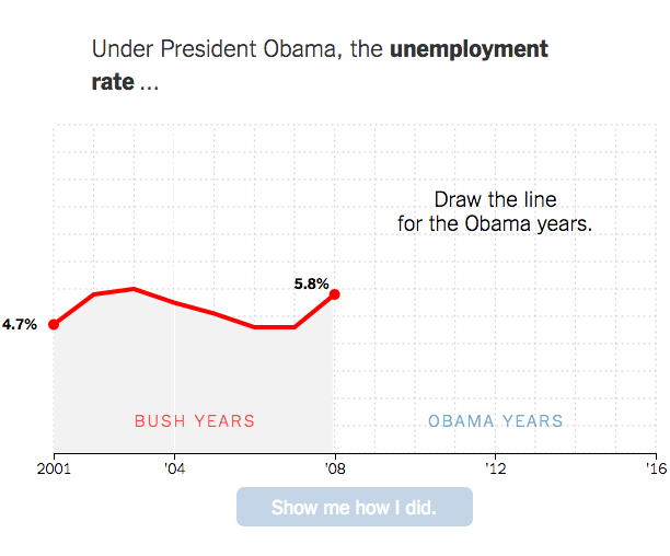
A couple of years back The New York Times asked readers to draw on a blank plot the relationship between income and college attendance. It was a way to get you to think about your own preconceptions and compare them against reality. The Times recently applied the same mechanic to the changes during Barack Obama’s presidency.
Bonus: Here’s how to make your own you-draw-it graph.

 Visualize This: The FlowingData Guide to Design, Visualization, and Statistics (2nd Edition)