Last month Pitch Interactive launched an online tool for tiled cartograms, or tilegrams for short. Upload your state-by-state data, and it does the rest. Now you can make them in R, thanks to Bhaskar Karambelkar, since I know you’re just itching to make your own election maps.
-
I often stare far into the distance and ponder world’s greatest questions — like when specific spells were used in the Harry Potter books. No longer. This straightforward chart by Skyler Johnson pinpoints when each spell was explicitly said in the books and what each does.
-
Maciej Ceglowski, the creator of bookmarking site Pinboard, spoke at the Library of Congress a couple of weeks ago about deep-fried data.
In our case, the deep-fryer is a toolbox of statistical techniques. The names keep changing—it used to be unsupervised learning, now it’s called big data or deep learning or AI. Next year it will be called something else. But the core ideas don’t change. You train a computer on lots of data, and it learns to recognize structure.
These techniques are effective, but the fact that the same generic approach works across a wide range of domains should make you suspicious about how much insight it’s adding.
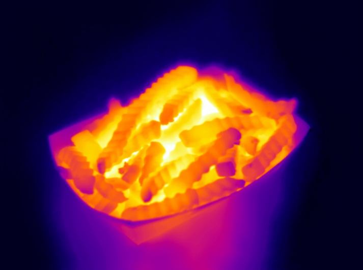
And in any deep frying situation, a good question to ask is: what is this stuff being fried in?
Deep fried food is often delicious, regardless of what’s inside the golden breading. But deep inside — or really right there in the front of our minds — we know it’s not good for us. Moderation. Or at least make sure you go to the good food stand at the carnival that uses the clean oil.
See the talk and many others here.
-
Florida has seen a lot of hurricanes come and go. Lazaro Gamio for the Washington Post looks at all the hurricanes that made their way towards the state over the past 100 years.
The thought of a hurricane freaks me out. This must be how non-Californians feel about earthquakes.
-
Based on data from researchers at Yale, the Upshot charts party registration by medical profession. Surgery and anesthesiology lean Republican, whereas psychiatry and infectious disease leans Democrat. As Margot Sanger-Katz notes, income between specialties likely plays a role. [Thanks, Bea]
-
-
The Simpsons is in its 27th season. That’s a lot of d’ohs. Todd W. Schneider had a look at the dialogue over the years, prominent characters, and declining ratings.
Did I mention 27 seasons? How is that even possible?
-
Artist Nicholas Rouguex visualized some musical scores in his project Off the Staff.
I can’t read music but I can parse it. The talent of reading music has always escaped me which is a little ironic considering I grew up in a musical family. However, I’ve always enjoyed how sheet music looks so I took a shot at visualizing the notes from musical scores and the result is this series of posters.
Notes were placed in a circular layout, evenly spaced. Each colored circle represents a note, and the size of the circle represents the length of the note. Colors represent instruments. Put it all together, and you get these diagrams that look like tie dye.
-
In an update to his two-party map, political scientist David Sparks shows the evolution of the two-party system across the country, since 1920. Red and blue. Keeps on moving.
[arve url=”https://youtu.be/I9aLRsMTk_o”]
-
Picking basketball players for a professional team is no easy task. College and high school players picked high in the draft might end up average in the NBA, and those picked low might actually be fine professional players. Russell Goldenberg for Polygraph dives into 20 years of NBA draft picks to find the biggest busts, the biggest steals, and convergence to the mean.
-
After the first presidential debate, #TrumpWon was a trending topic on Twitter, which led many to believe that there were bots involved — maybe from Russia. It didn’t help that a fake map of Saint Petersburg with a bunch of bubbles on it went viral too. The real reasons for the trending hashtag are much more mundane.
-
The general public kind of knows about data privacy issues. But not really. Or they know, and they’re willing to trade for the ability to share things easily on social media.
I liken it to people who eat hot dogs but avoid animal parts that aren’t in the shape of a steak. As long as it’s packaged right and you can’t see the bits, it must be okay. It’s similar to why people burn the American Community Survey but flip through their phone no problem.
ProPublica aims to dig into the black box a bit in their ongoing coverage on machine bias. Most recently they released the first of a four-episode video series: Breaking the Black Box. They started with Facebook. The video is accompanied by a Chrome extension that “lets you see what Facebook says it knows about you” and more interestingly, lets you rate the items and send accuracy back to ProPublica for analysis.
-
Each year, the National Highway Traffic Safety Administration releases data for traffic accidents that resulted in deaths. I briefly looked at the data a while back. Others did too. For years, there have been fewer deaths than the year before, but the 2015 data shows a 7.2 percent increase.
So, the NHTSA released the data earlier this year and, along with the White House, formally reached out to the data community to analyze the data.
DOT is aggressively seeking ways to improve safety on the roads. From our work with the auto industry to improve vehicle safety, to new solutions to behavioral challenges like drunk, drugged, distracted and drowsy driving, we know we need to find novel solutions to old challenges.
We’re also looking to accelerate technologies that may make driving safer, including connected and highly automated vehicles.
But we need your help, too! Data Science is a team sport.
Yes.
-
We know that income increased by a lot in 2015, but for who? If it’s just the rich getting richer, then the rise doesn’t mean much for a lot of people, but as Quoctrung Bui for the Upshot points out, this was not the case.
Real median incomes rose 5.2 percent in 2015 — phenomenal growth by economic standards. And 3.5 million people moved out of poverty. But more important, 2015 was encouraging to economists because of where income growth was concentrated: the poor and middle class.
I’m not 100% sure what to call this chart type, but the going term seems to be barcode chart. Each vertical line represents a year, and each row represents an income bracket. Mouse over a bar and you see the change in income for all brackets during the corresponding year.
-
How to Visualize Proportions in R
There are many ways to show parts of a whole. Here are quick one-liners for the more common ones.
-
Using data from their Washington Post-ABC News polling, the Washington Post compares shifting support for Clinton and Trump among several demographic groups.
The presidential contest is often compared to a horse race, with the candidates fighting to finish in first place on Election Day. We offer a bit of a different metaphor here. The campaign is also a series of simultaneously fought tug-of-war matches for different demographic groups — based on gender, age, and race/ethnicity, among others.
By rotating the time series to put time on the vertical and candidate lead values on the horizontal, the graphic provides a different metaphor: more left, more right, and mostly middle. I like it.
-
Thermal cameras, which use infrared to detect heat, provide images of temperature. Firefighters can use them to find people in smokey rooms, law enforcement can use them for surveillance, and technicians can use them to detect power faults. Brea Souders used one to take pictures of everyday foods. [via kottke]
-
A look at the rise for each state over three decades, for men and women.
-
Missing data is everywhere. Or, I guess technically it’s nowhere. You know what I mean. Missing data is common, especially with temporal data over long periods of time. Just look at country-level estimates for anything over ten years, and you’ll understand. Peter Beshai for Bocoup provides five solutions for line charts with missing data, using d3.js.