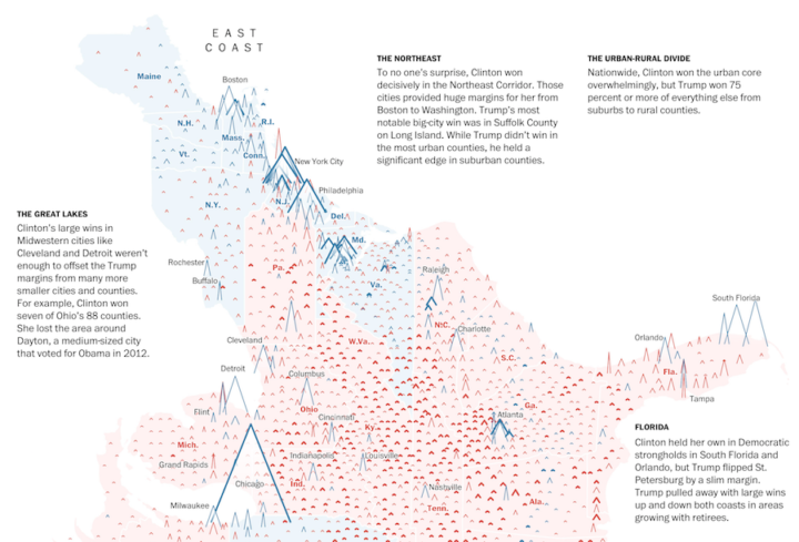
During the election, The New York Times showed a live gauge to show the current forecast for Clinton and Trump. It moved to show a 25th to 75th percentile band of uncertainty:
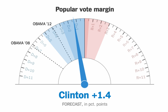
A lot of people didn’t get it, and it seemed to upset plenty of people too. Gregor Aisch, an NYT graphics editor, explains what they tried to accomplish with the gauges.
Read More


 Visualize This: The FlowingData Guide to Design, Visualization, and Statistics