Roger Peng, a biostatistics professor at John Hopkins University, talks about the past and future of data analysis, using music as a metaphor for the path.
-
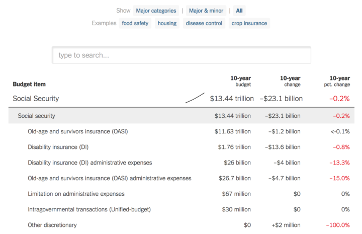
The administration released a budget proposal yesterday, which as you’d expect contains some big shifts. The New York Times calculated “the changes over 10 years, compared with projected spending under current law” and made the numbers available in a searchable table.
-

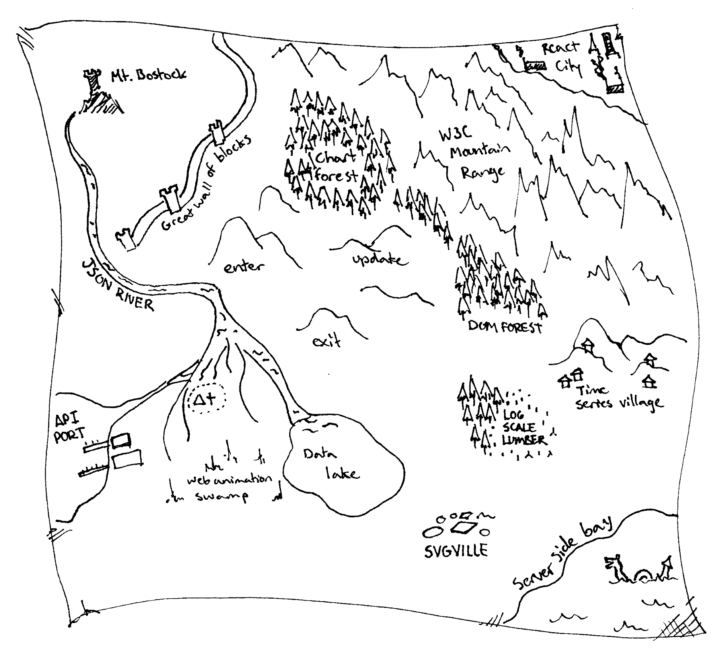
Game developer Oleg Dolya made a medieval fantasy city generator. Select the size you want, and get something like the above. “The generation method is rather arbitrary, the goal is to produce a nice looking map, not an accurate model of a city.”
-
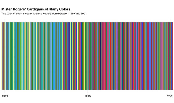
While watching a Mister Rogers’ Neighborhood marathon, Owen Phillips for The Awl wondered about the colors of Mister Rogers’ cardigans over the years. So Phillips tallied the colors and plotted every single one of them.
-
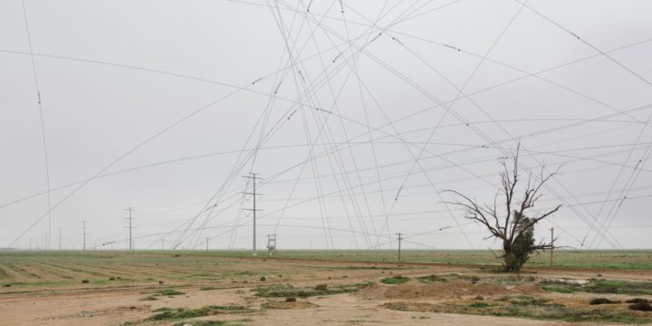
There is a 16-by-16 mile grid of big X’s in the Sonoran Desert that were used to calibrate spy satellites in the 1960s. They’re no longer in use, but Julie Anand and Damon Sauer have been studying the marks and overlaying the paths of publicly-known satellites that are detected during the time of a photograph.
-
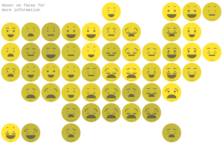
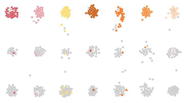
Lazaro Gamio for Axios used Chernoff Faces that look like emojis.
This visualization is a modified version of Chernoff Faces, a technique that maps multiple statistical values to the features of a face. Because it’s 2017, we expanded on the technique and made Chernoff Emojis. Each part of the emoji is controlled by the state’s ranking in a given metric, which range from the uninsured rate to the percent of adults who report getting enough sleep.
Fun.
The above is the desktop version, but I actually like the mobile version better, which shows face transitions between states.
-
I simulated a day for employed Americans to see when and where they work.
-
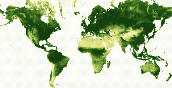
Using data from NOAA STAR, Nadieh Bremer creates a breathing Earth that shows the seasonal cycles of vegetation over the course of a year.
The animation happening in the map above, through all 52 weeks of 2016, visualizes these seasonal cycles. The rise and fall of the growing season in the Northern Hemisphere is particularly visible. However, when focusing on different parts of the planet other cycles & different seasons become noticeable as well; the Southern regions of Africa, Brazil, and New Zealand, having the reverse cycle as the North, or India getting drier and drier up until the July when the monsoons start. The more often you watch the year go by, the more small details will start to stand out.
See also John Nelson’s project from a while back of the same name, which made use of satellite imagery.
-
Ian Johnson provides some good direction for those looking to get their feet wet with d3.js.
Read More -
 Gerrymandering is the practice of manipulating boundaries in such a way that favors a political party. If you slice and group in various ways, you can end up with different election results.
How many different ways can you draw boundaries though? And can results really change that much, depending on you draw the boundaries? District, by Christopher Walker, is a puzzle game that shows you how it works. The goal: Group circles in such a way that favors your color.
-
The unexpected resignation of Census director John H. Thompson was likely related to the administration providing only half the requested budget for 2017. Mona Chalabi for The Guardian on why this matters:
Budget cuts at the Census Bureau mean counting fewer things. Fair enough right? Except that the subjects that are being targeted for cuts seem conspicuous. So far, the Trump administration has deleted questions on sexual orientation from the 2020 Census and at least two other government surveys. Meanwhile, two Republican-sponsored bills introduced in January say that government money can’t be used to collect data on “racial disparities”.
Worrisome.
-
The U.S. Census director John H. Thompson resigned and will leave June 30. Seems not good. And a horrible time for government data in general.
The news, which surprised census experts, follows an April congressional budget allocation for the census that critics say is woefully inadequate. And it comes less than a week after a prickly hearing at which Thompson told lawmakers that cost estimates for a new electronic data collection system had ballooned by nearly 50 percent.
Isn’t this supposed to be the age of big data or something? I thought data was the new oil. Measure things to improve them. Etc. Census data — not just the decennial stuff — is core in so much policy-making to make sure people are properly represented. The direction government data seems to be headed confuses and frustrates to no end, and to think that just a few years ago I’d think happy thoughts with the prospect of where it was going.
-
This is what you get when you add up all the days the average American adult spends sleeping, eating, commuting, and doing other activities.
-
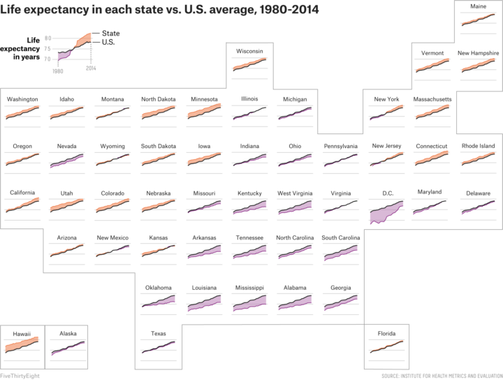
FiveThirtyEight continues their look at mortality by geography. This graphic by Anna Maria Barry-Jester compares life expectancy over time for each state. Purple means below average and orange means above.
The good news is that all the lines trend upward. The bad news is that some states are trending upwards much more slowly than the rest.
-
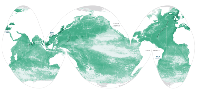
Using satellite data and spatial models, researchers estimate human influence in the ocean. Darker means more impact.
Two-thirds of the ocean shows increased strain from human-related factors, such as fishing and climate change. And more than three-quarters of coastal waters suffer from climate change and increases in the effects of harmful land-based activities, including pollution. In all, the researchers classified more than 40 percent of the ocean as “heavily impacted” by human activity.
It looks like you can find much of the data used here, under the Cumulative Impact Mapping section.
-
Filmmaker Kevin Smith talks about making things versus critiquing them. He’s talking about movies, but you can so easily plug in visualization. I just kept nodding yes. [via swissmiss]
-
Paul Hebert was curious about the colors used on the web’s larger sites, so he scraped the top ten ranked by Alexa. Then he plotted the colors in the stylesheets.
-
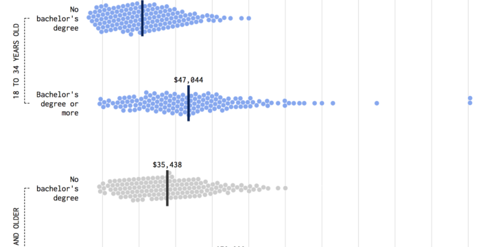
Compare incomes for young people from the Millennial generation and the baby boomer generation.
-

Summary statistics such as mean, median, and mode can only tell you so much about a dataset. Their scope is limited because for them to be useful, you have to assume things like distribution and dependencies. Visualization helps you see what else there is.
Justin Matejka and George Fitzmaurice demonstrate in their paper for the ACM SIGCHI Conference, in which they developed a method to generate datasets that “are identical over a range of statistical properties, yet produce dissimilar graphics.
-
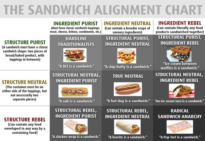
By @matttomic, this chart speaks to me.
Recently for Members
Second Edition
 Visualize This: The FlowingData Guide to Design, Visualization, and Statistics (2nd Edition)
 Visualize This: The FlowingData Guide to Design, Visualization, and Statistics (2nd Edition)
New tools, refined process.
Browse by Chart Type See All →


