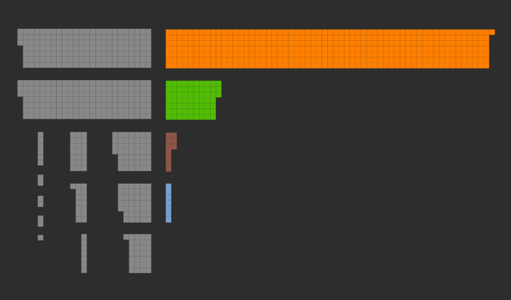
• Membership
  • Newsletter
  • Projects
  • Learning
  • About
  • Member Login
  • Millennial cherry-picking

    April 3, 2017

    Topic

    Statistics  /  bias, millennial

    Emily Beam highlights confirmation bias in articles recently suggesting that more millennial men pine for the days when men worked and women stayed at home, based on results from the General Social Survey.

    The GSS surveys are pretty small – about 2,000-3,000 per wave – so once you split by sample, and then split by age, and then exclude the older millennials (age 26-34) who don’t show any negative trend in gender equality, you’re left with cells of about 60-100 men ages 18-25 per wave. Standard errors on any given year are 6-8 percent.

    Mind your data.

  • Pianist eye tracking

    April 3, 2017

    Topic

    Statistical Visualization  /  eye tracking, piano

    What does a pianist look at while playing? Put a pair of eye tracking glasses on a professional while he plays. Then compare to a student.

    [arve url=”https://www.youtube.com/watch?v=GVvY8KfXXgE” /]

  • Visualization as skill set or stand-alone profession

    March 31, 2017

    Topic

    Visualization  /  industry, jobs

    Jumpstarted by Elijah Meeks asking why visualization people are leaving the field for less visually-centric industry jobs, there’s been ample discussion about data visualization’s role in companies.

    This naturally leaks over to the ongoing discussion about what visualization is and should be. Moritz Stefaner, who’s been at it since before I even knew what visualization really was, chimed in with his experiences and what he’s seen as a freelancer.

    Yet, as I argued earlier already, I don’t think we gain much from overemphasizing the (supposedly) fundamental differences between “serious/functional” and “aesthetic/entertaining” data visualizations, or, conversely, diminishing Excel dataviz work as “not really data visualization”.

    I am thinking back to the time when it was fashionable to “draw lines in the sand” or to attack designers on live TV. The harsh, narrow-minded criticism that novel designs and approaches faced for a while did not always lead to better results, but, in contrast, scared talented folks away from the community. I am really quite happy that, by now, we have a data visualization community that understands the many purposes of data visualization beyond scientific analysis.

    Many purposes. That’s the key here.

    Visualization can be a tool or a skill set that aids in the overarching goal of understanding data, whether it be quantitatively, qualitatively, or emotionally. Maybe you use the tools. Maybe you make the tools. Maybe you use the tools that you make. You can go as far as you want with any of these routes, and the one you choose brings various job titles.

    I’m completely detached from industry. (I mean, I’m one guy running a site from a home office, so I’m detached from a lot of things.) But in my experience, visualization can and should be a stand-alone profession. It’s not a big conceptual jump — if you go far enough — to see how the person who knows how to make charts can become the chart-maker.

  • Subreddit math with r/The_Donald helps show topic breakdowns

    March 31, 2017

    Topic

    Statistics  /  Reddit, text

    Trevor Martin for FiveThirtyEight used latent semantic analysis to do math with subreddits, specifically r/The_Donald.

    We’ve adapted a technique that’s used in machine learning research — called latent semantic analysis — to characterize 50,323 active subreddits based on 1.4 billion comments posted from Jan. 1, 2015, to Dec. 31, 2016, in a way that allows us to quantify how similar in essence one subreddit is to another. At its heart, the analysis is based on commenter overlap: Two subreddits are deemed more similar if many commenters have posted often to both. This also makes it possible to do what we call “subreddit algebra”: adding one subreddit to another and seeing if the result resembles some third subreddit, or subtracting out a component of one subreddit’s character and seeing what’s left.

    Hm.

  • Looking for more affordable homes and better schools in the suburbs

    March 30, 2017

    Topic

    Statistical Visualization  /  education, housing, Upshot

    Families often move out of the city to the suburbs for more affordable housing (or more space) and better schools for the kids. Quoctrung Bui and Conor Dougherty for The Upshot plot these two things, average price per square foot and school district performance, to compare against the respective city.
    Read More

  • Compare your commute time to others

    March 30, 2017

    Topic

    Maps  /  commute

    Commuting sucks. Here’s a straightforward map to compare how much or less your commute sucks compared to others in your area. Enter your ZIP code, and you get a simple comparison to the average, based on 2006-2011 U.S. Census American Community Survey.

  • Trump approval ratings compared to past presidents

    March 29, 2017

    Topic

    Statistical Visualization  /  FiveThirtyEight, government

    Using multiple polls as their source data, FiveThirtyEight is tracking approval and disapproval ratings for Donald Trump. The page leads with overall estimates with a couple of bands of uncertainty for projections into the next few months. I still wonder what proportion of readers understand the ranges, but I’m glad they’re there.

    Scroll down the page to see how Trump’s ratings compare to past presidents. You can switch between approval, disapproval, and net approval, along with options to change the time span — which is nice for a page that updates for the next four years.

  • Scrabble data and analysis

    March 29, 2017

    Topic

    Data Sources  /  R, Scrabble

    Looking for some data to play with? James P. Curley compiled Scrabble data using computer-played games in Quackle Scrabble. Check out his summary analysis or grab the data for yourself in the R package scrabblr.

  • Complement data with emotion for full effect

    March 28, 2017

    Topic

    Statistics  /  emotion, human

    Data is a great vehicle for arguments, but the (not just visual) perception can change completely depending how a reader feels. Cognitive neuroscientist Tali Sharot talks facts and emotions on Hidden Brain.

    The example at the end is interesting. Tell a person a joke when they’re sad, and they probably won’t think the joke is funny. Make the person happy first, and it’s more likely they’ll see the joke from your point of view. How does this transfer to the communication of data? [via Kim Rees]

  • LOOPY is a tool to think in systems

    March 27, 2017

    Topic

    Visualization  /  simulation

    Nicky Case, whose projects to simulate segregation and systems with emoji you might recognize, likes to think in systems. Piece together steps and objects, and let them interact with each other using various probabilities and weights. Simulate. See what happens.

    Case’s newest project, LOOPY, is a tool to build your own systems. No programming required. Just click-and-drag things and press play.

  • All major meteor showers, as seen from space

    March 27, 2017

    Topic

    Maps  /  meteor, space

    There are a lot of meteoroids circling around in space. Ian Webster visualized all of the major ones at once.

    Meteor showers on Earth are caused by streams of meteoroids hitting our atmosphere. These meteoroids are sand- and pebble-sized bits of rock that were once released from their parent comet. Some comets are no longer active and are now called asteroids.

    This visualization shows these meteoroid streams orbiting the Sun, some stretching to the outer regions of the solar system.

    Pan and zoom, filter by time, select specific showers, and watch from multiple vantage points. Nice. (It was sluggish in Safari but was smooth in Chrome.)

    See also Webster’s Asterank.

  • Fastest way to alphabetize your bookshelf

    March 24, 2017

    Topic

    Infographics  /  sorting

    Sorting algorithms. Apparently there are an endless number of ways to visualize them in various contexts, and somehow it never gets old. Here sorting in the context of books on a shelf.

  • Towards simple visualization

    March 23, 2017

    Topic

    Visualization  /  career

    Irene Ros, the Director of Data Visualization at Bocoup, talks about her path through the field of visualization, which kind of doubles as a quick history of the past decade.

    These days, I’ve relaxed the demands I put on myself around the visual wow-ness of my work. Sure, it’s really wonderful to have recognition from my peers in the industry, but it’s actually even more wonderful to build a really simple tool for small clinic practitioners to track their patient experience data in a digital way for the first time; to show and explain to them a box plot and suddenly see them make use of it. A box plot is never going to win awards, but a well crafted tool that is simple to use is going to make someone’s life better, or at least a little easier.

  • Catching a real ball in virtual reality

    March 23, 2017

    Topic

    Visualization  /  Disney, physical, VR

    Man wears virtual reality headset. Another man throws a ball to headset-wearing man. Headset-wearing man catches actual ball displayed in virtual reality. There’s something magical about the quick data processing going on here.

  • Economics of airline class

    March 22, 2017

    Topic

    Statistics  /  flights, money

    Wendover Productions explains basic economics of airline classes. The passengers in first class and business, assuming seats are occupied, make much more for airlines than the economy class. Sounds familiar.

  • Conflicted public opinion about global warming

    March 22, 2017

    Topic

    Maps  /  global warming, New York Times, opinion

    Based on estimates from the Yale Program on Climate Change Communication, The New York Times mapped the percentage of people who think global warming will harm the country against the percentage of people who think it will harm them personally. It’s a big contrast. A delayed trend essentially, which is a big source of why action is so slow-moving.

    Check out the Yale interactive too to see more contrasting opinions.

  • Simulation shows how your mouth works when you talk

    March 21, 2017

    Topic

    Infographics  /  simulation, talking

    You have a mouth with a bunch of tissue in it and manipulate your tongue, lips, throat, and other pieces so that somehow words come out. A lot of variables figure in, which can make the whole process of talking a complex process. Neil Thapen makes it more understandable with a fun simulator he calls Pink Trombone. Turn your sound on, and click and drag any of the words to see how voice changes when you modulate parts of the mouth.

  • Shifting national budget

    March 20, 2017

    Topic

    Infographics  /  budget, government, Washington Post

    The Washington Post looks at the shifting national budget over the past 40 years. Be sure to keep scrolling past the first overall to see the funding for departments separately. The consistent vertical scale works well.

  • Data Underload  /  sex, virginity

    When Straight Americans Lost Their Virginity

    Everyone has his or her own timeline, but here it is in general for Americans.

    Read More
  • Penrose map binning

    March 16, 2017

    Topic

    Maps  /  Penrose

    Cartographer Daniel Huffman tried out Penrose tiling for binning in maps:

    A Penrose tiling is a form of tessellation. It’s fun and unique in that it fills the entire plane, but has no repeats. Wikipedia has more detail about how these things are cool. Mostly, I thought of them because they look interesting and are sort of regular, without being too regular.

    He recently came back to the method to look at elevation for the pretty result above.

  • Page 164 of 391
  • <
  • 1
  • ...
  • 161
  • 162
  • 163
  • 164
  • 165
  • 166
  • ...
  • 391
  • >

Analyze, visualize, and communicate data usefully, beyond the defaults.

Become a member →

Recently for Members

May 8, 2025
When the data is not what it seems

May 1, 2025
Finding the Right Charts

April 24, 2025
Visualization Tools, Datasets, and Resources – April 2025 Roundup

April 17, 2025
Breaking Out of Chart Software Defaults

April 15, 2025
Line Chart with Decorative Neon Accents

Browse by Chart Type See All →

Venn Diagram Variable Width Bar Chart Alluvial Diagram Slope Chart Timeline Gantt Chart Spiral Chart Line Chart Parallel Coordinates Word Cloud

Browse By Topic

  • Visualization

    Seeing data

  • Maps

    Seeing geographic data

  • Infographics

    Explaining data

  • Networks

    Connecting data

  • Statistics

    Analyzing data

  • Software

    Working with data

  • Sources

    Getting data

  • Design

    Making data readable

Get the Book

Visualize This: The FlowingData Guide to Design, Visualization, and Statistics

Available now.

Order: Amazon / Bookshop

Made by FlowingData

  • The Process

  • Data Underload

  • Chart Everything

  • Guides

  • Books

  • Shop

  • About
  • Contact
  • Newsletter
  • LinkedIn
  • Instagram
  • Bluesky
  • RSS
Copyright © 2007-Present FlowingData. All rights reserved.