Since forever, we’ve tried to make jobs easier. More automated. In many cases, where a machine replaced a job, new jobs were created. Kurzgesagt explains why it’s different this time around.
Since forever, we’ve tried to make jobs easier. More automated. In many cases, where a machine replaced a job, new jobs were created. Kurzgesagt explains why it’s different this time around.
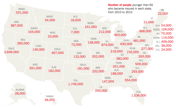
The Urban Institute estimated how many people in each state gained health insurance through the Affordable Care Act. Now they might lose it. The New York Times reports.
Oof.

Nicky Case, who has a knack for making complex topics playfully fun, delves into the evolution of trust between people and groups using game theory. And naturally, the explainer is in the format of a game. See how the golden rule plays out, how cheaters prosper in the short run but lose in the end, and how communication is key.
The game takes about 30 minutes to play. Worth your time.
FlowingData turned a decade last month. June 25 to be exact. Woo woo.
I had to buy hosting for some graduate school project in 2007, and it came with a free domain name. Looking for some variation of data flows, I settled on flowingdata.com. I used it as a sandbox for stray HTML pages, and then on some idle day when I didn’t want to write my dissertation, I setup WordPress. I wrote stuff. I rambled. I wrote about Flash. I shared things that I thought were interesting.
I initially didn’t set specific goals for the site, but I knew I didn’t want to be someone who critiqued charts all of the time. And I was way too inexperienced with visualization anyways. Who was I to judge – when I could barely step outside of the bounds of default plots in R? Visualizing data for a million people is very different from visualizing data for a few.
I decided FlowingData would be a happy place to highlight work I liked and a place I could put up my own stuff. It would be a place where people could see data was fun — enjoy it even — and then learn in the process. I learned too.
So not much changed in a decade. I hope to not change for many more years.
I thank my lucky stars that this is what I get to do for a living.
Thanks for reading. Thank you for supporting.
Some jobs tend towards higher divorce rates. Some towards lower. Salary also probably plays a role.
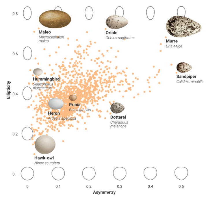
Bird eggs come in all shapes and sizes, and people didn’t really know why. After analyzing a number of variables, researchers think they found their answer.
After crunching the numbers, the scientists found the links they’d been looking for: the length of an egg correlates with bird body size. The shape of an egg—how asymmetrical or elliptical it is—relates to flying habits. And the stronger a bird’s flight, the more asymmetrical or elliptical its eggs will be.
Lots of charts and probably more information about bird eggs than you ever thought you wanted to know.
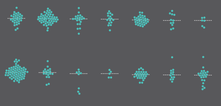
Histograms require some statistical knowledge to grasp, and without the tidbits, the distribution chart looks like any other bar chart. So much more though. They can show a lot about your data, and statisticians start nearly every analysis with at least one. Aran Lunzer and Amelia McNamara provide a visual essay to explain how they work, so that you too can reap the rewards.
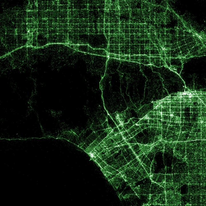
Shazam is a service with an app that lets you point your phone towards some music to identify the name and artist of a song. For a hack day, Umar Hansa mapped a billion recognitions. Some of the maps color-code recognitions by iPhone and Android use which is kind of interesting.
Hansa used Eric Fischer’s datamaps, in case you’re interested in making your own.
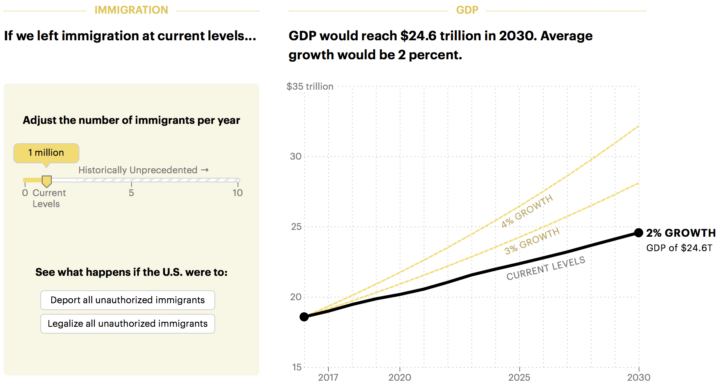
Want to increase the GDP? Easy. Let more immigrants in. Lena Groeger for ProPublica:
In an analysis for ProPublica, Adam Ozimek and Mark Zandi at Moody’s Analytics, an independent economics firm, estimated that for every 1 percent increase in U.S. population made of immigrants, GDP rises 1.15 percent. So a simple way to get to Trump’s 4 percent GDP bump? Take in about 8 million net immigrants per year. To show you what that really looks like, we’ve charted the effect below. You can see for yourself what might happen to the economy if we increased immigration to the highest rates in history or dropped it to zero – and everything in between.
The interactive in the article lets you pose the what-if with various immigration rates. Give it a try.
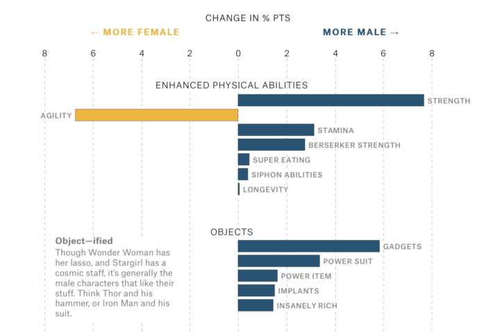
Amanda Shendruk for The Pudding analyzed how genders are represented differently in comic books, focusing on “naming conventions, types of superpowers, and the composition of teams to see how male and female genders are portrayed.” The charts are good, but I’m pretty sure the animated GIFs for a handful of female characters make the piece.
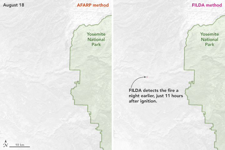
Traditional detection algorithms use infrared heat as the main signal of a wildfire. The Firelight Detection Algorithm uses visible light instead, detecting a fire possibly a day earlier.
FILDA uses the visible light of fire, detecting high resolution images of fires. Using VIIRS technology, images of fires at night can be captured using infrared and visible light information. FILDA can also detect 90% more pixels than previous methods, and can detect smoldering and flaming fires. This allows researchers to see when fires start, when they may be dormant, or what weather events contribute to the spread of the fire.
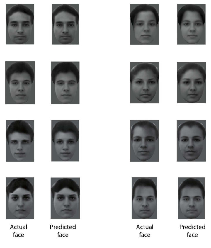
Researchers attached electrodes to neurons in monkeys, showed them pictures of faces, and then reconstructed the faces reading brain waves.
After decades of work, scientists at Caltech may have finally cracked our brain’s facial recognition code. Using brain scans and direct neuron recording from macaque monkeys, the team found specialized “face patches” that respond to specific combinations of facial features.
Like dials on a music mixer, each patch is fine-tuned to a particular set of visual information, which then channel together in different combinations to form a holistic representation of every distinctive face.
There are so many ways this could be used irresponsibly, but to be honest, tech-enhanced photographic memory sounds kind of awesome.
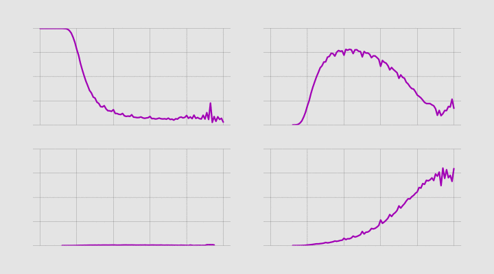
Sometimes it’s useful to animate the multiple lines instead of showing them all at once.
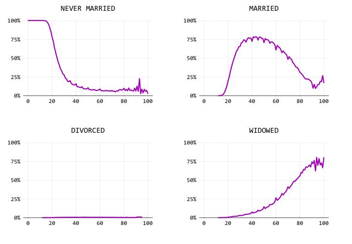
Using a century of data, we watch the shift of marital status in the United States.
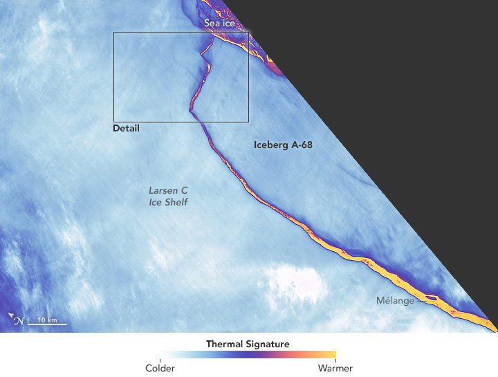
Using the thermal signature, NASA provides a detailed view of the break:
The false-color image was captured by Landsat’s Thermal Infrared Sensor (TIRS). It shows the relative warmth or coolness of the landscape. Orange indicates where the surface is the warmest, most notably the mélange between the new berg and the ice shelf. Light blues and whites are the coldest areas, including the ice shelf and the iceberg.
It’s like something out of a movie.
This explainer video by Vox on the oil patterns on bowling lanes was oddly fascinating. The varying degrees of oil can change a professional bowler’s strategy as a tournament progresses.
I kind of want to be a professional bowler now. This whole data thing is probably a fad anyways.
Mimi Onuoha on the importance of paying close attention to the data collection process before making data-informed decisions:
The conceptual, practical, and ethical issues surrounding “big data” and data in general begin at the very moment of data collection. Particularly when the data concern people, not enough attention is paid to the realities entangled within that significant moment and spreading out from it.
I try to do some disentangling here, through five theses around data collection — points that are worth remembering, communicating, thinking about, dwelling on, and keeping in mind, if you have anything to do with data on a daily basis (read: all of us) and want to do data responsibly.
Garbage in, garbage out, as they say.
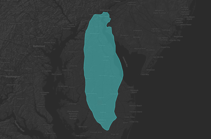
A giant iceberg broke off from Antartica. Like, really big. Quartz collected the comparisons made in various countries to make the numbers more relatable to readers.
As news traveled around the world that one of the largest icebergs ever observed had finally broken off from Antarctica, reporters were faced with a question of scale. Few among us can visualize just how large a 2,200 square-mile (5,698 square-kilometer) hunk of ice really is, so they had to come up with a reference their readers might recognize.
In the United States, the iceberg was the size of Delaware. In Spain, it was 10 Madrids. In India, it was one and a half times the size of Goa. Big.
Although, being from the U.S., I have to admit “the size of Delaware” still doesn’t do much for me. A quick look at Google Maps… it takes about two hours to drive the full length of the state. Okay, I think I got it.
Update: You can also overlay the iceberg on a map in an area of your choosing using Xaquín’s interactive.
The American Time Use Survey asks people what they do during the day. Activities are split into categories. One of those is sports and leisure, which is further broken down into more specific things like biking and basketball. Henrik Lindberg charted the relative peak times for these subcategories using overlaid area charts.
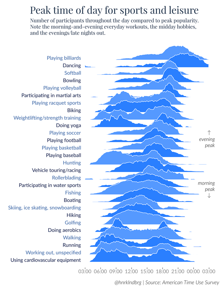
Fun.
Lindberg made it in R, and you can grab the data and code here.
The continental United States gets a total solar eclipse on August 21, so Denise Lu for The Washington Post mapped out every total solar eclipse that will happen in your lifetime. Enter the year you were born and see the paths on the globe.
 Visualize This: The FlowingData Guide to Design, Visualization, and Statistics (2nd Edition)
New tools, refined process.


