Yeah, but what if you combine and overlay all these datasets? [xkcd]
Yeah, but what if you combine and overlay all these datasets? [xkcd]
It’s that time of year again. Turn up the volume and blast It’s Gonna Be Me by NSYNC. No one will judge you.
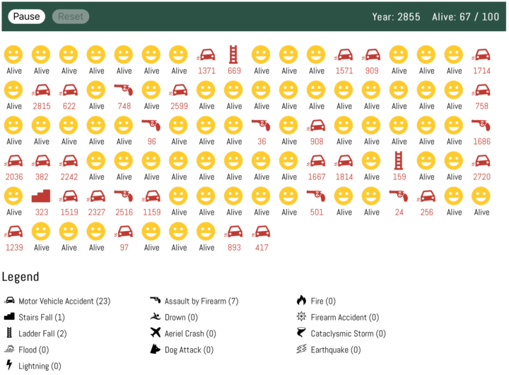
Here’s a fun what-if simulation that imagines a world where all natural causes of death were gone. People only die of things like car crashes and homicide. The result: people who live to thousands of years old.
Of course, this assumes that the likelihood of dying from external causes stays the same. With such a long life expectancy, do people start to take more risks? Or do we become more sloth-like because we have all the time in the world? Ah, that’s a thinker.
Want a simulation closer to reality? Here you go.
Statistician John Tukey, who coined Exploratory Data Analysis, talked a lot about using visualization to find meaning in your data. You don’t always know what you’re looking for, so you explore it visually. Etyn Adar, who teaches information visualization at the University of Michigan, makes a good case for banning the phrase in his students’ project proposals.
For all the clever names he created for things (software, bit, cepstrum, quefrency) what’s up with EDA? The name is fundamentally problematic because it’s ambiguous. “Explore” can be both transitive (to seek something) and intransitive (to wander, seeking nothing in particular). Tukey’s book seems emphasize the former — it’s full of unique graphical tools to find certain patterns in the data: distribution types, differences between distributions, outliers, and many other useful statistical patterns. The problem is that students think he meant the latter.
I see this sort of thing in my suggestion box too. Data exploration with visualization is good, but when someone describes their project as an exploration tool, it often means it lacks focus or direction. Instead it looks like generic graphs that don’t answer anything particular and leave all interpretation to the reader.
These are the traffic crashes that resulted in deaths in 2015, categorized by month, time of day, and factors involved.
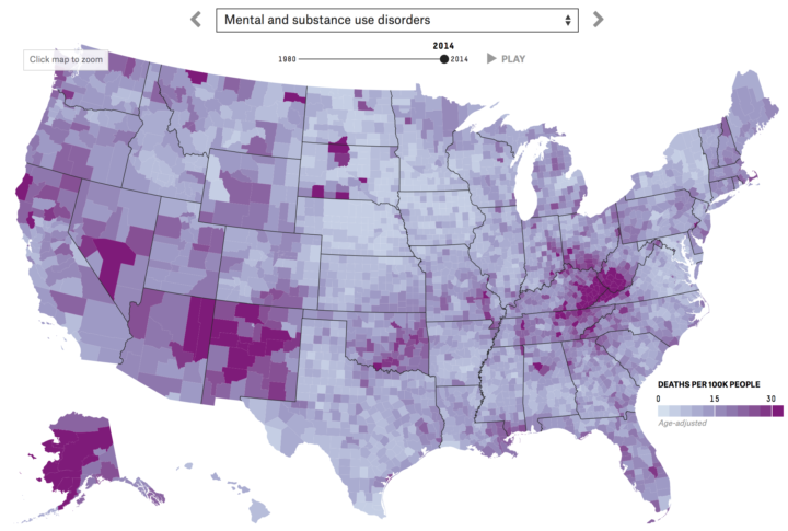
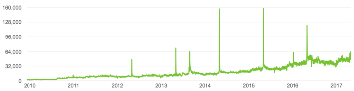
Nationwide mortality data relies on death certificates, and when cause of death is unknown, sometimes “garbage codes” are used to fill the space on the form. This leads to unwanted noise, because garbage in, garbage out as the saying goes. The Institute for Health Metrics and Evaluation tried to soften the noise and strengthen the signal. Ella Koeze for FiveThirtyEight mapped the results. Flip through causes and animate over time.
Some states have high rates. Some have low. But whether a state is lower or higher for you depends on more than just the high brackets.
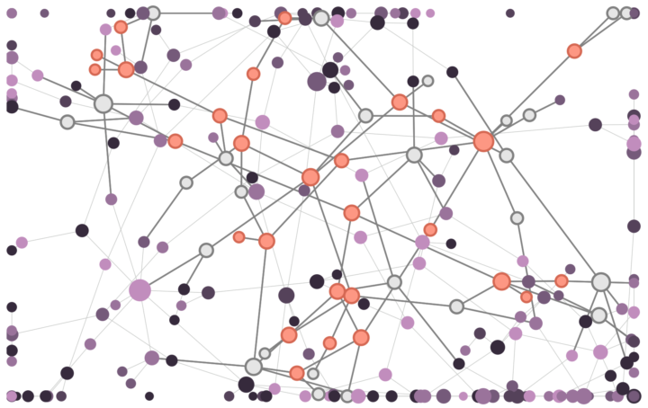
Disinformation is kind of a problem these days, yeah? Fatih Erikli uses a simulation that works like a disaster spread model applied to social networks to give an idea of how disinformation spreads.
I tried to visualize how a disinformation becomes a post-truth by the people who subscribed in a network. We can think this network as a social media such as Facebook or Twitter. The nodes (points) in the map represent individuals and the edges (lines) shows the relationships between them in the community. The disinformation will be forwarded to their audience by the unconscious internet (community) members.
Set the “consciousness” parameter and select a node to run.
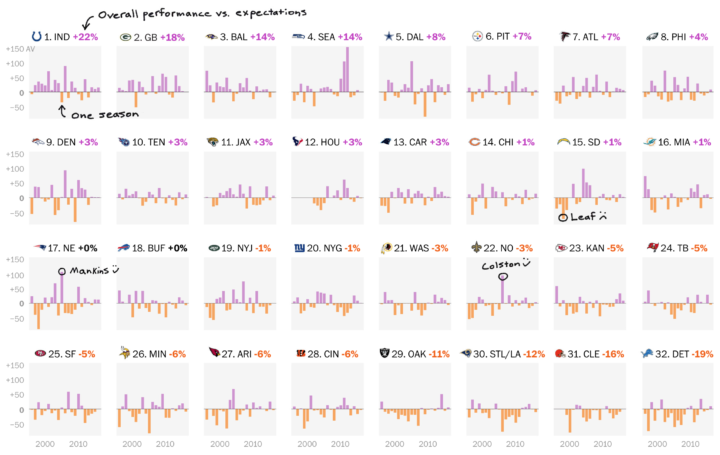
Reuben Fischer-Baum for The Washington Post looks at professional football expectations given their draft picks versus performance.
Read More
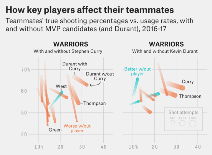
The choice for Most Valuable Player in the NBA is only minimally about the numbers, but it’s fun to look anyways. FiveThirtyEight makes the case for Stephen Curry. I particularly like the chart that shows how other players on a team fare when an MVP candidate doesn’t play.
Not only do virtually all of his teammates (10 of 11 players with at least 30 shots, representing over 1,700 shots taken without him3) shoot worse without Curry on the court to draw attention, they shoot dramatically worse. Overall, Curry’s teammates shoot 7.3 percentage points worse with Curry off the court, with his average teammate4 shooting 8.3 points worse. Among our MVP candidates, LeBron has the next-highest impact on average teammate shooting (3.9 points), followed by Westbrook (2.5 points). When it comes to opening up a team’s offense, Curry has no equal.
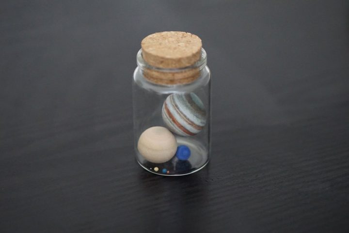
From Little Planet Factory, a Solar System in a bottle made to scale:
A small bottle attempting to maintain the correct scale between the 8 planets of the solar system at a scale of 1:5,000,000,000. Much as in reality the entire bottle is almost entirely dominated by the volume (and mass) of the four gas giants while the four solid planets settle almost dust like in comparison at the bottom of it.
Cute. [via @alykat]
Government data isn’t always the easiest to use with computers. Maybe it’s in PDF format. Maybe you have to go through a roundabout interface. Maybe you have to manually request files through an email address that may or may not work. However, this file that OpenElections received might take the cake.
It’s a spreadsheet, but the numbers are clipart.
City of Detroit produced a lookup tables for its absentee precincts in 2016. It's in Excel. But wait for it: the values are CLIP ART. pic.twitter.com/pzsPbjvc6j
— OpenElections (@openelex) April 17, 2017
Did someone enter clipart manually? Why is it clipart instead of numbers in Excel? Who made this file? So many questions, so little data.
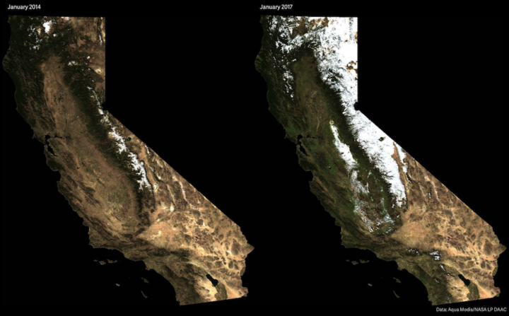
In case you didn’t hear, California had a bit of a drought problem for the past few years. We complained about not enough rain constantly, and we finally got a lot of it this year. Now we complain that there’s too much rain (because you know, we have to restore balance). On the upside, the state looks a lot greener and less barren these days. David Yanofsky for Quartz has got your satellite imagery right here.
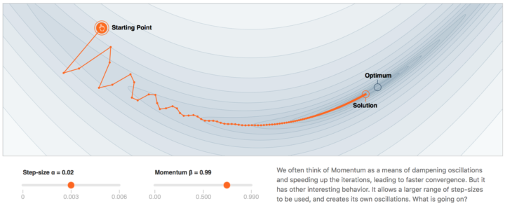
Gabriel Goh models momentum over at the new machine learning journal Distill. The visualization is not the focus, but it’s a nice supplement to help explain more complex concepts to a wider audience. More generally, if you haven’t checked out Distill yet, it’s worth your time.
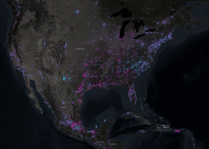
NASA recently released composite images of the Earth at night based on 2016 data, which was a follow-up to similar images for 2012. John Nelson compared the two, specifically looking for new lights that came on (blue) and lights that went off (pink). The former, suggesting growth and the latter, suggesting decline.
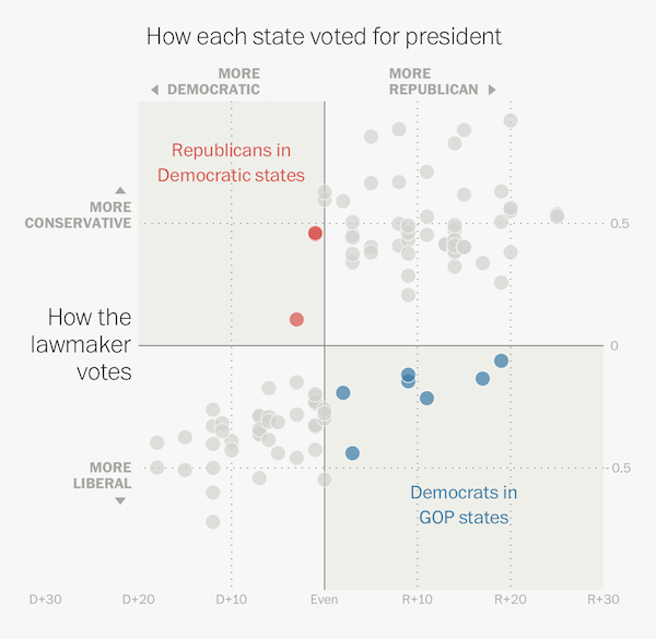
I know, it’s only April 2017, but some senators and representatives have some extra planning to as they figure out how to persuade midterm voters to re-elect them when the voters went a different direction for the presidential election. Kevin Schaul and Kevin Uhrmacher for The Washington Post use a scatterplot and scrollytelling to explain.
You had me at craft beer. Russell Goldenberg for The Pudding looks for the capital based on three factors — number of breweries, quality of breweries, and location — under the premise that the whole process of picking the best is really subjective.
Don’t miss the second the chart, which is a scatterplot that shifts favorite cities based on your preferences.

NASA just released a composite map of the world at night using satellite imagery from 2016. This is the first nighttime map since 2012, but the team behind the work hopes for bigger things with a more real-time system.
For instance, daily nighttime imagery could be used to help monitor unregulated or unreported fishing. It could also contribute to efforts to track sea ice movements and concentrations. Researchers in Puerto Rico intend to use the dataset to reduce light pollution and help protect tropical forests and coastal areas that support fragile ecosystems. And a team at the United Nations has already used night lights data to monitor the effects of war on electric power and the movement of displaced populations in war-torn Syria.
Be sure to check out the high-res versions to see all the little pockets of light around the world.
We live in a time when personal data leaves digital traces of what we do, what we like, and who we care about. Quinn Norton makes a concerted effort to not leave behind such traces using layers of security and encryption, which ironically makes for an old-fashioned love story.
My love affair has taught me that the age of data makes time solid in a way that it didn’t used to be. I have a calendar and email archive that nails down the when/where/who of everything I’ve done. I know when my kid was here; the last time I saw a friend in New York; exactly what my last email exchange with my mother was. Not so with my lover. Time is a softer thing for us. Sometimes it seems like he’s always been there, sometimes it seems like we’re a brand new thing. Every other relationship in my life is more nailed down than this one.
Soft time. I like it.
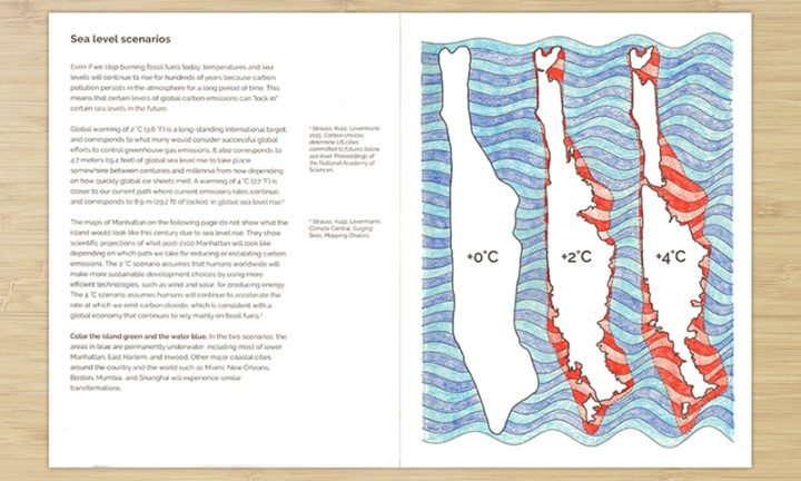
The Climate Change Coloring Book by Brian Foo makes data tactile and interactive. “The goal is to encourage learning, exploration, and reflection on issues related to climate change through act of coloring.” It’s in the early days of a Kickstarter campaign, but I suspect it’ll be funded in no time. Pledged.
 Visualize This: The FlowingData Guide to Design, Visualization, and Statistics (2nd Edition)
New tools, refined process.


