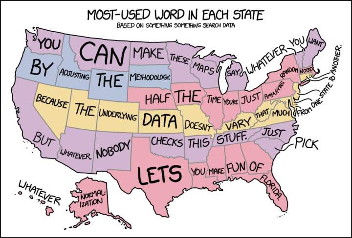
xkcd reading my mind somehow as usual. Not all state word maps are bad. But most of them are.
xkcd: Words in every state map
Second Edition
 Visualize This: The FlowingData Guide to Design, Visualization, and Statistics (2nd Edition)
 Visualize This: The FlowingData Guide to Design, Visualization, and Statistics (2nd Edition)
New tools, refined process.