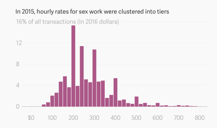
Default color schemes are often horrible, but spending a lot of time putting together color schemes when you don’t have a lot of minutes is also horrible. I Want Hue by Mathieu Jacomy at the Sciences-Po Medialab lets you set a few options, and it spits out a palette for your visualization.
-
Data Sketches, a collaboration between Nadieh Bremer and Shirley Wu, aims to visualize a monthly topic in two different ways.
Each month, we choose a topic and aim to have a visualization completed by the end of the month. Within the topic, we’re free to do whatever we want; a perfect opportunity to create, experiment, and have fun. The collaboration also gives us an encouraging sounding board, and a motivating pressure: a mutual reluctance of letting the other down.
They’re four months into the project with some fun results, and it’s a good example of how similar things can be shown in very different ways.
-
This is an update to the guide I wrote in 2009, which as it turns out, is now mostly outdated. So, 2016. Here we go.
-
Transitioning Map, Part 2: Refining the Format and Layout
How to make a more readable and more visually accurate map, before you dive into the big transitions.
-
This is some fine map work by Lazaro Gamio and Dan Keating for the Washington Post. It shows total votes and margin of victory for each county with a peaks and valleys metaphor. Taller means more votes, and wider means greater margin. The Post rotated the United States map so that the east coast is on top and the west coast is on the bottom, which allows for scrollability and provides more space horizontally to show margins.
Nice.
-
A group of researchers wondered if there was a trend or predictability for when a scientist’s most impactful work came about. It’s random.
Read More -
-
In case you didn’t get the memo, pattern fills are back and so hot right now. In the category of new-to-me, Textures.js by Riccardo Scalco is a JavaScript library that makes adding lines and dots in place of boring solid colors a trivial task.
-
[arve url=”https://youtu.be/Fqo5xPDCts8″]
Neil Halloran, creator of the interactive World War II documentary focused on deaths, is working on another focused on the cost of nuclear war. With the election tomorrow, Halloran pushed out an “election cut” to highlight what’s at stake. Very scary.
-
Noah Veltman put together a history of newspapers’ presidential endorsements since 1980 for about 100 publications. There’s a simple table showing Republican, Democrat, or other endorsement over the years, and you can download the data too.
-
We saw the changing percentage of white people in the United States and how whites are not the majority in a lot of places. Who is the majority in these areas? Here’s a breakdown for the main three races that make up majorities.
Read More -
Below is the estimated percentage of white population in the United States from 1970 to 2010, based on data from the Census Bureau and made more accessible by NHGIS. I like the evaporative quality coming up in the southwest.
Mostly though, this is just me trying out a new toy, and the form fascinates me at the moment.
Members: I’m working on a set of tutorials for how to make these. There are a few steps involved, so I’m breaking it down to make it more digestible. Part 1 is here.
-
Every election, there’s a slew of election maps that come in all shapes and sizes. The maps have evolved with the web, the amount of data available, and the level of reader interest, and it’s about finding a balance between the new and what works. To see the evolution, you can look to The New York Times portfolio over the decades. The Upshot has the rundown.
-
It’s been three years since the Affordable Health Care Act. Margot Sanger-Katz and Quoctrung Bui for The Upshot look at how this changed the percentage of those who were uninsured in this country. In some places the percentages didn’t change much, but in many others, there are much fewer uninsured.
-
For anyone who watched the presidential debates, I think it was fairly obvious what emotion each candidate projected at various moments. However, a group of graduate students from Columbia University applied computer vision and sentiment analysis to get a more quantitative gauge. Because, sure, why not. Sarah Slobin for Quartz explains the results.
-
This is too good not to watch. It’s a 1961 documentary on cartography and geography from the United States Air Force. Watch in all its vintage glory below.(You might want to turn down the volume during the first half minute.)
[via @mapdragons]
-
There’s been a lot of talk about building a wall at the U.S.-Mexican border lately. Seems straightforward enough, right? Just put some bricks up and be done with it. Well, it’s not really that easy, just from a logistics standpoint. Nevermind the politics. Josh Begley for the Intercept grabbed satellite images for the 1,954 miles of boundary line and then strung together the 200,000 images in a time-lapse to show the scale of what “build that wall” means.
-
Map making is a finicky challenge where oftentimes your map data — points, lines, and polygons — must align just right with your external data that exists as a CSV file or related. Mapshaper is an online tool that helps you massage your geographic data to where it needs to be.
The online application has been around for a while, but I only recently used it, and it’s kind of magical. It’s one of those things where you half expect the whole thing to fail, and then when it seems to be working you still expect there to be some wrinkle that makes using the tool a pain. Not so with Mapshaper.
-
One of best ways to learn visualization in any given software is to look at examples and apply to your own data. The R graph gallery helps you with the first part providing plenty of examples and the code snippets to make them. It’s still relatively new, but it should prove useful as it grows (hopefully). [via Revolutions]