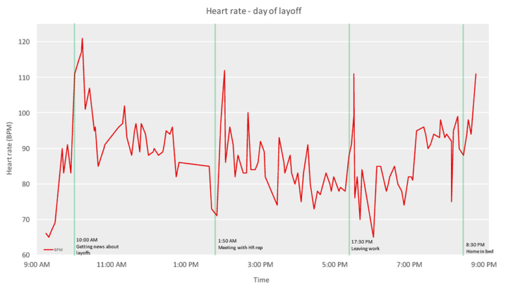
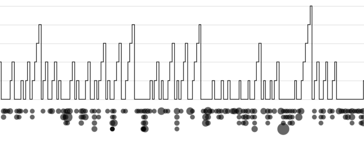
In planning for the upcoming inauguration, the U.S. military is using a giant multi-part rollout map to do walkthroughs. Yep.
[arve url=”https://www.youtube.com/watch?v=Dvy2r8T0pkg”/]
In planning for the upcoming inauguration, the U.S. military is using a giant multi-part rollout map to do walkthroughs. Yep.
[arve url=”https://www.youtube.com/watch?v=Dvy2r8T0pkg”/]
In some areas of the United States it poured down rain, which caused historic floods, and in other areas there was a lack of rain, which caused historic drought. The Washington Post has a map for that. Purple means less rain than usual, and green means more.
By definition, heartland is some central place of importance of a country. But ask people where to find America’s heartland, and the actual boundaries of this so-called area grows fuzzy. The Upshot asks its readers the same question with a multiple-choice poll.
First, it gets you to think about your concept of the heartland. Second, it provides a baseline to compare against others. Third, it goes into more detail for each option. And by the end, well, you still don’t quite know where the heartland is, but at least you learn something.
I have a feeling we’ll see this story format more this year.
We tend to think of demographics on a large scale. Countries, counties, and cities. Then we look at trends over time for thousands or millions of people. But it can be equally, if not more, interesting to look at the same trends at a personal level. This is what Dorothy Gambrell did. She charted her ten closest friends in New York.
I like how even though the charts are for only ten people, we see similar patterns that we might see for millions.
That was fast. Just when you get used to dating with 2016, 2017 comes along. A big thank you to all of you who make this site possible. I thank my lucky stars that this is what I get to do every day, and I hope I get to do it for years to come.
This year I made a conscious effort to learn to visualize data with d3.js. I still used R for exploration and data preparation, but on the presentation side of things, I always tried to go native in the browser first.
The popularity of my experiments and learning exercises took me by surprise. This was the ninth year of FlowingData, and from a pageviews perspective, it was almost twice that of any other year. And keep in mind that blogs were supposed to have died multiple times over already.
Read More
Map who “likes” television shows on Facebook, by ZIP code, and you get a good idea of cultural boundaries. This is what Josh Katz for the Upshot did for 50 of the most liked shows in the United States, finding three distinct regions: “cities and their suburbs; rural areas; and what we’re calling the extended Black Belt.”
Nikhil Sonnad for Quartz mapped the top 100,000 words used in tweets. Search to your heart’s content.
The data for these maps are drawn from billions of tweets collected by geographer Diansheng Guo in 2014. Jack Grieve, a forensic linguist at Aston University in the United Kingdom, along with Andrea Nini of the University of Manchester, identified the top 100,000 words used in these tweets and how often they are used in every county in the continental United States, based on location data from Twitter.
See also the dialect quiz and maps by Josh Katz from a few years back.
You might remember Bayes mentioned a few times in your introduction to statistics course. Or maybe you hear it every now and then in the news, and maybe you’re not quite sure what people are talking about. Here’s an introduction video to Bayesian statistics by Brandon Rohrer.
[arve url=”https://www.youtube.com/watch?v=5NMxiOGL39M”/]
There’s also a text version, if you prefer that over video. [via Revolutions]
The tweenr package in R, by Thomas Lin Pedersen, helps you interpolate data for easier animated transitions.
tweenr is a small package that makes it easy to interpolate your data between different states, specifying the length of each change, the easing of the transition and how many intermediary steps should be generated. tweenr works particularly well with gganimate but can be used for any case where interpolation of data is needed.
Why I’m just now learning about this, I have no clue. I thought we were friends.
From Google Research, a look at how discrimination in machine learning can lead to poor results and what might be done to combat:
Here we discuss “threshold classifiers,” a part of some machine learning systems that is critical to issues of discrimination. A threshold classifier essentially makes a yes/no decision, putting things in one category or another. We look at how these classifiers work, ways they can potentially be unfair, and how you might turn an unfair classifier into a fairer one.
Shadows cast by buildings affect the feel and flow of a city, and lack of sunlight can change aspects of daily living, such as rent. In a place like New York City, where there are tall buildings aplenty, the effects are obvious. Quoctrung Bui and Jeremy White for The New York Times mapped the darkness.
Read More
It’s been quite the year of randomness and things we never would have imagined at any other time before they occurred. So in the spirit of this year, here’s A Christmas Story for you.
Read More
This animated visualization from NASA Goddard Space Flight Center shows a model of carbon dioxide swirl around the planet, “using observations from NASA’s Orbiting Carbon Observatory (OCO-2) satellite.”
Here’s a fun piece called Radio Garden. It’s exactly what the title says. Pan the globe and listen to live radio at all the green dots.
The Beer Judge Certification Program lists 100 styles of beer. Here’s a chart for all of them.
Climate change is doing some weird stuff. What were once rare weather events could grow more common. ProPublica and The Texas Tribune zoom in on Houston, where there’s likely to be much more flooding than usual and not enough residents prepared for the rise.
scientists say climate change is causing torrential rainfall to happen more often, meaning storms that used to be considered “once-in-a-lifetime” events are happening with greater frequency. Rare storms that have only a miniscule chance of occurring in any given year have repeatedly battered the city in the past 15 years. And a significant portion of buildings that flooded in the same time frame were not located in the “100-year” floodplain — the area considered to have a 1 percent chance of flooding in any given year — catching residents who are not required to carry flood insurance off guard.
It’s a scroller with detailed maps of what’s happened in terms of flooding over the past decade or so. “I’m not a scientist” but this seems serious.
By design, the electoral college and population don’t quite match up state-by-state. This results in a lower ratio of electoral seats to people for the higher populated states and a higher ratio for the lower populated states. Denise Lu for The Washington Post provides a small multiples state grid to show the differences.
These charts show the difference between each state’s share of the national population and its share of votes in the electoral college since 1960. If the bars are above the line, the state has a greater share of electoral votes than it does population, meaning it is overrepresented. If the bars are below the line, the state is underrepresented.
Geography and state borders play a big part in how elections play out and where candidates campaign. Neil Freeman demonstrates with a map that generates random state boundaries.
This interactive map creates randomly-generated state boundaries for the United States, and see who would recent presidential elections under the map. Under different combinations of states, different regions become the deciding factor, and even broad popular support can be overturned by the specific state boundaries.
I think to really drive the point home, Freeman could highlight the elections that shift in final result instead of relying on just the 270 mark.
Update: Freeman applied the method to boundaries formed by various aspects of our lives.